Shopify · August 23, 2026 · 21 min read
Best Shopify Themes for Every Niche (2026)
Compare named Shopify themes by niche, catalog structure, mobile buying tasks, maintenance cost, and verified operational fit.
By Polo Themes
Compare named Shopify themes by niche, catalog structure, mobile buying tasks, maintenance cost, and verified operational fit.
A theme for multi-niche should help shoppers with different product questions make a confident decision without forcing them to decode the store. Visual style matters, but structure matters more: shoppers need to understand the range, compare meaningful differences, see constraints, and recover from uncertainty. Choose with a sample catalog and a launch plan in hand, not from a polished homepage screenshot alone.
What must a multi-niche Shopify theme do?
A multi-niche theme must organize consequential comparisons, preserve product states on mobile, expose policies and fulfillment boundaries, and remain editable. Shopify Help Center — Choosing themes says Theme Store industry categories describe primary design intent but do not restrict use. A shortlist place therefore requires representative catalog evidence, not a label, mood, or feature count.
The best multi-niche theme is the one that makes its hardest purchase questions easy to answer. Evaluate these requirements before colors, type, or animation:
- 1. Match navigation to buying intent — verify the behavior with realistic names, images, variants, and descriptions rather than demo content.
- 2. Make product differences scannable — verify the behavior with realistic names, images, variants, and descriptions rather than demo content.
- 3. Keep the primary mobile task obvious — verify the behavior with realistic names, images, variants, and descriptions rather than demo content.
- 4. Give policies and fulfillment details a clear home — verify the behavior with realistic names, images, variants, and descriptions rather than demo content.
- 5. Let the merchant team edit core pages safely — verify the behavior with realistic names, images, variants, and descriptions rather than demo content.
How should you test a theme before committing?
Test candidates with the same collection, mobile buying task, hierarchy, editor rehearsal, and integrations. According to Shopify Help Center — Adding, previewing, and buying themes, merchants can preview and customize paid themes before purchase. Include unavailable and complex products, then record observed outcomes, apps, customizations, gaps, owners, and rollback conditions.
- Build a representative collection. Include a bestseller, a complex product, an out-of-stock item, and one product with the longest realistic title and option labels.
- Run a mobile buying task. Ask someone unfamiliar with the catalog to find an item, compare alternatives, understand delivery or access, and reach the cart.
- Audit information hierarchy. The product identity, price, primary choice, availability, and purchase action should remain clear without relying on decorative banners.
- Test the editor workflow. Confirm your team can change navigation, homepage modules, collection storytelling, and product-page sections without fragile code edits.
- Check extension seams. Validate any reviews, subscriptions, delivery, personalization, age-gating, prescription, or digital-delivery app with the actual theme preview.
Which merchandising patterns matter across niches?
Effective merchandising exposes opening-decision attributes, reserves deeper context for product pages, and connects stories to purchasable states. Shopify Help Center — Metafields says custom data can extend products and appear through compatible themes. Whether the niche needs measurements, warnings, sizes, access, specifications, or sell units, every filter and campaign link needs maintained data.
A multi-niche theme cannot repair unclear assortment strategy. Decide which attributes deserve filters, which comparisons belong on product cards, and which details should wait until the product page.
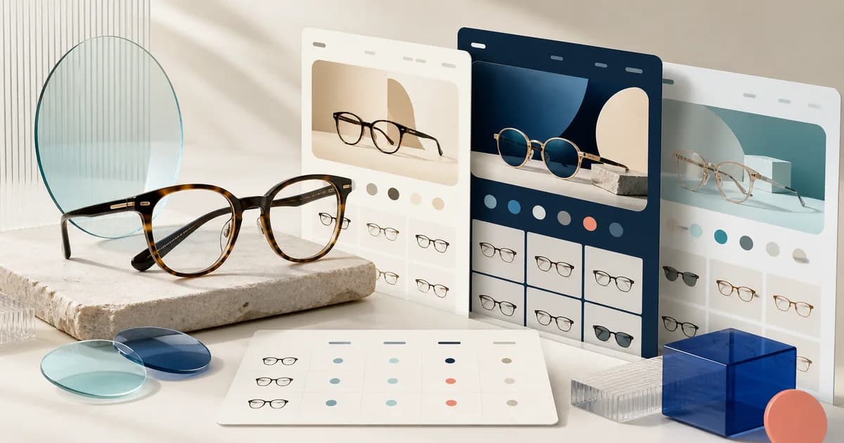
- Use Optics when frame, lens, and style discovery lead the journey.
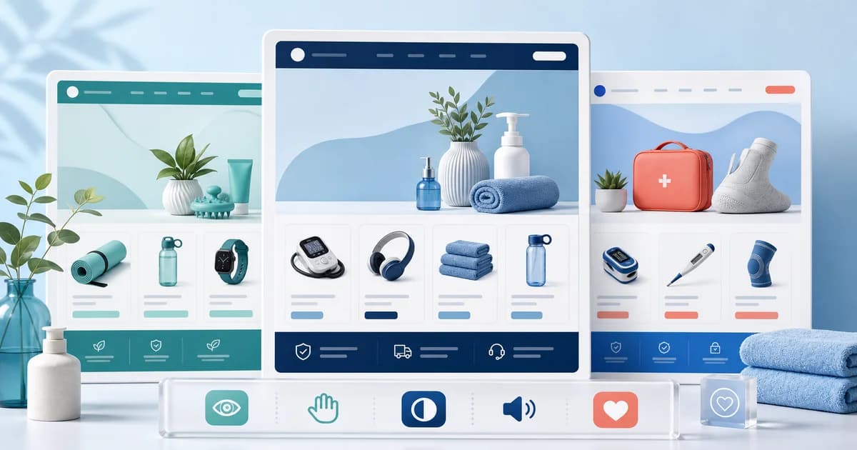
- Use Medical when trust, precise product information, and health-oriented categories lead.
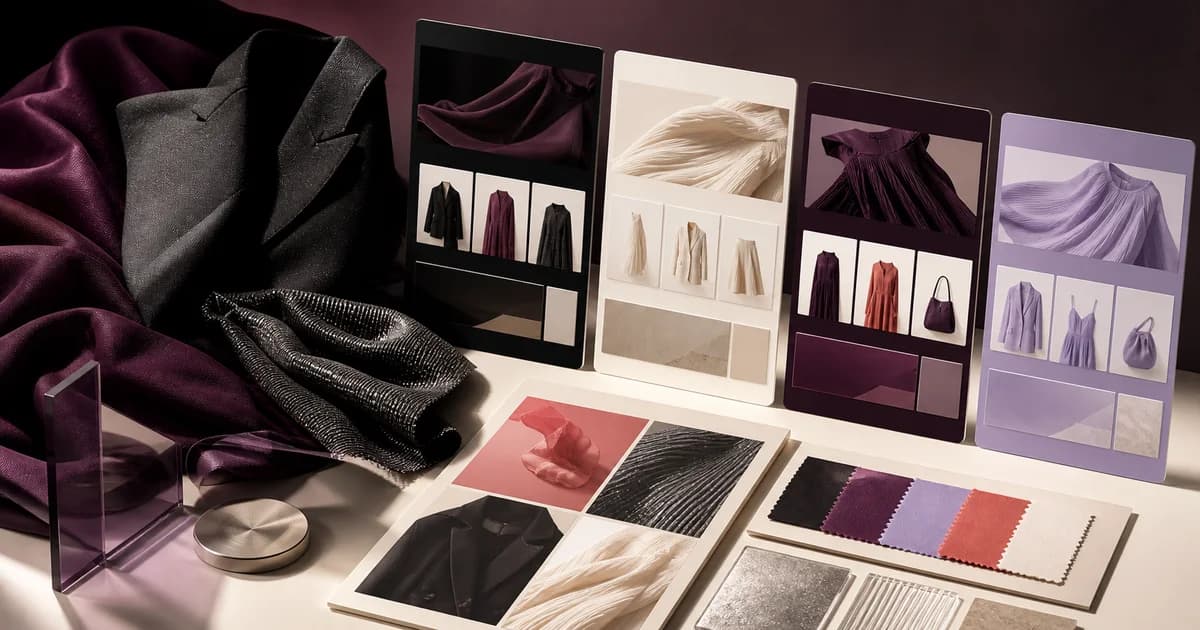
- Use Wosa for visual fashion collections, variants, editorial imagery, and seasonal drops.
- Use CourseWhiz for curriculum, instructor, outcome, and digital-offer presentation.
- Use Electronix for specifications, compatibility, accessory discovery, and broad navigation.
- Use Groxery for category-dense, repeat-purchase food and household assortments.
How should you shortlist the Polo catalog?
Start with the Polo theme closest to the catalog’s hardest decision, then add an adjacent control. Shopify Help Center — Choosing themes explains that no theme is restricted to its listed industry, supporting cross-niche comparison. Load identical fixtures and let the direct match lose when another candidate preserves information, exceptions, and operations with less custom ownership.
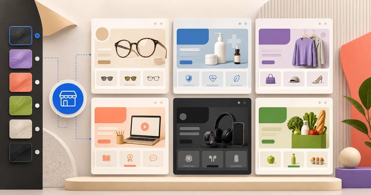
Polo Themes offers six specialist Shopify themes rather than claiming one universal design fits every merchant. Use the eyewear guide, healthcare guide, fashion guide, course guide, electronics guide, and grocery guide to inspect each buying problem, then test the closest structure with representative products. The right choice is the theme whose information architecture survives the real catalog, content, and operational rules with the fewest workarounds.
Browse the Shopify theme catalog, then use the niche selection method in this guide to compare direct and adjacent fits with the same representative products.
How do six Polo candidates earn a shortlist place?
Optics, Medical, Wosa, CourseWhiz, Electronix, and Groxery each begin with a niche-specific information hypothesis. Shopify Help Center — Choosing themes confirms that industry placement is guidance rather than a restriction. Frame fit, controlled facts, apparel variants, learning offers, technical identity, and repeat baskets must still survive representative tasks and operational recovery.
Optics, Medical, Wosa, CourseWhiz, Electronix, and Groxery are starting points for six different information problems. Optics should make frame identity and measurements easier to organize while leaving prescription or try-on services to separately tested systems. Medical should give exact product information, documents, restrictions, and support a calm hierarchy without implying professional or regulatory authority. Wosa should connect fashion imagery to real color and size states. CourseWhiz should describe a learning offer while distinguishing storefront purchase from course delivery. Electronix should preserve models, specifications, and compatible relationships. Groxery should keep sell units, departments, and mixed baskets legible while fulfillment remains an operational dependency.
A direct niche label is useful because it can reduce adaptation, but it is not a waiver for testing. Optics loses to an adjacent candidate if its direct styling hides a required measurement. Medical loses if a broader catalog theme makes controlled records and documents easier to maintain. Wosa loses if the team cannot keep campaign media synchronized with available garments. CourseWhiz loses if buyers cannot explain what happens after payment. Electronix loses if the cart drops a region or revision. Groxery loses if pack identity or location eligibility becomes ambiguous. Record the reversal against the actual catalog task rather than treating the catalog order as fixed.
A worked cross-niche shortlist exercise
Consider a merchant group opening six small stores: four frame models with a separate lens service, a bounded catalog of reusable health products, a seasonal clothing capsule, one self-paced course plus a live cohort, a range of laptop docks and cables, and a local pantry assortment. Build one difficult record for each store before opening any preview. Use a multi-width frame, a device with a revision-specific document, trousers with petite and regular cuts, the dated cohort, two similar docks with different host requirements, and a six-unit grocery pack that can become unavailable. These fixtures expose the information architecture more reliably than polished demo bestsellers.
Preview Optics with the frame and verify that model, color, width, measurements, and the lens boundary survive selection. Preview Medical with the device and locate exact identity, current instructions, restrictions, and support. Preview Wosa with the trousers and connect every campaign image to a valid cut, color, and size. Preview CourseWhiz with the cohort and reconcile dates, timezone, curriculum, access, and the post-payment handoff. Preview Electronix with both docks and prevent compatibility by resemblance. Preview Groxery with the pack and preserve pack count, customer quantity, availability, and picker output. An adjacent theme may be tested as a control, but it receives the identical fixture and task.
Run one failure-recovery drill before choosing
A clean add-to-cart path is necessary but too forgiving. Give each finalist one niche-specific break: a corrected frame dimension, a replaced healthcare document, a sold-out garment linked from a lookbook, a paid course order with no entitlement, a same-name hardware revision, or an unavailable grocery pack after the basket is built. Observe whether the merchant can pause the affected state, correct the accountable source, preserve unrelated choices, explain the next valid action, and verify the result across product, cart, order, fulfillment or delivery, and support. Reject silent substitution, default-variant switching, stale downloads, invented compatibility, and messages that claim completion before a separate system confirms it.
Acceptance evidence for the final niche decision
- Candidate rationale: name why the selected theme beat the other preview for the representative catalog, including any direct-match theme that was deliberately rejected.
- Rendered proof: retain the hardest collection, product, option, mobile, cart, and recovery states with the theme version and active integrations.
- Operational proof: show that the order preserves the exact frame, device revision, garment variant, course offer, electronics model, or grocery sell unit needed downstream.
- Ownership proof: identify who maintains the niche facts, who approves consequential changes, who monitors connected services, and who can restore the previous unpublished theme.
- Retest trigger: name the catalog, theme, app, service, policy, or fulfillment changes that invalidate acceptance and require the niche drill to run again.
Evidence to gather during the preview
- Capture the number of taps from collection entry to a configured item in the cart on mobile.
- Check whether important attributes remain legible with long titles, sale states, and unavailable variants.
- Preview at least one policy-heavy product and confirm supporting information appears before purchase.
- Compare all shortlisted previews with the same sample catalog so content quality does not bias the result.
Common mismatches to catch early
- Choosing a visual mood before defining filters and product attributes.
- Assuming an adjacent-niche theme includes a specialist workflow.
- Adding apps before confirming the theme already covers the underlying presentation need.
Treat each multi-niche mismatch as a cost: a small content adjustment may be reasonable, while a missing core workflow can turn a low-cost theme into an expensive custom build. Record who owns the workaround and how it will be tested before launch.
Why do six niches create six different buying problems?
Each niche concentrates risk in a different decision: optical fit, healthcare identity, fashion variants, course access, electronics compatibility, or grocery fulfillment. Shopify notes in Shopify Help Center — Choosing themes that industry categories aid discovery but do not restrict themes to that industry. Compare structures against each niche’s consequential uncertainty.
The Polo catalog does not treat industry labels as decorative skins. Each direct-match theme begins from a different kind of customer uncertainty. Eyewear shoppers need to reconcile style with physical fit. Medical buyers need exact identification and confidence in supporting information. Fashion shoppers move between editorial desire and variant availability. Learners evaluate an outcome that will be delivered after payment. Electronics buyers compare specifications and compatibility. Grocery customers assemble a large basket quickly and often return for the same items. A useful theme comparison starts with these differences.
Optics: frame discovery with measurable fit
Optics is the direct choice for lenses and frames. Evaluate it with products that differ by frame shape, dimensions, material, color, and lens context. A good optical collection lets shoppers explore style without losing the factual cues required to judge fit. A good product page places measurements and included components beside the relevant choices. Prescription collection, verification, lens production, and virtual try-on are not theme features claimed by the catalog; if the business needs them, test the chosen service inside an unpublished theme and document the handoff.
Medical: precise information in a calm hierarchy
Medical is intended for medical supplies and also names health, baby, and beauty as possible categories. Its value is not a promise of regulatory compliance; it is a responsive presentation designed for information-heavy products. Test exact identifiers, intended-use language, dimensions, compatibility, warnings, supporting documents, customer support, and product-specific return constraints. Remove any demo badge or promotional phrase that could imply an approval the merchant cannot prove. Professional purchasing, prescriptions, regulated claims, storage, traceability, and local eligibility remain separate business obligations.
Wosa: editorial fashion connected to purchasable variants
Wosa is the direct clothing-store theme. Its clean typography and modern visual presentation work best when campaign imagery leads directly into understandable products and available variants. Test size and color combinations, fit guidance, fabric and care details, unavailable states, collection filters, and mobile image controls. Wosa can be adapted to jewelry, footwear, beauty, streetwear, baby clothing, or fitness, but that is an adjacent recommendation. Each adaptation needs a deliberate information layer—material and scale for jewelry, width and fit for shoes, or ingredient and shade detail for beauty.
CourseWhiz: selling access to a defined learning outcome
CourseWhiz presents course materials, descriptions, and purchase options for educators and learning businesses. A course page should name the intended learner, practical outcome, curriculum, prerequisites, instructor, format, access duration, support, and refund terms. Shopify’s official digital-product guidance says merchants must mark non-physical offers appropriately and use an app when a download link must be delivered. CourseWhiz does not claim to host lessons or manage enrollment. Place a test order and prove the email, login, download, or external learning-platform access before publishing the offer.
Electronix: comparison, compatibility, and broad navigation
Electronix is designed for electronics and includes an Ajax cart, customizable sections, and a mega menu. Those capabilities support a broad catalog, but trustworthy electronics merchandising depends on normalized data. Use stable model identifiers, consistent specification names and units, explicit connector or device compatibility, warranty terms, and confirmed accessory relationships. Preview a complex product, a nearly identical alternative, a sold-out configuration, and a mixed accessory basket. An attractive recommendation carousel is harmful if it suggests combinations the catalog team has not verified.
Groxery: quick recognition across a repeat-purchase catalog
Groxery is the direct grocery option and the closest structural fit for several replenishment-led adjacent niches. Test department navigation, search, pack and unit distinctions, quantity controls, availability, ingredients, allergens, storage, and delivery eligibility. The storefront should help a returning shopper rebuild a basket without obscuring a new shopper’s need for detail. Delivery zones, time slots, substitutions, cold-chain handling, picking accuracy, and fresh inventory are operational systems, not implied capabilities of the theme. Verify them with representative mixed carts.
How do you build a controlled theme-comparison catalog?
Freeze one neutral pack containing simple, complex, unavailable, policy-heavy, and imperfect products, then load it into every candidate. Shopify Help Center — Adding, previewing, and buying themes confirms that paid themes can be previewed and customized before purchase. Define identical tasks and edits so structural differences appear under equal catalog pressure.
Theme demos contain carefully selected titles, photography, and products, so comparing demos produces a biased result. Build a neutral content pack that every candidate must carry. Include one simple bestseller, one product with many options, one item with a long technical description, one unavailable variant, one policy-heavy item, one large collection, one promotion, and imperfect but realistic image ratios. Define expected navigation and filters before opening the previews. This controlled set reveals whether the theme supports the catalog or merely flatters its own demo content.
- Collection task: find a product from a broad entry point, narrow by two meaningful attributes, compare alternatives, and recover after a zero-result filter.
- Product task: identify the item, understand the consequential differences, select a valid option, find delivery or access terms, and add the intended configuration.
- Exception task: encounter unavailable stock, a restricted destination, an invalid option combination, or a required policy and understand what to do next.
- Merchant task: change navigation, collection storytelling, a reusable product section, an announcement, and a brand token without editing fragile code.
- Maintenance task: identify every app block, code customization, theme-specific setting, and manual content dependency that needs review after an update.
How should you score evidence instead of impressions?
Set niche-specific weights before reviewing finalists, score completed buyer and operator tasks, and attach observations to every rating. Shopify Help Center — Choosing themes advises checking available support before buying a paid theme. Price implementation and ownership gaps, and reject critical workflows dependent on unverified apps, unsupported claims, or fragile workarounds.
Choose weights before the final review. Optical and footwear stores may emphasize fit comprehension. Medical and supplement catalogs may emphasize exact information and policy placement. Fashion and beauty may emphasize variant feedback and image behavior. Electronics may emphasize specifications and compatibility. Grocery may emphasize navigation speed and quantity clarity. Every store should score mobile completion, editor maintainability, accessibility basics, extension compatibility, failure states, and change cost. A score without a recorded task or observation is only an opinion dressed as data.
Price each gap twice: once for initial implementation and once for ownership after launch. A small content rewrite is different from a custom compatibility finder. A verified app is different from an undocumented snippet. Record who updates the workaround, what happens during theme upgrades, which customer states are tested, and how it can be removed. Reject a candidate when a launch-critical workflow depends on an unowned or misleading workaround, even if the homepage wins the visual review.
What changes when a Shopify theme changes?
Products and other admin-managed resources remain, while templates, sections, styling, app code, and customizations can be theme-specific. Shopify Help Center — Adding, previewing, and buying themes says the old theme remains accessible after switching. Stage presentation and integrations carefully; a switch is neither a catalog migration nor a one-click reskin.
Shopify’s official theme documentation distinguishes admin-managed resources from theme-specific configuration. Products, collections, menus, pages, and blog posts remain in the admin when a merchant switches themes. Section and block settings, global styling, theme wording, templates, app-added code, and code customizations can be specific to the theme or version. That means a theme switch is neither a catalog migration nor a one-click visual swap. Stage the new theme, recreate required presentation, test integrations, and keep the previous published theme available as a rollback option.
A compact decision record should capture the selected theme and version, sample content, scored tasks, known gaps, required apps, custom work, owners, acceptance checks, and rollback path. It should also state why other finalists lost. This record helps future maintainers understand whether a setting protects a genuine customer need or survives only because nobody remembers its origin. Review the record before each material theme update, app replacement, catalog expansion, or move into an adjacent niche.
How can a two-day theme evaluation workshop stay practical?
Prepare frozen fixtures and decision owners, configure the hardest journey before the homepage, observe buyers and editors, and stress unavailable and narrow-screen states. Shopify Help Center — Adding, previewing, and buying themes supports sharing unpublished-theme previews for feedback. Finish with evidence, gap owners, publication steps, and rollback—not a universal ranking.
- Prepare the evidence pack. Freeze sample products, policies, imagery, required integrations, evaluation tasks, weights, and decision owners.
- Configure from the inside out. Build a complex product template first, then its collection, navigation, cart, policies, and finally the homepage routes into those working paths.
- Observe without coaching. Give buyers and the merchant editor explicit outcomes, not click instructions. Capture their questions and wrong turns.
- Stress the edges. Use long titles, unavailable combinations, discounted states, narrow screens, slow images, mixed carts, and exception messages.
- Decide and document. Score only observed evidence, price gaps, assign owners, define acceptance tests, and record the publish and rollback sequence.
The output is not a universal ranking. It is a defensible match between one catalog, one operating model, one team, and one theme. If two themes score closely, select the one with fewer persistent exceptions and less custom ownership. Brand styling can be refined; a mismatched information architecture keeps charging the business every time a product is added, a policy changes, an app updates, or a customer needs help.
Why should the first three templates come before the homepage?
The hardest product template reveals required data, options, policies, and integrations; its collection reveals discovery needs; only then can the homepage route shoppers honestly. Shopify Help Center — The theme editor confirms that sections and settings control content and layout. Build templates first so campaign panels cannot promise journeys the catalog cannot complete.
Start with the hardest product template because it exposes the data, option, policy, and integration requirements. Next build the collection that helps a shopper reach and compare those products. Only then compose the homepage as a routing layer for different intents. Reversing this order encourages teams to perfect campaign panels while the catalog journey remains unresolved. The homepage should make promises that the collection and product pages can actually keep.
For every template, document its content owner, source fields, empty state, sold-out state, mobile order, required app blocks, and primary acceptance task. Reuse one template where product questions are genuinely shared; split only when a category needs a different decision structure. Too many templates create silent inconsistency, while one overloaded template forces irrelevant sections onto every item. The best architecture is the smallest set that expresses real customer differences.
How should adjacent niches be used in a shortlist?
Treat an adjacent theme as a structural hypothesis, map consequential questions to storefront locations, and mark each answer native, configurable, app-supported, custom, or absent. Shopify Help Center — Choosing themes explicitly says themes are not restricted to listed industries. Test the riskiest answer with real data, rejecting resemblance when required answers remain custom or missing.
An adjacent recommendation means the nearest information structure in Polo’s current catalog, not a claim that the theme was designed or certified for that business. Optics can provide an optical base for sunglasses and contact lenses, but those catalogs ask different questions. Wosa can frame jewelry or beauty visually, but engraving, scale, ingredients, and shades need deliberate support. Groxery can organize repeat-purchase pet or supplement goods, but species, warnings, servings, and regulated claims do not appear automatically. State the adaptation plainly wherever the theme is recommended.
Test adjacent fit by listing the niche’s five most consequential customer questions and mapping each to a visible place in the candidate. Mark each answer native, configurable, app-supported, custom, or absent. Then test the riskiest answer with actual data. If several core questions fall into custom or absent, the closest Polo theme may still be the wrong implementation choice. An honest no-fit decision protects the merchant from purchasing a visual resemblance that creates structural debt.
How do you keep theme performance claims evidence-based?
Measure staged candidates with representative images, fonts, apps, analytics, custom code, and catalog depth, then monitor important live templates. Shopify Help Center — Improving online store performance says apps, third-party libraries, themes, and custom code can affect performance. A clean vendor demo therefore describes one configuration, not the merchant’s production result.
A theme’s architecture contributes to storefront performance, but a production store also carries merchant images, fonts, tracking, app scripts, personalization, reviews, and custom code. Do not turn a clean preview into an unsupported “fastest” claim. Measure the staged store with representative content and required integrations, then monitor the live templates that matter. When performance regresses, identify the request, asset, script, or rendering change responsible instead of treating the theme name as a diagnosis.
Apply the same discipline to “mobile-friendly,” “conversion-optimized,” and “beginner-friendly.” Responsive layout is necessary but does not prove that option controls are comfortable, validation messages are visible, or a long catalog is navigable. A persuasive module cannot guarantee conversion. Many settings can make a theme harder for a first-time editor. Translate every label into an observable task, test it, and report the conditions. Evidence makes the recommendation useful without manufacturing a leaderboard.
How do you choose the maintenance model with the design?
Name owners for product data, navigation, settings, apps, code, releases, and regression checks before purchase. Shopify Help Center — The theme editor says themes expose sections and settings for code-free design changes. Compare that actual editing surface, documentation, update path, and rollback burden against the team that will maintain it.
Before purchase, name who owns product data, navigation, theme settings, app integrations, custom code, releases, and regression checks. Decide how changes move from a draft theme to production and how the previous version remains recoverable. Review vendor documentation and update paths. A store with no developer should avoid a decision that depends on frequent code patches; a capable team may accept customization when it protects a valuable workflow. The same theme can be sustainable for one organization and fragile for another because ownership is part of fit.
Run one final cross-niche sanity check before purchase: remove the demo photography and ask whether the remaining labels, filters, product facts, and exception states still fit the catalog. Optics should still answer frame-fit questions; Medical should still surface precise use and support information; Wosa should still connect imagery to available variants; CourseWhiz should still explain access; Electronix should still clarify compatibility; and Groxery should still support a mixed, repeat-purchase basket. If the structure stops making sense without its styling, the shortlist is not yet evidence-based.
What belongs in a publishable theme acceptance record?
Record theme version, representative catalog, devices, markets, integrations, scored tasks, exception states, workarounds, risks, owners, and evidence links. Shopify Help Center — Adding, previewing, and buying themes confirms that only one theme is published while others remain available. Add publication sequence, observation window, rollback trigger, and prior-theme location.
Before the selected theme goes live, turn the evaluation into an acceptance record the operating team can reuse. Name the tested theme version, products, collections, devices, markets, integrations, and exception states. Link screenshots or recordings to each scored task and distinguish a passed native behavior from a workaround. Record unresolved risks with owners and due conditions. Finally, write the publish sequence, observation window, rollback trigger, and previous-theme location. This evidence makes the recommendation auditable and prevents a later visual tweak from silently removing a buying requirement that the original evaluation protected.
A practical decision scorecard
- Catalog fit: Can customers browse and narrow the real assortment?
- Product comprehension: Does the page explain differences, options, and constraints at the moment they matter?
- Mobile completion: Can a shopper finish the main task comfortably on a narrow screen?
- Editorial control: Can the merchant team maintain key pages in the theme editor?
- Operational fit: Do shipping, access, compliance, returns, and support information have clear homes?
- Change cost: How much custom code or app-specific styling must be maintained after theme updates?
Keep the completed scorecard beside the staged theme and record the catalog sample, test device, integrations, known gaps, decision owner, and review date. That evidence makes a later redesign or theme update comparable to the launch decision instead of relying on memory or a changed demo.
Key Takeaways
- Start from the niche’s hardest buying decision, then test one direct theme and one credible adjacent control.
- Use identical catalog fixtures, mobile tasks, editor rehearsals, integrations, and failure states for every candidate.
- Treat Optics, Medical, Wosa, CourseWhiz, Electronix, and Groxery as structural starting points, not workflow guarantees.
- Score observed customer and operator evidence while pricing both initial gaps and ongoing ownership.
- Publish only with a versioned acceptance record, named owners, retest triggers, and a recoverable prior theme.
Conclusion
Choose a multi-niche theme by testing the complete buying journey, not by ranking demos. Start with the requirements unique to shoppers with different product questions, verify them on mobile, and favor a structure your team can keep accurate after launch. Use the niche guides in this pillar for a deeper test plan, then compare the corresponding live product previews.
Frequently asked questions
Is there one best Shopify theme for every store?
No. A theme is best only relative to a catalog, buyer task, operating model, and team. Specialist structure usually beats a generic feature count.
Should I choose by industry or by features?
Start with the industry’s buying questions, then verify the features that answer them. Industry styling without functional fit is only decoration.
Can I change themes later?
Yes, but settings, app integrations, and custom code may need rework. Duplicate the current theme and stage the replacement before publishing.