Figma · August 23, 2026 · 9 min read
Figma Components and Variants Explained
Components capture reusable structure; variants and properties expose meaningful state, size, emphasis, and content choices without duplicating patterns.
By Polo Themes
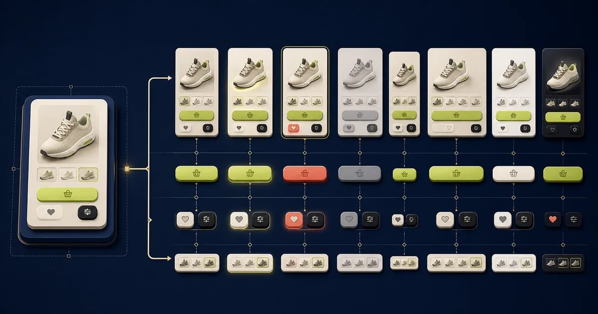
A component should represent a stable interface pattern. Variants are useful when the pattern has a bounded set of meaningful alternatives. The goal is not the largest possible component set; it is a model that makes the correct choice obvious.
Key Takeaways
- Define the responsibility of a component before drawing variants.
- Represent product state explicitly instead of encoding it in layer names.
- Prefer composition when independent responsibilities would multiply variants.
- Publish only combinations that have a real product use case.
How should you define a component boundary?
Define a component where anatomy, behavior, accessibility, and maintenance responsibility genuinely repeat; keep one-off page composition outside it. Figma's 2026 “Guide to components in Figma” distinguishes 2 linked roles: main component and instance. That source-consumer relationship is useful only when the main component owns a stable contract and instances retain bounded flexibility.
Create a component around a repeated behavior or structure, such as a product card, quantity control, or alert. Avoid turning an entire page into one opaque component. Expose text, boolean, instance-swap, and variant properties where editors need controlled flexibility. The e-commerce website design pillar develops this connected responsibility in a dedicated guide.
- Keep responsibilities narrow.
- Name properties in product language.
- Preserve slots for content that genuinely varies.
What should you document impossible and dependent combinations?
Document which property combinations are valid, dependent, unavailable, or nonsensical before exposing controls to library users. Figma's 2026 “Overview of variables, collections, and modes” lists 6 variable types. Those types can express supporting values and modes, but they do not replace a written rule such as loading disables interaction or sale price requires a comparison price.
Add a short decision table beside complex component sets. State which properties can combine, which value changes another property's meaning, and which states are owned externally. For a product option, unavailable and selected may require a specific product rule; for a button, loading may suppress its icon and label while preserving dimensions. Use the table during code mapping and library review. Removing impossible combinations makes both the Figma component and implementation API safer and easier to test. The variables and design-tokens guide connects these values to a governed semantic vocabulary.
Why should you separate identity from composition?
Keep product identity—media, title, price, badges, and options—separate from the grid, carousel, recommendation, or cart composition that places it. Figma's 2026 “Share libraries in an organization” describes 3 sharing levels. Publish stable identity patterns at the justified scope while allowing consuming compositions to solve their own layout and data constraints.
A product-card component represents a recognizable pattern; a collection grid represents composition of cards. Keeping those responsibilities separate lets the card evolve without encoding every possible page layout. The same distinction applies to input versus form row, price versus purchase panel, and icon button versus carousel. The Figma design-system guide places this pattern inside a contribution and release process.
Ask whether consumers need to swap, configure, or compose a part. Expose properties only where controlled variation is useful. Deeply nested overrides may technically work but create fragile editing. If a region needs unconstrained content, a documented slot or smaller composed component is often clearer than a giant property surface.
How should you design a property matrix before drawing variants?
List independent properties, allowed values, dependencies, and forbidden combinations before creating variants; then decide whether each belongs to a variant, boolean, text, instance swap, slot, or composition. Figma's 2026 “Guide to components in Figma” defines 2 linked roles—main components and instances—so the matrix should protect the source contract without blocking legitimate instance content.
List each property, allowed values, default, and incompatible combinations. A button might have emphasis, size, icon position, loading, and disabled behavior, but certain combinations should never appear. Resolve that logic in the model rather than creating a canvas full of unexplained examples. The Dev Mode handoff guide shows how to communicate this decision and its acceptance evidence.
Count the combinations implied by the matrix and simplify before production. Boolean properties are useful for independent optional elements; variant properties suit mutually exclusive modes; instance swap supports bounded substitution; text properties expose copy. Using the correct property type keeps the component easier to inspect and map to code.
How should you represent interactive state accurately?
Represent only states the product can actually enter, naming triggers, disabled behavior, focus, feedback, and recovery rather than treating hover as the whole interaction. Figma's 2026 “Create interactive components with variants” shows 5 checkboxes expanding to 32 frames and 160 connections without reuse. Model shared behavior once and keep consequential differences explicit.
Default, hover, focus-visible, active, selected, disabled, loading, success, and error are not interchangeable decoration. Model only states the pattern genuinely owns and annotate transitions supplied by a parent flow. For example, a field can own focus and invalid presentation, while a form owns submission and error-summary behavior. The commerce design-token guide connects these values to a governed semantic vocabulary.
Include keyboard focus even if the visual design rarely displays it in presentations. Disabled controls should remain understandable, and unavailable commerce options may need explanation rather than simple disabling. Validate every state against semantic tokens so a palette update does not erase important feedback.
How do you control variant growth through composition?
Control variant growth by composing smaller responsibilities—icon, label, badge, price, media, option, and action—instead of multiplying every possible combination into one set. W3C's 2023 “Understanding Success Criterion 2.5.8: Target Size (Minimum)” sets a 24-by-24 CSS-pixel baseline with exceptions. Keep that actionable sizing rule with the control component across compositions.
If a product card supports badges, price types, ratings, wishlists, quick add, color swatches, inventory messages, and several layouts, one exhaustive component set can become unmanageable. Compose stable subcomponents and expose only high-value decisions at the card level. Page-level context can choose composition without multiplying the global matrix. Use the editable PoloThemes Figma bundle to inspect these decisions in a complete editable product.
Create separate components when purpose or behavior changes, even if the appearance overlaps. A link styled like a button and a form submission button may share tokens but have different semantics. Design-system consistency does not require pretending distinct controls are the same object.
How should you name components for library users?
Name components by product role and navigable hierarchy, then name properties in language consumers can predict without knowing the layer tree. Figma's 2026 “Share libraries in an organization” distinguishes 3 publication levels. Searchability and naming become more consequential as reach expands, so test discovery with users at the intended scope before organization-wide release.
Names should help a designer search and choose: Product card, Price display, Option selector, and Cart line item communicate more than arbitrary visual labels. Property values such as primary, secondary, compact, selected, and unavailable should have documented meaning. Avoid names tied to a single page position.
Descriptions should state purpose, expected content, and important restrictions. Add examples that demonstrate recommended composition and misuse. When code components exist, align terminology where it improves communication, but do not rename either system mechanically if their boundaries legitimately differ.
How can you use variants for real states?
Use variants for bounded visual or behavioral states such as size, emphasis, selection, availability, and validation—not arbitrary page content. Figma's 2026 “Create interactive components with variants” quantifies the combinatorial risk: 5 independent checkboxes can produce 32 frames and 160 connections. Split responsibilities or use properties before the set becomes impossible to review.
Model distinctions the product and code must recognize: default, hover, focus, disabled, loading, error, selected, and unavailable. Do not create variants for every arbitrary color or copy combination. A property matrix should be small enough to inspect and map to implementation.
- Distinguish disabled from unavailable.
- Include keyboard focus in the state set.
- Avoid impossible property combinations.
What should you audit before publishing a component set?
Audit anatomy, property logic, impossible combinations, content extremes, responsive behavior, focus and target states, naming, description, code mapping, and migration impact before publishing. Figma's 2026 “Share libraries in an organization” offers 3 sharing levels. Release first at the narrowest useful scope, observe instances, and widen only with ownership and rollback prepared.
Open the component playground or a dedicated matrix and exercise every supported property combination. Look for impossible combinations, hidden dependencies, clipped focus, inconsistent nested states, unstable dimensions, and labels that make sense only to the author. Test representative instances in product, collection, cart, and form compositions rather than judging the component in isolation.
Ask a designer to select the right variant from a written scenario and ask a developer to map each property to implementation. Confusion is evidence that the model or documentation needs work. Record deprecations, migration impact, and code parity before publishing; a tidy main component is not sufficient if accepting the update breaks existing instances.
How should you evolve shared components safely?
Evolve shared components through proposals, representative-instance testing, accessible review, release notes, migration guidance, and monitored adoption; do not silently repurpose existing properties. Figma's 2026 “Guide to components in Figma” defines 2 linked roles, main components and instances. Review both sides: source correctness and the real consumer impact of every published change.
Before publishing a change, inspect dependent instances, property preservation, nested swaps, responsive sizing, and visual states. Renaming or deleting properties can create broad migration work. Stage risky changes in a branch or test library, document impact, and provide a transition path.
Deprecation is often safer than immediate removal. Mark the old component, explain its replacement, migrate high-risk flows, and audit remaining use. A component library stays trustworthy when updates are predictable and consumers understand whether accepting them changes appearance, behavior, or only internals.
Keep systems maintainable
Prefer composition over a giant nested variant explosion. Use smaller components for price, badge, media, and controls, then compose them into cards and sections. Document when an instance may be detached and identify the coded counterpart during handoff.
- Audit unused variants quarterly.
- Deprecate rather than silently rename shared patterns.
- Match design properties to code concepts where practical.
Challenge the property model with real scenarios
Write product-language scenarios before reviewing the set: a product card with a sale price and unavailable quick add; an option selector with one selected value and another sold out; a button waiting on a cart request; and a field error associated with its label. Ask a designer who did not build the library to configure each using only exposed properties and documentation.
Inspect resulting combinations for hidden dependencies, contradictory states, clipped focus, lost overrides, unstable dimensions, and values that exist only for visual tweaks. If selected and unavailable combine, define the meaning; if loading suppresses a label, preserve an accessible name and predictable width. Separate state owned by a parent flow from state owned by the component.
Map the scenarios to coded components with a developer. Terminology need not be mechanically identical, but responsibility and allowed state should agree. Remove impossible combinations, compose large sets from smaller patterns, and deprecate risky properties with migration notes. Publish when another user can choose correctly without canvas archaeology or private knowledge.
Implementation checklist
- Every component has a clear responsibility.
- Variants represent bounded product states.
- Properties use consistent names and values.
- Examples cover content extremes and accessibility states.
Conclusion
Components create reuse; well-designed properties create safe reuse. Model the decisions people need to make, and the library will stay understandable as the catalog and team grow.
Frequently asked questions
When should I use a variant instead of a separate component?
Use a variant when the alternatives share identity, structure, and behavior. Use separate components when they serve different purposes or would create confusing conditional properties.
How many variants are too many?
There is no universal number. The warning sign is a property matrix containing impossible combinations or requiring editors to memorize hidden rules.


