Figma · August 23, 2026 · 9 min read
Design Tokens for E-Commerce UIs
Create e-commerce design tokens around semantic roles, commerce states, modes, and governed delivery across Figma and code.
By Polo Themes
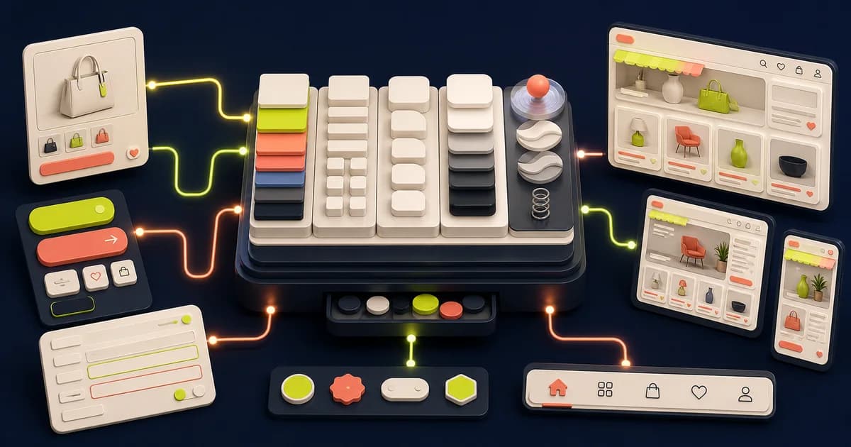
Commerce interfaces repeat high-risk states—price changes, promotions, inventory, validation, and purchase actions—across many pages. Semantic tokens help those states remain coherent while brands, themes, and platforms evolve.
Key Takeaways
- Name stable commerce meaning rather than visual appearance.
- Keep primitives, semantic aliases, and component decisions distinct.
- Release tokens as versioned interfaces shared with code.
- Exercise proposed changes across brands, modes, and adverse states.
Which repeated commerce decisions belong in the inventory?
Figma’s “Overview of variables, collections, and modes”, retrieved in 2026, defines 6 variable types. Use those types as inventory buckets, then record repeated commerce meanings across product, collection, cart, checkout, account, and support—not just visually similar values. The inventory should reveal shared decisions and intentional exceptions before anyone names tokens.
Begin with a route-by-state matrix. A muted border may be accidental drift on one card but a deliberate unavailable-state signal on another, so tallying values alone is insufficient. The variables and design-tokens guide shows how to turn confirmed patterns from this matrix into governed Figma collections, aliases, and modes.
Group true duplicates and investigate near-duplicates before normalizing them. Some variation is accidental drift; some reflects a different semantic role or platform. Tokens should encode decisions the team intends to share, not erase every contextual difference.
How should you define semantic token aliases?
Figma’s “Overview of variables, collections, and modes”, retrieved in 2026, documents 6 variable types and aliasing between variables. Define semantic aliases such as text-primary, surface-raised, action-primary, focus-ring, and status-warning so components depend on meaning. A brand or mode can then change primitives without silently changing the role.
Test an alias by asking whether its name still makes sense when the underlying hue, spacing value, or brand changes. Names such as blue-600 fail that test for a primary action; action-primary survives it. The Figma design-system guide adds contribution, adoption, and release governance once several teams depend on the vocabulary.
Keep aliases readable and ownership clear. Excessive layers make debugging hard, while components pointing directly to raw values make coordinated changes risky. Document allowed combinations and examples, especially text-on-surface and state-on-surface pairs.
How do you map tokens across Figma and code?
Figma’s “Overview of variables, collections, and modes”, retrieved in 2026, separates variables into 6 types, while code targets also require explicit units and syntax. Map each supported type to one repository-owned representation, document unsupported values, and preserve aliases. An exporter serializes the contract; it does not decide the contract.
Write one round-trip fixture containing a primitive, semantic alias, mode override, dimension, and component consumer. Export it, inspect the diff, resolve it in the browser, and compare the result with Figma. The component variants guide explains how those semantic values should reach reusable states without exposing raw styling choices.
Store code artifacts in the repository's normal system and validate component adoption. Tool output can serialize values but cannot decide semantic compatibility, rollout, or accessibility.
How should you evaluate a token proposal with evidence?
Figma’s “Guide to components in Figma”, retrieved in 2026, distinguishes 2 linked roles: main components and instances. A token proposal should therefore show both the shared source decision and the affected consumers. Require concrete components, states, existing-role comparisons, supported modes, code impact, and an owner before approving a new name.
A campaign-specific illustration color can remain local; a warning role repeated in inventory, fulfilment, and validation probably cannot. Place the proposed role beside its nearest existing aliases and explain the difference in plain language. The team libraries guide supplies the publication, consumer notification, and migration process after that semantic review succeeds.
How should you add commerce-specific semantics selectively?
W3C’s “Understanding Success Criterion 1.4.3: Contrast (Minimum)”, retrieved in 2026, sets text thresholds of 4.5:1 and 3:1. Commerce aliases such as price-compare or inventory-warning must resolve to compliant text-and-surface pairs in every supported mode. Add a role only when its meaning repeats; keep campaign-specific art direction local.
A semantic color is not a complete state. Pair the resolved token with wording, iconography, structure, or control state so unavailable inventory, a discount, and invalid input remain distinguishable even if their hues converge. The Figma-to-React guide follows that role into coded props, semantic output, and application state.
Pair tokenized visuals with content and structure. A color token cannot by itself communicate unavailable inventory, invalid selection, or a discount. Validate each role on product cards, product details, cart rows, forms, banners, and modes before publishing it.
How should you model commerce meaning?
Figma’s “Overview of variables, collections, and modes”, retrieved in 2026, defines 6 variable types that can carry shared decisions. Model commerce meaning above those primitives: text, surfaces, actions, focus, status, price, inventory, and promotion. A semantic role should describe what a value does, not which route, campaign, or color currently uses it.
Create a small proving set containing a product card, option selector, notice, form field, primary action, and cart row. Resolve the same roles through default, selected, unavailable, warning, and error states. The editable PoloThemes Figma bundle provides realistic product, cart, and checkout screens for this exercise.
- Start with repeated decisions.
- Keep state meaning independent of hue.
- Use aliases to connect semantics to primitives.
How should you release tokens as an interface?
Figma’s “Overview of variables, collections, and modes”, retrieved in 2026, identifies 6 variable types that an export contract may need to represent. Release tokens like an interface: version mappings, publish change notes, deprecate before removal, and verify consumer adoption. Serialization cannot judge visual meaning, migration risk, or rollout order.
Classify each change before publishing. Adding an unused alias differs from changing a widely consumed action color; renaming differs from removing; a mode adjustment may affect only nested contexts. List affected components and code packages, identify the migration owner, and provide a rollback value for broad visual changes.
- Assign cross-functional owners.
- Publish change notes.
- Test real storefront routes after adoption.
How should you build primitive scales carefully?
Shopify’s “Theme architecture”, retrieved in 2026, lists 8 top-level directories, showing how broadly shared styling can reach a theme. Build primitive color, space, size, radius, type, and motion scales only from demonstrated needs across those surfaces. A complete mathematical ramp is less useful than a compact scale with documented units and consumers.
Plot actual values from representative product, collection, cart, navigation, and form components before normalizing them. Preserve an outlier when it expresses a real constraint; remove it when it is merely drift. Components should consume semantic roles, leaving primitive scales as implementation ingredients rather than everyday design vocabulary.
Validate ramps for usable contrast combinations and state differentiation. Check typography across languages and prices, and spacing at zoom and narrow widths. Record units and transformation rules for each platform; a Figma number does not explain whether code expects pixels, rem, milliseconds, or a unitless value.
How should you design modes without combinatorial chaos?
Figma’s “Overview of variables, collections, and modes”, retrieved in 2026, supports modes across 6 variable types. Use a mode for a coordinated context—such as brand or light and dark—not as a miscellaneous variant bucket. Document defaults, inheritance, nested overrides, and unsupported combinations before multiplying independent axes.
Test a dark promotional panel inside a light page, a market-specific label inside a brand mode, and third-party content that cannot inherit the system. These nested cases expose whether mode ownership is predictable. If designers or code cannot represent a combination safely, prevent it rather than relying on memory.
Check third-party widgets, product imagery, logos, charts, focus, disabled, and status colors in every supported mode. Do not launch a mode that the content and integration owners cannot maintain. Unsupported combinations should be prevented or documented.
How should you govern additions and deprecation?
Figma’s “Guide to components in Figma”, retrieved in 2026, distinguishes 2 linked roles: main components and instances. Govern tokens with the same source-and-consumer awareness. A proposal must show repeated need, semantic gap, examples, affected instances, maintainer, release class, migration path, and evidence that the replacement works.
Stage broad value changes in a branch or test library, then inspect representative consumers before publication. A compatible addition may need no migration; a rename needs mapping and communication; a removal needs proof that consumers moved. Record exceptions explicitly so old raw values do not become invisible dependencies.
Deprecate with a replacement and migration path. Audit raw values, stale aliases, and unused tokens. Remove only after consumers migrate. A smaller trusted set is more useful than a huge taxonomy designers bypass because they cannot find the right role.
How should you design modes and themes safely?
Figma’s “Overview of variables, collections, and modes”, retrieved in 2026, applies modes across 6 variable types. Treat each mode as a coordinated theme contract and test its resolved text, surfaces, actions, status, spacing, and media contexts together. Do not publish a brand, dark, or density mode that only swaps headline colors.
Render product photography, logos, promotional art, focus indicators, disabled controls, warning messages, and third-party widgets against every theme. Confirm the default and fallback when a nested component lacks an override. Add a mode only when design, code, content, and maintenance owners can support its combinations.
- Define fallback values.
- Test nested contexts.
- Document unsupported combinations.
Token release quality evidence
Include the affected component and mode in every token review. A value that works on a foundation swatch may fail against product imagery, a promotional surface, or an interactive state. Approve the semantic role only after those contexts remain understandable.
Test tokens through scenarios
Change a brand accent, increase spacing, switch mode, strengthen focus, and alter warning treatment. Inspect representative commerce routes in Figma and code. Intended values should propagate, while unrelated roles remain stable and all content stays readable.
Record failures as alias, component, content, or implementation issues and fix the responsible layer. Repeat the scenario before releases. This proves the token system supports change rather than merely documenting the current visual theme.
Exercise tokens across commerce states and brands
Build a token proving ground containing a product card, price treatment, option selector, notice, form field, primary action, and cart line. Render default, hover, focus-visible, selected, unavailable, loading, success, warning, and error states in every supported brand or theme mode. Include long labels and dense promotional content so spacing and typography roles are tested as a system.
Export the same semantic names through the real code transform and compare resolved browser values. Check that action, text, and status roles retain meaning across modes and components do not bypass them with raw values. Validate contrast and non-color communication after resolution. Record platform limitations rather than creating silent aliases with different meanings in design and code.
Treat failures as taxonomy evidence. A missing role may justify a semantic token; a one-off request may belong locally; near-identical roles may need consolidation. Review naming, ownership, migration, and affected components before publishing. Run the proving ground whenever a primitive, mapping, mode, or transform changes to expose downstream impact.
Implementation checklist
- Tokens use stable semantic names.
- Commerce states are distinguishable beyond color.
- Modes are bounded and tested.
- Design and code changes follow a release process.
Conclusion
Tokens make commerce design adaptable when they encode shared meaning. A compact vocabulary that survives brands, modes, component states, and platform transforms is more useful than a large catalog of raw values. Govern additions and migrations through the same proving ground used to validate their rendered effect.
Frequently asked questions
Should every measurement become a token?
No. Tokenize values that repeat, carry semantic meaning, or need coordinated change. One-off art direction can remain local.
How are tokens different from CSS variables?
A token is a named design decision that may target multiple platforms. A CSS custom property is one way to express that decision on the web.


