Shopify · August 23, 2026 · 10 min read
Best Mobile-Friendly Shopify Themes
Compare Dawn, Enterprise, and Impact on representative phones for navigation, options, cart recovery, accessibility, and measured field performance.
By Polo Themes
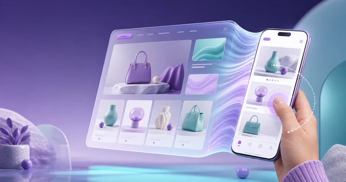
Every current Theme Store candidate should respond to a narrow viewport, but responsive is not the same as comfortable, efficient, or comprehensible on a phone. This mobile-focused ranking places Dawn first as the free control, Be Yours first for mobile-oriented beauty and lifestyle merchandising, Broadcast for a feature-rich mobile campaign system, and Enterprise for mobile discovery in a broad catalog. The order is a testing priority, not a promise that one theme will outperform another after real media, apps, and tracking are installed. Mobile friendliness must be demonstrated with customer tasks on representative devices.
Use the high-performance theme guide for measured delivery, the conversion-oriented theme guide for task friction, the Shopify theme catalog for current previews, and the pricing page to decide whether a paid mobile feature replaces enough validated work to justify its cost.
Which Shopify themes deserve a mobile-first shortlist?
Dawn is the lean mobile control, Be Yours the product-education candidate, Broadcast the native-feature consolidation candidate, and Enterprise the large-catalog discovery candidate. The Dawn — Shopify Theme Store page describes a minimalist responsive foundation with discovery tools, making it a useful control; every configured candidate still requires successful real-device task completion.
- 1. Dawn — best mobile baseline. Its restrained, product-forward structure makes it the right control for judging tap flow, media, options, filters, and cart behavior without paying for capabilities before a need is proven.
- 2. Be Yours — best for mobile-first beauty and lifestyle storytelling. Its official listing explicitly highlights fast mobile pages, accessibility, sticky cart, quick buy, and a slide-out drawer, with merchandising patterns tailored to beauty. Verify those claims with your media and product data.
- 3. Broadcast — best feature-rich mobile candidate. Broadcast officially emphasizes mobile and speed and provides sticky cart, quick buy, promotional sections, product tabs, and discovery controls. It suits teams that can manage its breadth without creating a crowded phone experience.
- 4. Enterprise — best mobile large-catalog candidate. Search, filtering, infinite scroll, mega-menu behavior, sticky navigation, and merchandising tools make it relevant for deep assortments. Test long lists and constrained devices carefully.
What does mobile-friendly require beyond responsive layout?
Mobile-friendly means shoppers can find, understand, choose, correct, and buy with legible content, stable state, accessible controls, useful recovery, and acceptable response time. W3C’s WCAG 2 Overview | Web Accessibility Initiative (WAI) | W3C covers reflow, text resizing, focus, orientation, and input behavior, placing those requirements inside acceptance rather than treating responsive layout alone as sufficient.
A mobile-friendly product page preserves decision context. The shopper should see which product they are considering, understand price and availability, choose options without losing labels, inspect useful media, learn delivery and returns, and act without accidental taps. Sticky purchase controls can help, but they must update when variants change and must not cover content, consent controls, or error messages. Drawers should trap and restore focus correctly. The on-screen keyboard should not obscure form feedback. Long option names, translated labels, discounts, and sold-out states must remain readable rather than wrapping into ambiguous fragments.
Collection discovery deserves equal weight. A responsive grid can still be frustrating when filters are buried, applied filters are invisible, cards shift as images load, or returning from a product loses the shopper’s position. Test search, sorting, filtering, pagination or infinite loading, swatches, quick buy, recommendations, and back navigation with a realistic catalog. Use one hand as well as two. Check small and large phones, portrait and landscape, increased text size, and both major mobile operating systems where the audience warrants it. A polished homepage alone proves almost nothing.
When should you choose Dawn or Be Yours for mobile?
Choose Dawn when a restrained general catalog completes the phone journey without extra layers; choose Be Yours when maintained beauty or lifestyle education resolves real product questions on small screens. The Be Yours — Shopify Theme Store listing emphasizes visual storytelling and product discovery, making it a relevant education candidate whose configured mobile hierarchy still needs testing.
Dawn should be built first because it is a current Shopify-designed free theme with a minimalist presentation and common discovery tools. Load the same mobile content planned for every paid trial. If Dawn supports the core task cleanly, the team gains a simpler baseline and can direct effort toward product truth, media, fulfillment, and acquisition. If it fails, name the exact failure—perhaps sticky purchasing, beauty-specific content, denser promotion, or catalog navigation—before browsing alternatives. A concrete gap prevents the team from confusing novelty with improvement.
Be Yours is a focused paid candidate for beauty, fragrance, skincare, and adjacent lifestyle catalogs. The official page calls out fast mobile pages, accessible design, sticky and quick-buy behavior, a slide-out cart, and beauty-specific storytelling such as ingredient tabs, routines, hotspots, and before-and-after presentation. These tools are valuable only with accurate claims and maintained content. Test shade or scent options, ingredient details, usage, subscriptions or replenishment where relevant, and the cart with real app blocks. Never let attractive mobile storytelling outrun evidence or obscure a material product condition.
How do Broadcast and Enterprise solve different mobile problems?
Broadcast can consolidate governed campaign and product tools that might otherwise stack overlays or scripts; Enterprise can preserve search, filters, and navigation through a deep assortment. The Broadcast — Shopify Theme Store listing includes broad cart, promotion, and discovery features, but neither that native breadth nor Enterprise’s catalog positioning guarantees better mobile outcomes.
Broadcast offers a wide set of mobile commerce controls, including sticky cart, quick buy, promotional modules, product tabs, recommendations, filters, and navigation. Its strength is consolidation when those features replace multiple extensions. Its risk is density: banners, popups, badges, quick views, cross-sells, and sticky controls can compete for a small screen. Configure a restrained draft and add features one at a time. For each addition, verify tap order, dismissal, focus, page movement, and performance. If a module lacks a specific customer problem and an owner, leave it disabled.
Enterprise belongs in the mobile test when the assortment is large or varied. Its official listing foregrounds speed and provides extensive discovery and merchandising features. Simulate the worst collection, not a curated dozen products. Apply several filters, change sorting, load more items, visit a product, return, search a long term, and recover from no results. Measure whether the interface preserves context and whether scripts remain responsive on a modest device. Large-catalog functionality is not mobile-friendly merely because it fits inside the viewport; it must reduce work without creating delay or disorientation.
What mobile acceptance rule should each candidate pass?
Dawn must complete the core journey leanly, Be Yours must keep education synchronized with options, Broadcast must prevent overlapping demands, and Enterprise must preserve discovery state. Shopify’s Web performance reports — Shopify Help Center separates mobile and desktop field views, so each candidate’s phone acceptance should include real-user performance evidence alongside task completion.
Dawn passes as the mobile winner when the baseline journey needs no extra fixed control or app overlay to remain usable. Test the longest variant labels, a validation error below the fold, a sold-out combination, and a cart quantity correction while the on-screen keyboard is present. It fails if the merchant must bolt on several mobile-only behaviors or if core product evidence becomes an accordion maze. A plain interface that preserves context is a stronger result than a dramatic interface whose essential state is hidden. Use Dawn’s result to identify a precise capability that any paid theme must improve.
Be Yours passes for beauty and lifestyle when its ingredient, routine, comparison, and media patterns help a shopper choose without making unsupported claims. Test a customer comparing options, opening ingredient details, checking usage, changing a subscription or purchase choice where configured, and correcting the cart. It fails when before-and-after media lacks proper context, content blocks push price and options too far down, or sticky controls show a stale variant. The specialized structure deserves its rank only when product education and action stay synchronized on the smallest supported screen.
Broadcast passes when consolidation creates a calmer phone experience than the app-based alternative. Inventory every banner, drawer, popup, badge, chat control, consent control, and sticky action that can appear in one session. Exercise their combined states, including dismissal and keyboard focus. Reject the configuration if controls overlap, the viewport becomes mostly fixed interface, or campaign messages survive after their source promotion ends. A feature-rich theme is mobile-friendly when governance limits simultaneous demands; native implementation alone does not make a surface accessible or useful.
Enterprise passes when a shopper can navigate the largest real collection without losing query, filter, sort, scroll, or product context. Use unfamiliar testers and a lower-powered device, then ask them to locate an item satisfying several constraints and explain why it fits. Reject the theme if infinite loading obstructs footer access, back navigation restarts discovery, applied filters become invisible, or delayed scripts make controls feel unresponsive. For a broad catalog, successful mobile discovery is the acceptance criterion; a fast first screen that makes comparison exhausting is still a failure.
Record failures with a screen, browser, device, orientation, connection, product state, and exact recovery step. Retest the same case after every relevant theme, app, or content change. This evidence separates a reproducible mobile defect from personal preference and makes the final ranking auditable.
How should you run a rigorous device and accessibility pass?
Build a device matrix from audience evidence, include lower-powered hardware, and test touch, zoom, reflow, contrast, focus, assistive labels, reduced motion, validation, back behavior, and interrupted recovery. W3C’s WCAG 2 Overview | Web Accessibility Initiative (WAI) | W3C provides testable accessibility criteria across these concerns; each reproducible failure also needs an owner and safe retest routine.
Create a device matrix from actual analytics when available, then include at least representative narrow and wide phones plus a lower-powered device profile. Test touch targets, zoom, reflow, contrast, focus, screen-reader labels, reduced-motion preferences, orientation changes, autofill, validation, and browser back behavior. Use real network constraints. Check header, menu, announcement, search, filters, product gallery, options, accordions, pickup or delivery information, cart drawer, cart page, account entry, contact, and policies. Record the device, browser, theme version, result, and evidence for every critical failure.
Performance belongs in this acceptance test because slow response is a mobile usability defect. Shopify’s reports use LCP, INP, and CLS to show real visitor experience, while repeatable lab tests help compare unpublished candidates. Keep content and app configuration equivalent, run several measurements, and examine variability rather than preserving the best score. After release, monitor page-level and device-specific real-user results. No theme name can guarantee those outcomes after third-party code, media, analytics, consent tools, and campaign sections change the delivered page.
Test interruption and recovery as well as the ideal flow. Move between Wi-Fi and a constrained connection, background and reopen the browser, rotate the device, dismiss and restore a cart drawer, correct an invalid field, and navigate back after applying collection filters. Confirm that the page preserves selections and communicates what happened. Mobile sessions are often fragmented, so recovery quality can matter as much as first render. The high-performance theme protocol explains how to compare the delivery cost of these same interactive states without declaring an unsupported universal winner.
Key Takeaways
- Responsive layout is only the starting point; stable state, accessible interaction, recovery, and speed complete mobile acceptance.
- Dawn, Be Yours, Broadcast, and Enterprise address different mobile content and discovery problems.
- Test representative products and combined app states on real and lower-powered devices, not only emulated homepages.
- Record exact device, browser, orientation, connection, state, and recovery evidence for every critical failure.
Decision
Choose Dawn when a lean free baseline completes the mobile journey, Be Yours when its beauty-oriented mobile patterns answer real product questions, Broadcast when a controlled set of native campaign features replaces heavier tooling, and Enterprise when broad-catalog discovery is the central mobile problem. Trial current versions with the same products and required apps. The winning candidate is the one on which shoppers can find, understand, choose, correct, and buy with stable context—not the one whose desktop demo shrinks most elegantly. Use the high-performance theme protocol to measure delivery quality.
Frequently asked questions
Are all Shopify Theme Store themes mobile-friendly?
They are intended for modern storefront use, but merchants still need to verify their specific content, apps, settings, devices, accessibility states, and customer tasks. Responsive layout alone is insufficient evidence.
Is a sticky add-to-cart always better on mobile?
No. It can preserve the primary action, but it must reflect the selected variant, avoid covering content or errors, remain accessible, and justify the screen space in observed customer tasks.