Figma · August 23, 2026 · 8 min read
How to Use a Figma UI Kit: A Beginner's Guide
Use a Figma UI kit safely by auditing its foundations, mapping components to real content, and customizing connected instances deliberately.
By Polo Themes
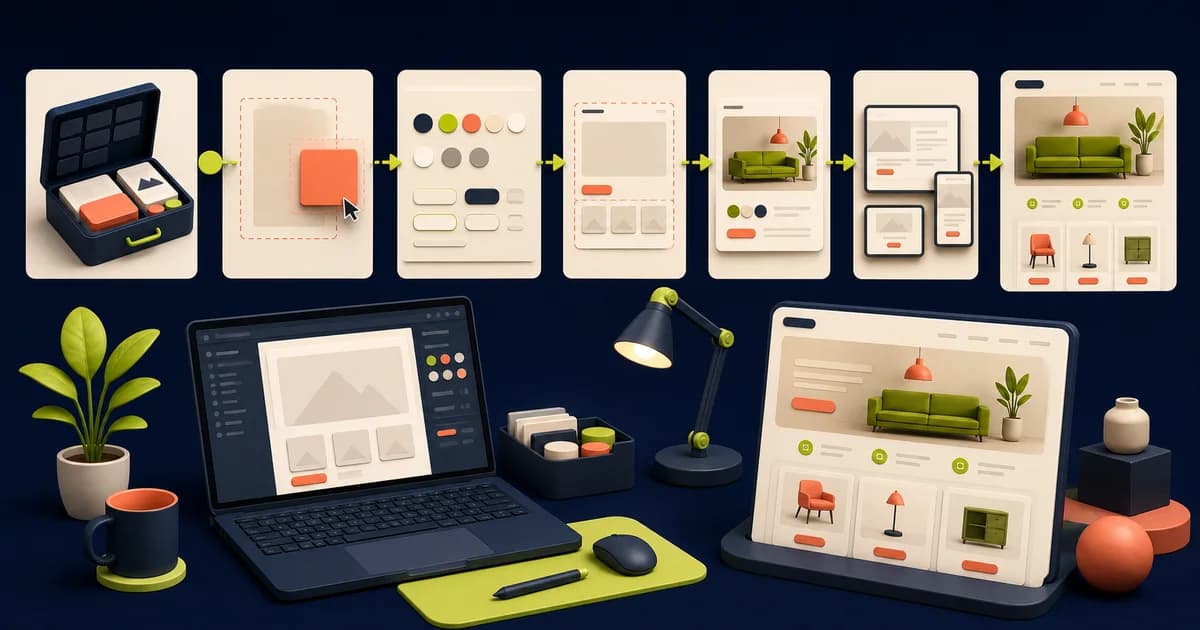
A UI kit is a starting system, not a finished brand. The fastest beginner workflow is to understand how the file is organized, preserve its reusable structure, and replace decisions in layers: foundations first, components second, page content last.
Key Takeaways
- Audit the kit structure and license before changing styles.
- Replace foundations before polishing individual pages.
- Keep instances connected unless a documented responsibility requires an extension.
- Deliver only the tested patterns the store actually needs.
How should you read a UI kit as a system?
Figma’s “Guide to components in Figma” distinguishes 2 linked roles: main components and instances. Start on the cover, documentation, and foundations pages rather than copying the first attractive screen. Trace one button, card, navigation item, and form control back to its main component.
Create a one-page map of foundations, component sets, examples, assets, and external libraries. Then inspect an instance override, a property, a nested component, and a variable alias to learn the kit's editing grammar. The e-commerce website design pillar helps place those reusable parts inside complete routes and shopper states before customization begins.
Create a small map of pages, component sets, assets, and examples. Note duplicate-looking patterns before deleting them because they may represent different states or viewport behavior. If the kit uses external libraries, confirm whether you have access and whether publishing or detaching will affect later edits.
How should you adapt foundations in a safe sequence?
Figma’s “Overview of variables, collections, and modes” describes 6 supported variable types. Change shared color and typography sources in a test branch or duplicated page, then inspect representative components before publishing or accepting updates across the file. Some raw values may have been intentionally local; others may be accidental drift.
Change one foundation category at a time in a duplicated proving page, then inspect product cards, controls, alerts, forms, and promotional surfaces across states. This makes regressions attributable instead of mixing color, type, spacing, and imagery failures. The commerce auto-layout guide shows how spacing and typography changes propagate through nested, content-driven components.
Update spacing, radii, elevation, and imagery after the core palette and type hierarchy are stable. Avoid changing many dimensions simultaneously, because regressions become hard to locate. Record each intentional deviation from the kit so another designer can distinguish brand customization from accidental detachment.
How should you replace demo content systematically?
Baymard Institute’s 2023 “Product Listing UX: What Information to Display in Product Listings (50% Get It Wrong)” identifies 5 broadly essential listing attributes. Build a content fixture around those baseline facts, then add category-specific prices, options, inventory, delivery, returns, long names, missing media, and localization to expose assumptions hidden by polished demo products.
Use at least one ordinary item, a long-title item, a sale, an unavailable variant, missing optional copy, an unusual image ratio, and a localized string. Remove fictional ratings, awards, or delivery promises. The component variants guide helps convert these content extremes into deliberate reusable states instead of detached frame copies.
Check claims and metrics as editorial content, not decoration. Remove placeholder ratings, customer counts, awards, delivery promises, and discount percentages unless the business can substantiate them. A publishable storefront should never inherit fictional proof simply because it looked convincing in the source kit.
How should you prepare brand inputs before restyling?
Validate approved marks, typefaces, color roles, photography, icons, voice, product data, and policy copy before restyling the kit; a mood board is not an implementation source. W3C’s 2023 “Understanding Success Criterion 1.4.3: Contrast (Minimum)” requires 4.5:1 for normal text and 3:1 for large text, giving brand-color adaptation a measurable first constraint.
Record the owner and license for every mark, typeface, photograph, and icon before importing it. Then map approved brand choices to semantic roles and test text-on-surface pairs in default, focus, disabled, error, and campaign contexts. The variables and design-tokens guide turns those roles into governed aliases instead of scattered overrides.
Translate the brand into semantic decisions such as action-primary, surface-muted, heading-display, and image-product rather than replacing every blue layer with a favorite color. This approach keeps states consistent and makes later dark-mode, campaign, or accessibility changes manageable.
How can you extend without breaking reuse?
Figma’s “Guide to components in Figma” distinguishes 2 linked roles: main components and instances. When a needed state is absent, first decide whether it belongs as a property, variant, nested component, or separate pattern. Add the smallest reusable change that represents a real product decision.
Try the missing requirement against existing properties and composition before expanding the component matrix. Keep a one-page exception local; change the main component when several consumers need the same responsibility. The Figma design-system guide supplies contribution, review, release, and migration practices when an extension becomes shared system work.
Keep experimental extensions local until reviewed. Name them with the same grammar as the kit, document their purpose, and test existing instances before merging them into a shared library. If the new requirement is unique to one page, composition may be clearer than expanding a global component matrix.
How should you deliver an implementation-ready subset?
Figma’s “Guide to Dev Mode” documents 4 export formats: PNG, JPG, SVG, and PDF. Remove unused demonstration pages from the delivery copy or clearly mark them out of scope. Organize approved flows, annotate responsive behavior and states, configure asset exports, and identify which values are tokens versus page-specific art direction.
Keep an untouched source, then create a delivery file containing only approved flows, components, responsive examples, annotations, and assets. Mark inherited examples as out of scope instead of leaving developers to guess. Use the editable PoloThemes Figma bundle to rehearse this reduction on a complete commerce file with a clean comparison reference.
Walk developers through changed foundations, added properties, data assumptions, and unresolved questions. If the UI kit has no coded counterpart, say so directly. Measurements and generated snippets can inform code, but they do not provide semantic structure, business logic, integrations, accessibility, or testing.
How should you customize from broad to specific?
W3C’s “Understanding Success Criterion 1.4.3: Contrast (Minimum)” sets text thresholds of 4.5:1 and 3:1. Change semantic colors and typography at their shared source, then adjust components, then refine individual layouts. Prefer swapping component properties and editing exposed values over detaching instances.
Start on a proving page and change semantic color and type roles before component-specific styling. Next adjust shared component properties; finish with genuine page-specific art direction. Insert realistic catalog content during each stage. If a local refinement requires detachment, document why composition or a source-component extension could not represent it.
- Apply brand tokens before page polish.
- Rename components only when the naming system remains clear.
- Use realistic edge-case content.
How do you turn examples into a store flow?
W3C’s “Understanding Success Criterion 1.4.10: Reflow” evaluates at 320 CSS pixels or 400% zoom from 1,280 pixels. Select only the screens your journey needs and connect them into a coherent path. Add absent states such as empty search, invalid discount, unavailable option, and payment failure.
Choose one representative browse-to-purchase path and label every screen with its shopper task, production data, entry state, and exit. Add zero results, unavailable options, invalid discounts, and payment failure only where the product can enter them. PoloThemes provides editable layouts; the store team still owns catalog truth, policies, integrations, and implementation.
- Map every screen to a shopper task.
- Remove unused patterns from the delivery file.
- Review the adapted flow with the implementation team.
How do you run a final adaptation audit?
W3C’s “What's New in WCAG 2.2” identifies 9 current criteria added after WCAG 2.1. Review the adapted kit as if you did not create it. Follow a complete browse-to-purchase task, inspect shared instances for accidental detachment, and compare every foundation against the approved brand source.
Give the delivery file to another designer without verbal coaching. Ask them to trace a purchase path, change one brand role, update a component state, replace a difficult product, and identify implementation notes. Their failures expose unclear naming, hidden detachment, stale demo content, and missing documentation more reliably than the original editor reviewing familiar pages.
Then give the file to another designer for a small change without verbal coaching. Note what they cannot find or safely edit, improve names and documentation, and repeat the task. A beginner-friendly result is not measured by how quickly the first editor finished pages; it is measured by whether the system remains understandable, lawful, reusable, and honest for the next person.
Audit before editing
Duplicate the source file and locate its pages, libraries, variables or styles, component sets, and examples. Check fonts and image licenses, inspect component properties, and identify which screens are production patterns versus demonstrations. This short audit prevents accidental detachment and inconsistent restyling.
- Keep an untouched reference page.
- List missing states and screens.
- Confirm the kit's license and font availability.
Adapt one journey without breaking the kit
Duplicate the source and choose a compact journey: collection card, purchase panel, cart line, and confirmation notice. Inventory variables or styles, component properties, nested instances, fonts, icons, responsive assumptions, and license. Map every pattern to real content and behavior. Missing unavailable, loading, error, or long-content states become recorded gaps rather than ideal sample copy.
Change foundations first: brand typography, semantic color, spacing, and imagery rules. Then update main components and verify connected instances inherit intentionally. Use properties and swaps for supported variation; create a local extension when the product needs a new responsibility. Detach only when a documented one-off cannot fit the component model, because widespread detachment destroys leverage.
Review the adapted journey at narrow and wide sizes with realistic data. Compare it with the untouched reference page to separate upstream behavior from changes. Ask a developer to identify coded counterparts and implementation gaps, then document naming, ownership, and export needs. Another designer should be able to extend it without repeating the audit or editing around hidden structure.
Implementation checklist
- Source file is preserved.
- Brand foundations update consistently.
- Instances remain connected where practical.
- Content, missing states, and ownership are documented.
Conclusion
A kit creates leverage when you preserve its system and make deliberate changes. Treat it as reusable design infrastructure, and you will move faster without producing a file only its original editor understands.
Frequently asked questions
Should I detach every UI-kit component?
Usually not. Detaching throws away shared updates and properties. Detach only when a one-off structure genuinely cannot be represented by the component model.
Is a UI kit the same as a coded theme?
No. A UI kit is a design resource. A coded theme contains the templates, settings, scripts, styles, and platform integrations required to run the store.


