Figma · August 23, 2026 · 9 min read
Prototyping in Figma for E-Commerce
Prototype commerce flows in Figma to answer questions about decisions, states, and recovery—not to simulate an entire storefront.
By Polo Themes
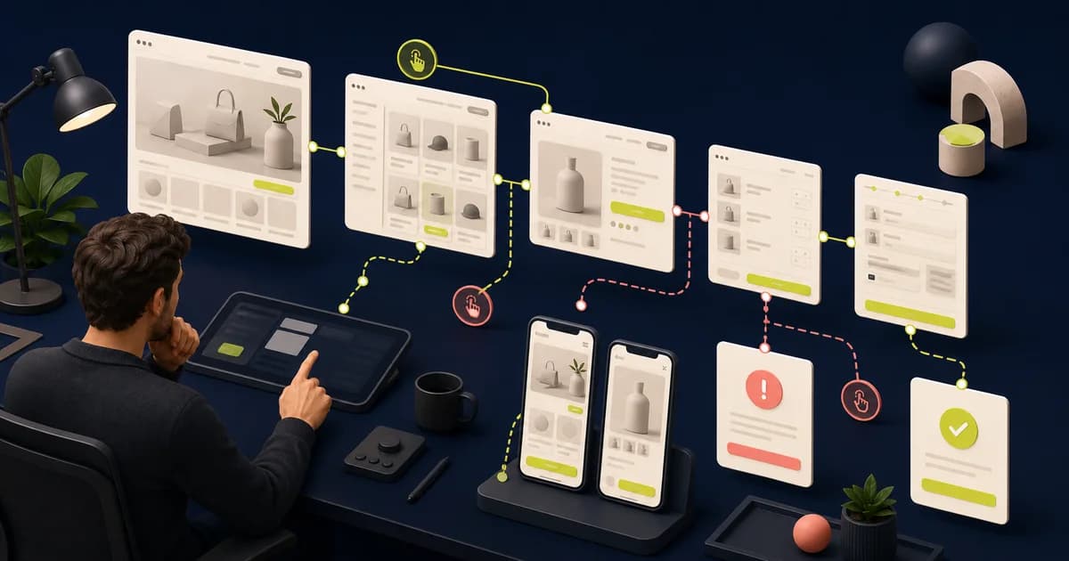
A useful commerce prototype has a learning goal. It might test product discovery, option selection, cart editing, checkout comprehension, or recovery from an error. Build only the fidelity needed to answer that question.
Key Takeaways
- Write the research question before connecting frames.
- Choose fidelity according to the risk being tested.
- Model state transitions and recovery, not just happy-path navigation.
- Carry findings into design decisions and implementation acceptance.
How should you write the research question and scenario?
GOV.UK’s “Plan user research for your service” recommends 4 to 8 participants per round and at least one round every 2 weeks. Make each round answer one actionable uncertainty: name the audience, starting context, task, risky branch, expected evidence, and limitation instead of vaguely asking whether shoppers like the checkout.
For example, ask whether first-time shoppers can tell when delivery cost becomes final after choosing an unavailable variant. Use plausible products and policies, then state that the prototype cannot prove live inventory or payment behavior. The e-commerce website design pillar helps locate that narrow scenario within the complete discovery-to-purchase journey.
Choose participants and content that reflect the question. A specialist eyewear selection flow needs plausible frame and lens choices; an electronics comparison needs meaningful specifications. Placeholder content lowers the validity of findings because participants cannot make the same judgments they would make with real products.
How do you choose fidelity by risk?
Figma’s “Create interactive components with variants” shows how five checkboxes can expand to 32 frames and 160 connections without reusable interactions. Spend that complexity only where risk demands it: sketches can test route language, mid-fidelity components can test sequence, and polished visuals belong where brand trust, imagery, or perceived clarity affects the answer.
A question about whether “Continue” names the next step may need only a wireframe; a question about perceived payment safety may need realistic content and visual treatment. Skip cinematic transitions unless motion itself is under study. The Figma checkout-flow guide identifies totals, validation, payment, and recovery points where added fidelity can earn its cost.
Prototype only enough surrounding context for the task to feel coherent. A single product flow may still need search entry, product state, cart feedback, and recovery. Mark shortcuts or simulated behavior so observers do not mistake prototype convenience for confirmed platform capability.
How should you model commerce state transitions?
Figma’s “Create interactive components with variants” calculates 32 possible frames and 160 connections for five independent checkboxes. Commerce choices compound similarly, so map the state model before wiring it: selection, price, availability, quantity, discount, validation, loading, confirmation, and failure. Use reusable interactions only when collaborators can still see what changes and why.
Selecting a blue size-eight shoe may replace gallery media, alter price, expose low stock, and enable purchase in one action. Name that resulting state and show its recovery if stock changes. The Figma product-page guide provides the product, media, inventory, and purchase dependencies needed to build a believable example.
Include changes outside the clicked control. Selecting a variant may update media, price, stock, delivery, and the purchase action. Removing a cart item may change discounts and totals. These relationships are the design contract; a transition that changes only color can give reviewers a false sense of completeness.
How should you model states clearly?
Figma’s “Create interactive components with variants” reduces a five-checkbox example from 32 duplicated frames and 160 links to reusable variant interactions. Apply that economy without hiding the model: name frames by outcome, expose selected and unavailable values, show validation and feedback, and keep a reviewer able to trace each transition without reverse-engineering variables.
Keep a small state index beside the flow and link each tested path to its starting condition. A clever component that silently retains a previous selection can invalidate later tasks if observers miss it. The Dev Mode handoff guide shows how to translate named outcomes, shortcuts, and unresolved behavior into implementation-ready annotations.
- Prototype selection and feedback.
- Distinguish loading, empty, error, and success.
- Keep motion purposeful and optional.
How should you synthesize evidence into decisions?
GOV.UK’s “Sharing user research findings” recommends 1 or 2 sentences for the essential facts and another 1 or 2 for importance and consequences. Keep observation, interpretation, severity, and recommendation distinct. Repeated hesitation may reflect terminology, hierarchy, missing information, participant context, or prototype fidelity; test the explanation before prescribing a component change.
Write “three participants looked for delivery cost before choosing size” as an observation, not “move delivery above the options” as a predetermined fix. Compare contrary behavior and known shortcuts, then decide what to change or retest. The design-to-development handoff guide gives accepted findings an owner and implementation destination.
Update the relevant flow, component, content rule, or requirement and link the finding. Retest material changes. Prototype learnings become valuable when they change an owned artifact and acceptance example rather than ending as a presentation that the implementation team never sees.
How should you preserve the tested prototype version?
Figma’s “View a file's version history” says autosave checkpoints are created every 30 minutes, but Starter teams can access only 30 days. Name and link the exact tested baseline with each finding. Later navigation, copy, or state changes can then be assessed for retesting instead of being mistaken for the version participants actually used.
Store the scenario, starting frame, device assumptions, shortcuts, participant group, and observation beside that version link. If a later edit changes the recovery path, mark the earlier conclusion as scoped rather than silently carrying it forward. The editable PoloThemes Figma bundle offers realistic flows for practicing this evidence trail.
How should you test confidence as well as completion?
GOV.UK’s “Using moderated usability testing” recommends sessions of 30 to 60 minutes, giving room to examine understanding rather than record completion alone. After the task, ask what was selected, what it costs, what happens next, and what the participant would do if availability or delivery changed. Keep prompts neutral and confidence qualitative.
Someone can reach confirmation while believing the wrong size, total, or delivery promise was chosen. Compare their explanation with the prototype state and note which label, summary, or feedback produced the mismatch. Do not turn a conversational confidence answer into a universal score; use it to locate uncertainty worth another design and research round.
How should you create a reusable prototype evidence packet?
GOV.UK’s “Sharing user research findings” suggests a compact finding with 1 or 2 sentences of facts and 1 or 2 explaining consequences. Package that finding with the research question, participant criteria, tested version, task script, permitted notes, prototype limitations, decision, owner, open questions, and the coded validation still required.
The packet should let a teammate reconstruct scope without opening every recording. Separate participant behavior from facilitator interpretation and design recommendation, attach only consented evidence, and point to the exact state tested. When the flow changes, label which findings remain applicable and which need a new round.
When the design changes, decide whether earlier evidence still applies. A label correction may need a quick confirmation; a restructured purchase flow may invalidate the session. Link accepted findings to specific components or acceptance examples and schedule coded validation for gaps. This chain of evidence makes prototyping part of delivery rather than a disposable demonstration.
How should you design for realistic testing?
GOV.UK’s “Using moderated usability testing” advises no more than six one-hour sessions per day and at least 15 minutes between them. Use that reset time to restore data, starting frame, viewport, and permissions. Verify every task path, remove accidental dead ends, prepare a backup, and keep instructions neutral enough to avoid teaching the answer.
Rehearse with a colleague who did not build the prototype. They will expose stale overlays, tiny hit regions, broken back paths, and states that retain data unexpectedly. Explain unavoidable simulation before the task, but do not rescue participants from intentional difficulty. Consistent setup makes behavior across sessions more comparable.
Ask participants to think aloud sparingly, then use neutral follow-up questions about expectation and confidence. Observe the route they choose, information they seek, errors they notice, and whether they recover. Capture exact behaviors and quotes without turning one session into a universal conclusion.
How should you validate what Figma cannot?
W3C’s “Understanding Success Criterion 1.4.10: Reflow” tests content at 320 CSS pixels or 400% zoom from a 1,280-pixel viewport—behavior a canvas transition cannot prove. Assign semantic markup, announcements, keyboard trapping, autofill, responsive layout, network timing, analytics, integrations, security, and completed payment to coded validation with named owners and environments.
Repeat the risky task after implementation using representative devices, input methods, data, and failure controls. Compare the result with accepted intent while allowing engineering to improve semantics or resilience. Record platform-driven departures explicitly; changing the Figma file after launch does not retroactively validate browser behavior or assistive output.
After implementation, repeat critical tasks in a realistic environment with representative devices and input methods. Compare behavior against the accepted prototype intent while allowing engineering choices that improve semantics or resilience. Record deviations explicitly rather than silently changing the design source after launch.
How do you choose a testable journey?
GOV.UK’s “Plan user research for your service” says a round usually needs 4 to 8 participants and should answer specific questions for specific user groups. Choose one complete decision with a meaningful failure branch, such as recovering from an unavailable option or rejected discount, rather than a polished tour that distributes attention across unrelated screens.
Define the starting context, believable goal, catalog data, expected evidence, and stopping point before connecting frames. The journey needs enough surrounding information for a real choice but no decorative detours. A narrow task makes hesitation and recovery interpretable, while an end-to-end demo can hide which interaction caused uncertainty.
- Define success before linking frames.
- Use realistic content and choices.
- Include at least one recovery path.
Test and hand off findings
Observe where participants hesitate, misunderstand, or cannot recover. Record evidence separately from proposed fixes. Update the design, then annotate intended behavior for implementation; prototype wiring itself is not a production specification.
- Use a consistent task script.
- Capture unexpected paths.
- Translate findings into acceptance examples.
Use the prototype to answer a risky journey question
Frame a precise question such as whether shoppers can recover when a chosen variant becomes unavailable after entering the cart. Build only required states: initial selection, cart feedback, changed availability, explanation, alternative choice, and successful recovery. Use realistic names, prices, labels, and policy copy. A narrow prototype produces clearer evidence than a high-fidelity tour.
Give participants a goal without teaching the path. Observe where they look for availability, whether they understand what changed, which information they expect to remain, and whether recovery feels safe. Capture behavior separately from aesthetic preference. Include keyboard navigation where feasible while recording announcements, validation, and platform behavior Figma cannot reproduce.
Translate findings into owned decisions: revise hierarchy or copy, add a missing state, confirm a platform constraint, or schedule an implemented usability check. Preserve the scenario and reason behind each change. Repeat the task after development because real focus, data timing, browser history, cart persistence, and analytics introduce risks the prototype only describes.
Implementation checklist
- Prototype has a learning question.
- Critical states and recovery are represented.
- Test data resembles the real catalog.
- Findings and implementation decisions are documented.
Conclusion
Prototype the uncertainty. A focused flow that exposes a bad assumption is more valuable than a cinematic demo that proves only that links work.
Frequently asked questions
How realistic should the prototype be?
Use the lowest fidelity that produces reliable feedback. Visual polish matters for brand questions; flow and copy may be enough for architecture or comprehension questions.
Can a Figma prototype test checkout performance?
No. It can test comprehension and sequence, but real performance, browser behavior, payment integration, and analytics require a coded environment.


