Product · August 23, 2026 · 7 min read
Virtual Try-On for Eyewear Stores
A practical framework for evaluating and releasing eyewear virtual try-on without mistaking a visualization for fit or optical advice.
By Polo Themes
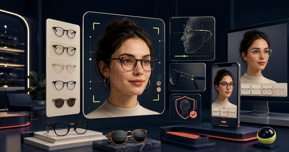
The short answer: virtual try-on can make frame exploration more concrete, but it is not a fit guarantee, an optical assessment, or a reason to hide dimensions. Treat it as one visualization tool in a selection journey that still includes honest multi-angle imagery, product attributes, accessible alternatives, and a route to support. Its value comes from helping a person form a shortlist while being candid about what the simulation can and cannot show.
Define the decision it is meant to help
A try-on project begins with a customer decision, not a camera effect. It may help someone compare silhouette, color, relative scale, or several shortlisted frames. Write the intended job in one sentence and put its limits next to it. The tool should not imply that an overlay confirms comfort, physical fit, prescription suitability, lens performance, or a result for every device and lighting condition. Clear boundaries protect shoppers and give the team a more useful product brief.
Consider where the feature belongs. On a broad collection, it may be a quick exploration entry. On a product page, it may help resolve the last visual question. In either location, the conventional route must remain obvious: photos, dimensions, selected variant, and product description should work without granting camera access. A feature that creates a dead end for a person who declines access is not a complete purchase experience.
Audit the vendor and data path first
Before implementation, document what the chosen service receives, whether images or derived data are retained, which processor handles them, where the relevant terms are published, and how a shopper can understand the choice. Have the appropriate privacy and legal owners review the data flow for the markets you serve. Do not assume that a visual feature is low-risk because it feels familiar. Consent language should describe the real action rather than bury it behind a generic “continue” button.
- Map the browser, storefront, vendor, analytics, and support touchpoints.
- Identify the data created in successful, cancelled, and failed sessions.
- Confirm how the experience behaves when permission is denied or a device is unsupported.
- Name owners for vendor review, copy changes, incident handling, and removal.
- Keep the underlying store functional if the provider is unavailable.
Prepare accurate frame assets
A try-on cannot become trustworthy through interface copy alone. It depends on accurately prepared product assets and stable variant mapping. Create a checklist that links each visual asset to the exact frame, color, and current product record. Review every new collection before it appears in the tool, and remove assets when a product becomes unavailable or changes. The inventory and feature states should never quietly disagree.
Preserve ordinary product photography as the source a shopper can inspect. A front view, side view, detail views, and stated dimensions explain the object in a way a simulation may not. Keep image order and labels consistent across products. This also gives customer support a shared vocabulary when a shopper asks what they saw or why a color appears different in a particular environment.
Design a useful, candid interface
Place the entry where the user can understand both its purpose and its alternative. A direct label such as “Try this frame visually” is clearer than a magical promise. Before camera access, explain the next action in plain language. During the experience, keep the selected frame visible, make it easy to change variants, and offer controls with text labels. Afterward, return the shopper to the same product context with the imagery, dimensions, and selection action intact.
Do not rely on a close icon for recovery. Provide a visible “continue without try-on” route, show a useful fallback message on unsupported devices, and avoid trapping keyboard focus inside a modal. If the interface includes motion, a person must be able to pause or avoid it. These details are not edge cases: they are part of whether the store provides an equivalent path for its customers.
Make accessibility a release condition
Visual try-on can be especially exclusionary if it is treated as the only proof. Test the entry, instructions, controls, errors, and exit path using keyboard navigation and assistive technology, and test the ordinary shopping path independently. The relevant accessibility standard is broader than one widget: headings, labels, focus order, contrast, zoom behavior, and error recovery all affect whether the feature can coexist with the store.
Ask representative participants to complete the same task with and without the feature. Record not just completion, but what information they could not find, what claims they inferred, and whether they could recover from a refusal or error. The result may show that better product photography or clearer dimensions are a higher-value improvement than a more elaborate camera flow.
Measure assistance, not novelty
Set measures before launch. Possible signals include try-on entry and completion, fallback use, movement from a product to a saved shortlist or cart, support questions, and fit-related return reasons. Segment by device and feature state. A high interaction count only proves that people interacted; it does not prove better selection or a better outcome. Compare over enough time to account for campaigns, changes in inventory, and differences in traffic quality.
Qualitative review matters too. Read the terms shoppers use in support requests and post-purchase feedback. If people describe the tool as a fit guarantee, the feature language is too strong. If they abandon after permission, the value may not justify the interruption. If they reach support with a better shortlist, that can be a useful outcome even when the feature does not directly increase a single headline metric.
Release in controlled stages
- Write the feature job, prohibited claims, fallback route, and acceptance checks.
- Validate assets and variant mapping with a small, representative set of frames.
- Run privacy, accessibility, support, and failure-state reviews before exposure.
- Release to a limited audience or catalog slice where your operating model permits it.
- Review evidence and customer feedback, then keep, revise, expand, or remove the feature deliberately.
Keep rollback simple. The product page should remain complete if the entry is removed, and the team should know who can disable it when a provider, asset, or policy issue appears. A reversible release is preferable to turning a new interaction into a hidden dependency in the buying path.
The Optics E-Commerce Shopify Theme is the direct Polo Themes catalog fit for an eyewear store and provides an ecommerce design foundation with clear visual hierarchy, clean typography, and readable contrast according to its verified product record. Its related Figma UI kit includes a frame-finder quiz among its listed screens. Those existing surfaces can organize discovery around a new try-on entry. They do not include or validate a particular try-on vendor, privacy posture, or accessibility outcome; assess those separately in your own environment.
Test a try-on session from permission to fallback
Write a scenario before usability testing: the shopper compares two frames, grants camera access, changes a color, leaves the experience, returns to the product page, and continues without the camera. Check whether the selected product and variant remain clear at every step. Then repeat with permission denied, a camera error, a slow connection, a narrow viewport, keyboard navigation, and browser zoom. The ordinary gallery, dimensions, and support route must remain available.
Ask participants what the rendering helped them judge and what they still could not know. Listen for confusion between visual impression and physical fit, color appearance and actual finish, or alignment and measurement. Revise labels and nearby guidance when the interface encourages a stronger inference than the tool can support. Avoid declaring that try-on improves fit or reduces returns unless your own appropriately designed evidence supports that conclusion.
Prepare the operational fallback
- Keep the standard gallery and recorded frame dimensions accessible without camera permission.
- Explain whether an image is processed, stored, shared, or deleted before collection begins.
- Provide a visible way to close the experience and return to the same selected variant.
- Give support a troubleshooting path that does not ask customers to send unnecessary personal imagery.
- Pause affected products when assets or calibration inputs no longer match the current catalog record.
- Review vendor, privacy, accessibility, and product-data changes before expanding the release.
Ownership should be explicit. Merchandising owns the frame-to-asset match, product or engineering owns the interface state, the appropriate privacy and legal reviewers assess the data path and wording, and customer support owns the human fallback. A vendor can provide software, but the retailer still controls what promise appears beside the product and whether the experience remains usable when the enhancement fails.
Keep a version note for the vendor integration, frame asset, and consent language used in each release. When any one changes, repeat the relevant permission, rendering, fallback, accessibility, and catalog checks before treating earlier test results as current.
Conclusion
Virtual try-on is valuable when it helps a customer imagine a frame without asking them to confuse an image with certainty. Define the decision, inspect the data and vendor path, preserve a complete no-camera journey, prepare accurate assets, and measure whether selection actually improves. The strongest rollout is modest in its claims and rigorous in its fallback, support, and review process.
Frequently asked questions
Does virtual try-on tell a customer whether a frame will fit?
No. It can support visual exploration. Keep stated dimensions, conventional imagery, clear product facts, and appropriate support available for the actual selection decision.
What happens when camera access is denied?
The shopper should be able to continue with the full product experience: images, dimensions, comparisons, and support. Explain the fallback plainly and do not make camera access a condition of browsing.
What should be reviewed before launch?
Review asset accuracy, variant mapping, consent and data handling, device and permission failures, keyboard and assistive-technology behavior, support scripts, prohibited claims, and the removal path.