Guides · August 23, 2026 · 8 min read
Shopify Collection Page Best Practices
Build Shopify collection pages around clear scope, useful filters, stable sorting, complete product cards, accessible controls, and measurable discovery.
By Polo Themes
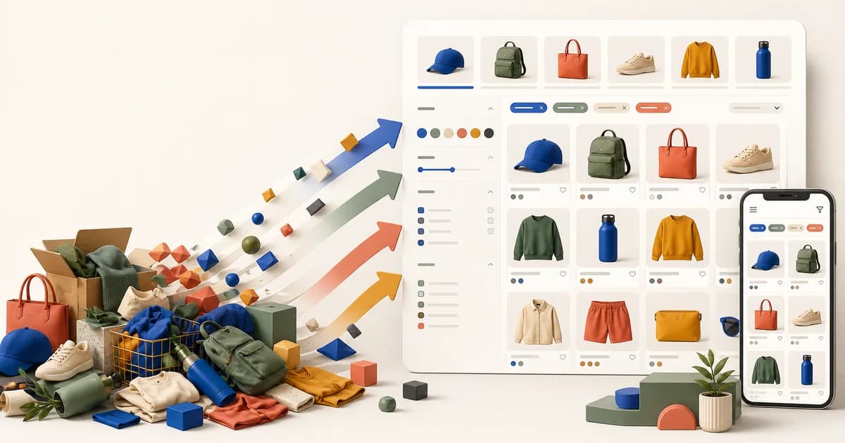
A strong Shopify collection page helps a customer understand the assortment, narrow it with meaningful constraints, compare products, and continue without losing context. Optimize the page around discovery tasks rather than a universal grid formula. Collection size, product complexity, merchandising intent, traffic source, device, and available catalog data determine which controls deserve space.
Shopify recommends storefront filtering for collection and search results. It can expose filters derived from availability, category, price, product data, variant options, and configured metafields. That capability does not make every available facet useful. Merchants must maintain consistent product data, while themes must render state, counts, URLs, empty results, sorting, and pagination accessibly and efficiently.
Define the collection’s promise
Write one sentence describing what belongs in the collection and why a shopper arrived. A curated seasonal story, a product-type category, a brand range, and an automated sale collection have different jobs. Use the collection title, concise description, and supporting image only when they clarify scope. Large editorial banners should not push the first useful products beneath the initial mobile view without evidence that the story earns that space.
Audit membership rules and product data before redesigning the template. Incorrect tags, categories, vendors, metafields, availability, or automated conditions create misleading filters and empty branches. Name the operational owner for each facet. Interface polish cannot repair a catalog in which the same material is spelled several ways or products sit in the wrong collection.
Design the product card for comparison
Every card should identify the product, useful image, current price context, relevant availability, and any attribute required to compare within this assortment. Show ranges when prices vary rather than presenting the lowest price as though every variant costs that amount. Sale labels should reflect real compare-at pricing. Keep promotional badges few, attributable, and mutually understandable.
Secondary imagery, swatches, ratings, quick add, and delivery cues can help in the right catalog, but each adds density, data, code, and interaction states. A fashion collection may benefit from color choices; a technical parts collection may need compatibility; a grocery collection may need unit quantity. Choose the information from observed comparison questions, not because the theme exposes a setting.
Make the whole product identity easy to reach without nesting conflicting controls. Card links, swatches, quick-add buttons, wishlist controls, and badges need separate accessible names and predictable focus. Preserve product context when images fail, scripts are delayed, or text grows. Avoid hover-only information because touch and keyboard customers may never receive it.
Configure filters around customer language
Select a small starting set of facets that map to real decisions: size, fit, material, compatibility, price, availability, dietary property, or another domain-specific attribute. Use labels customers recognize. A database field name is not automatically suitable interface copy. Order filters by importance for the collection, not alphabetically across every catalog category.
Shopify applies filter groups with AND logic and values within a group with OR logic. Make the resulting state visible through selected controls, removable chips or an equivalent summary, result count, and a clear-all action. Preserve applied filters in the URL using Shopify’s supported parameter behavior so refresh, back, share, and browser history remain meaningful.
Show value counts where the platform provides trustworthy values and disable or omit impossible choices according to the intended interaction. Do not leave a customer in a zero-result state without explaining what is active and how to recover. Test simultaneous facets, long values, many values, translated labels, price ranges, unavailable inventory, and a collection whose filter configuration differs from another.
Make mobile filtering a complete interaction
A mobile filter drawer or sheet needs a heading, result context, close action, selected-value summary, clear behavior, apply behavior, keyboard focus management, screen-reader naming, and scroll containment. Decide whether each choice updates immediately or waits for Apply, then keep that model consistent. If results load during selection, announce the change without repeatedly disrupting focus.
Keep applied-filter state visible after the panel closes. A compact trigger can include the active count, while removable selections give direct recovery. Test browser back, device rotation, text enlargement, very long facet lists, a virtual keyboard, and slow responses. A drawer that looks tidy in a static narrow frame may become unusable when the content exceeds one screen.
Offer sorting that changes a real decision
Use Shopify-supported collection sort options that the merchant intends to offer, such as featured, price, title, date, or best-selling where applicable. Label them honestly. A custom label such as Recommended needs a documented ordering rule; do not imply personalized or editorial ranking if the implementation only repeats the default order.
Sorting should retain compatible filters, update the result context, and remain represented in the address so navigation works. Test equal prices, sale prices, sold-out products, localized titles, and manually merchandised order. If a merchant deliberately pins products, clarify how alternate sorts affect that curation.
Choose pagination or progressive loading deliberately
Shopify Theme Store requirements call for pagination or lazy loading so collections do not render an unlimited catalog at once. Pagination offers explicit boundaries and dependable navigation. A Load more pattern can preserve scanning continuity. Infinite scrolling requires additional care for focus, browser history, footer access, result position, and recovery after visiting a product.
Whichever model you choose, keep every product reachable without requiring fragile client state. Provide meaningful status while more results load, prevent duplicate cards, and restore the previous position when customers return. Test the last page, an empty page after catalog changes, a collection with many pages, filtered pagination, and a direct link beyond the first page.
Handle empty and constrained states
A collection with no products needs an explicit message and a truthful next route. A filtered collection with no matches should identify the active constraints and offer removal, not claim the store has no products. When inventory removes all purchasable items, distinguish that commercial condition from a loading failure.
Do not automatically redirect every empty state to a broad collection; customers may need to understand that a bookmarked assortment ended. Merchandising can provide suitable adjacent categories, search, or notification options where the business supports them. Keep those routes maintained and avoid collecting availability alerts without consent, ownership, and fulfillment.
Protect speed on dense grids
Serve responsive card images with dimensions and appropriate candidates, lazy-load images that begin below the viewport, and avoid downloading both primary and hover images when the second will not be used. Limit initial product count and inspect the actual Largest Contentful Paint element. Grid density that seems efficient can become expensive when each card includes large media, swatches, reviews, recommendations, and app scripts.
Render core product information, filters, and navigation in Liquid and HTML. Enhance updates without making the catalog disappear when JavaScript fails. Scope scripts to the collection template, update only the result region, cancel obsolete requests, and maintain a usable loading state. Measure filter interaction latency as well as initial load because repeated refinement is the page’s central task.
Support discovery and indexing without fabricating pages
Give durable collections unique titles and useful descriptions based on their actual assortment. Use canonical and pagination behavior supported by the theme and platform, and keep navigation links crawlable. Filter combinations can create many parameterized addresses; decide indexing policy with current search guidance and business demand rather than turning every combination into an automatically targeted landing page.
A strategically important facet may deserve a curated collection with maintained copy, membership, navigation, and ownership. That is different from exposing thousands of thin filter permutations. Do not promise search traffic from a theme setting. Verify rendered metadata, internal links, product reachability, and structured data after implementation.
Measure discovery outcomes responsibly
Track collection views, filter use, zero-result states, sort changes, product-card selection, quick-add attempts, add-to-cart success, and downstream purchase signals with consent and stable event definitions. Examine guardrails such as performance, errors, returns, and accessibility. A higher card click rate is not automatically an improvement if customers bounce from mismatched products.
Form a hypothesis from an observed problem, change one coherent aspect, and segment results by collection type, device, traffic source, and catalog scale where sample quality supports it. Keep the merchandising calendar in view because promotions and stock shifts can confound results. Record inconclusive findings instead of inventing a general conversion rule from a noisy test.
Collection-page checklist
- The title, description, membership, and first products establish a coherent assortment.
- Cards expose the product facts needed for comparison without unverified badges or hidden controls.
- Filters use maintained catalog data, customer language, visible state, shareable URLs, and recoverable zero results.
- Sorting labels match Shopify behavior and preserve compatible context.
- Pagination or progressive loading keeps all products reachable and restores position.
- Mobile, keyboard, screen-reader, text enlargement, failure, long-content, and empty states are tested.
- Performance and discovery measures include downstream buying quality rather than one interaction rate.
Conclusion
Shopify collection-page quality comes from coherent scope and dependable refinement. Maintain catalog data, design cards for the product questions that matter, configure a restrained set of facets, preserve filter and sort state, and keep every result reachable. Validate dense real collections on mobile and measure whether customers find suitable products, not merely whether they click more controls.
Frequently asked questions
How many filters should a Shopify collection have?
Use the smallest set that supports meaningful customer decisions for that assortment. Audit usage, zero-result branches, and catalog maintenance rather than applying one count to every collection.
Is infinite scrolling better than pagination?
Neither is universally better. Infinite scrolling adds history, focus, footer, and recovery risks; pagination adds explicit breaks. Test the chosen behavior with the catalog and buying journey.
Should sold-out products appear in collections?
That depends on replenishment, demand, and merchandising policy. If shown, label availability accurately and provide only recovery actions the business can fulfill.