Business · August 23, 2026 · 17 min read
Niche E-Commerce Playbooks for Six Store Types
Eyewear, medical, fashion, courses, electronics, and grocery stores succeed through different proof, merchandising, and operating systems.
By Polo Themes
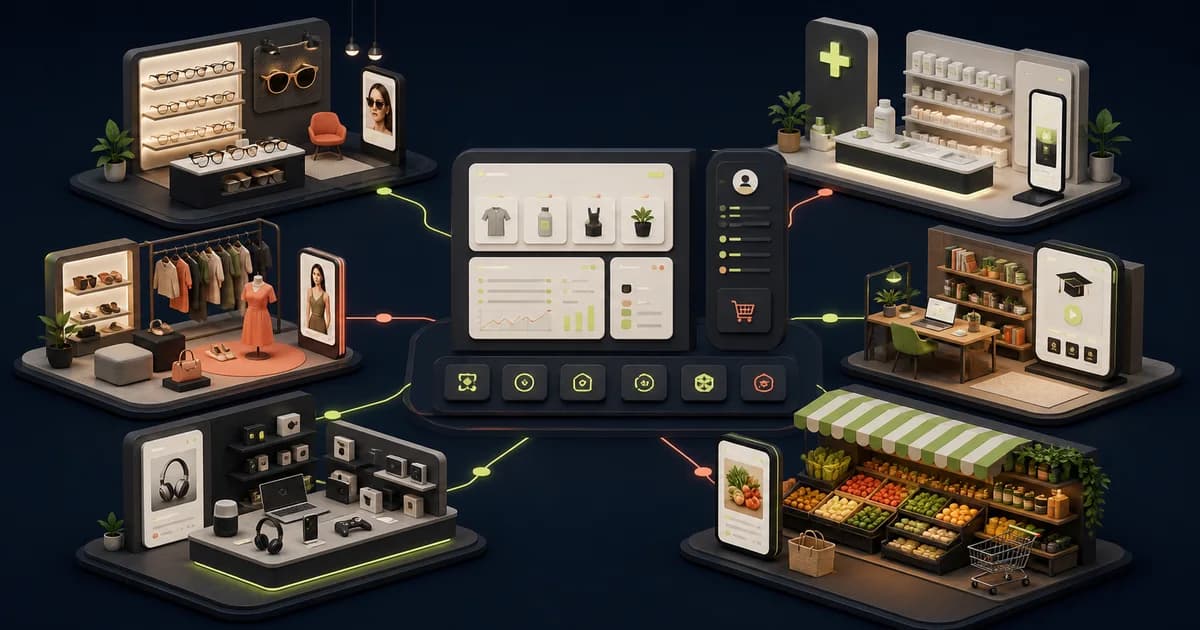
The short answer: choose a niche storefront by the decision a customer must make, then make that decision easier with truthful information, a workable operation, and a theme that supports the needed hierarchy. Eyewear, medical supplies, fashion, courses, electronics, and grocery all sell online, but they do not ask buyers to take the same risk. A frame buyer needs fit and lens clarity. A medical buyer needs traceable, carefully bounded product information. A fashion buyer needs to judge fit, material, and return terms. A learner needs to understand the curriculum and access model. An electronics buyer needs exact model and compatibility detail. A grocery buyer needs an honest promise about what can arrive, when, and with what substitutions. One generic “beautiful store” pattern will leave important questions unanswered in at least some of those journeys.
The answer-first model: start with the buyer’s uncertainty
A niche e-commerce playbook is not a list of visual motifs. It is a repeatable way to connect product data, page structure, customer support, and fulfillment to a particular kind of choice. Before selecting a theme, write the customer’s hardest question in plain language. It might be “Will these frames fit me?”, “Is this item appropriate for the intended use?”, “Which size and fabric should I choose?”, “What will I actually be able to learn and access?”, “Will this work with what I own?”, or “Can this basket be delivered in the condition I expect?” If the product page, collection, cart, and support path cannot answer that question, an attractive hero image will not repair the journey.
The practical implication is simple: use a different decision model for each store type. A decision model names the evidence, comparison steps, exceptions, and operating promise needed before a customer can commit. It also gives a team a way to reject decorative work that does not reduce uncertainty. A larger banner, a new color system, or a promotional countdown may be useful in a specific campaign, but none should displace the proof a buyer needs to make a safe, informed selection.
What every niche store still has in common
- A clear entry point: the first screen states what the store is for and gives a shopper a sensible next action.
- Structured product truth: attributes live in maintained fields rather than only in images or improvised marketing copy.
- Evidence beside the choice: fit, specifications, access terms, inventory status, or policies appear where a buyer needs them.
- Accessible interaction: controls, instructions, images, error states, and essential documents need to work beyond an ideal desktop demo.
- An owned exception path: support knows who handles an incorrect item, unavailable option, damaged delivery, refund question, or claim correction.
- A feedback loop: repeated customer questions, failed searches, returns, refunds, and fulfillment issues change the next content or product-data priority.
These are operating disciplines, not feature claims. Shopify themes can provide page layouts, sections, navigation patterns, and responsive presentation. They do not verify product facts, determine legal obligations, authorize prescriptions, calculate suitability, manage course delivery, guarantee compatibility, or run a delivery operation. Treat any theme as the editable front end of a broader system. The system needs named data owners, real policies, platform configuration, and a process for correcting information when the business changes.
How to select a Polo Themes foundation without forcing a fit
Polo Themes has a direct Shopify catalog handle for each of the six editorial niches in this guide. That is a useful starting point because it gives a team a relevant visual and merchandising foundation to inspect. It is not a claim that a theme is the only suitable option, a complete business system, or an endorsement of a particular store strategy. Open the live catalog record, review its current documentation and compatibility, and test the actual buyer path with the store’s own content before adopting it.
- Optics Shopify Theme — optics-shopify: the direct catalog match for eyewear. Use it as a foundation for frame-led merchandising; supply verified dimensions, lens flow, imagery, and aftercare policies separately.
- Medical E-Commerce Shopify Theme — medical-shopify: the direct catalog match for medical and healthcare merchandise. It cannot determine product classification, jurisdictional requirements, or whether a claim is substantiated.
- Wosa E-Commerce Shopify Theme — wosa-shopify: the direct catalog match for fashion and clothing. It cannot create accurate size data, material detail, availability, or a fair returns process.
- CourseWhiz E-Commerce Shopify Theme — coursewhiz-shopify: the direct catalog match for course-led stores. It does not itself define curriculum quality, learner access, entitlement, assessment, or refund policy.
- Electronix E-Commerce Shopify Theme — electronix-shopify: the direct catalog match for electronics. It does not validate specifications, compatibility, included items, warranty coverage, or repair handling.
- Groxery E-Commerce Shopify Theme — groxery-shopify: the direct catalog match for grocery and food. It does not make inventory, allergen data, substitutions, storage, picking, or delivery capacity accurate.
Choose from these foundations by running a short proof task, not by comparing screenshots. Load representative products with long names, missing images, unavailable variants, dense facts, and awkward edge cases. Then ask a representative buyer to complete the core job on a phone and with a keyboard. If the foundation makes the decision hierarchy clearer with maintainable configuration, it is a candidate. If it only resembles the niche while hiding the hard information, it needs substantial adaptation or is the wrong starting point.
1. Eyewear: make fit and lens decisions inspectable
Eyewear is a combination of identity, physical fit, and sometimes a more complex lens or prescription path. The decision model is not “Which picture looks best?” It is “Which frame and lens path can I understand well enough to choose, and what help is available if the choice is wrong?” A shopper should be able to move from shape or style discovery into dimensions, material, color, lens options, availability, and adjustment or return terms without being sent to a vague support page. The page hierarchy should preserve both editorial inspiration and concrete frame facts.
For the storefront, keep comparable dimensions in a consistent format and pair them with several useful views: front, side, detail, scale, and a wearing context where appropriate. A finder can help a shopper narrow a selection, but it should explain the attributes behind a recommendation and offer a conventional browse-and-compare route. A virtual try-on may support exploration, yet it is not a substitute for verified dimensions, optical advice, a clear limitations statement, or an accessible no-camera path. Do not describe an image simulation as proof that a product will fit or suit a particular prescription.
Catalog match: Optics Shopify Theme, handle optics-shopify, is the direct Polo Themes foundation for an eyewear presentation. Its fit is visual and structural, not clinical: the merchant remains responsible for frame data, lens workflow, prescription handling, product claims, and customer care. Track frame-finder completion, product-to-cart progression by frame type, questions that require fit or prescription support, and fit-related return reasons. Those signals reveal whether the decision model is helping more reliably than a homepage click metric alone.
2. Medical: lead with traceability, boundaries, and responsible support
Medical and healthcare commerce deserves the most restrained playbook in this group. The decision model is “Can I identify the product, understand its stated intended use and conditions, and purchase through the right route?” That model changes with product, market, buyer, and jurisdiction. It is not safe to flatten those differences into generic reassurance. A store should separate consumer browsing from professional or restricted pathways where its own qualified advice requires that separation, and it should make the responsible support route visible before purchase.
Build records around information the business can verify: manufacturer and model identifiers, product attributes, documents, stated intended-use language, warnings, stock state, and the owner of a correction. Avoid adding clinical, regulatory, or outcome language merely because it sounds persuasive. The United States Food and Drug Administration’s Device Advice material is a primary starting point for understanding the scope of medical-device regulatory information, but it is not a substitute for qualified advice for a particular offer or location. In every market, classify the assortment and claims with the appropriate responsible experts before publishing or automating checkout rules.
Catalog match: Medical E-Commerce Shopify Theme, handle medical-shopify, is the direct Polo Themes catalog foundation for medical merchandise. It can support the storefront presentation, but it cannot establish compliance, prove intended use, verify purchaser eligibility, or manage recalls. Measure whether buyers reach and use specification information, which questions escalate to support, order corrections by product category, and returns caused by a suitability mismatch. Review those records alongside any corrections to product content; a growing correction pattern is a content-governance problem, not simply a conversion problem.
3. Fashion: help a shopper translate a garment into their own life
Fashion is often treated as a pure inspiration category, but the purchase decision includes fit, fabric, construction, occasion, availability, and return confidence. The decision model is “Can I picture this garment on me, understand how it is made and sized, and recover if it is not right?” A lookbook can create desire, yet a transaction page must make the garment legible. Product imagery should show the item consistently enough to compare color, silhouette, details, and context. Product text should distinguish material facts, fit notes, care information, and style direction rather than blending them into a single atmospheric paragraph.
Sizing deserves its own operating practice. A single generic size chart is rarely enough when cuts or suppliers differ. Link the guidance to the product, explain what the measurements refer to, and ensure the team knows how size information is maintained. Be candid about availability and return terms before checkout. A campaign that lands on unavailable items or obscures the exchange path may create attention while damaging the customer’s confidence. Do not use urgency language as a replacement for a clear product proposition; if a time-bound offer is real, make its scope and conditions clear.
Catalog match: Wosa E-Commerce Shopify Theme, handle wosa-shopify, is the direct Polo Themes foundation for clothing and fashion stores. It does not supply measurement truth, model context, material facts, seasonal inventory discipline, or post-purchase policy. Monitor size-guide use, variant-selection completion, collection-to-product progression, and fit-related return reasons. Read support conversations alongside those measures. When a shopper repeatedly asks what a fabric feels like or how a cut runs, the best response may be better product information, not another promotional block.
4. Courses: sell a learning commitment, not an ambiguous digital file
A course store sells an expected learning experience, not simply access to a product page. The decision model is “What will I study, what is expected of me, what access will I receive, and what support or refund terms apply?” A credible course page makes the curriculum scope, prerequisites, intended learner, teaching format, instructor context, practical work, access conditions, and support route understandable before payment. It avoids promising a career, income, credential, or other outcome that the provider cannot substantiate. Testimonials can be useful context, but they should never stand in for a clear account of what the learner will receive.
The operating system matters as much as the landing page. Define where learning content lives, how entitlement is granted, what happens when payment succeeds but access fails, who answers learner questions, how content changes are communicated, and how refunds are assessed under the published terms. A storefront can present the offer and take payment, but it does not automatically become a learning platform or support desk. Test the complete path with a real account state: purchase, confirmation, access, reset, support request, cancellation where offered, and any refund workflow.
Catalog match: CourseWhiz E-Commerce Shopify Theme, handle coursewhiz-shopify, is the direct Polo Themes foundation for course-led commerce. It should be evaluated as a course presentation and sales foundation, not as evidence that a store has built delivery, assessment, membership management, or learner outcomes. Track curriculum-section engagement, checkout completion by course, learner activation after purchase, lesson progress where the learning system can report it, support requests, and refund reasons. A strong sales page with weak activation is not a finished journey.
5. Electronics: turn specifications into a confident, supportable selection
Electronics buyers usually worry about choosing the wrong model, missing an accessory, or discovering an incompatibility after delivery. The decision model is “Can I identify the exact item, compare the differences that matter to my setup, and understand what support or remedy exists?” The store therefore needs normalized specifications, clear variant naming, included-item detail, condition information, compatibility boundaries, and model-specific policy language. A comparison table is useful only when its fields are consistent and unknown values are not silently turned into reassuring blanks.
Build product data before marketing pages. Resolve whether a given variation changes ports, connectors, power needs, region, condition, accessory bundle, warranty, or return treatment. Photograph the interfaces and included items when that visual evidence helps a buyer identify the product. Keep support content close to the decision: a compatibility guide, setup note, or plain-language return path is more useful before checkout than a broad promise in the footer. Never imply a universal compatibility outcome without supportable testing and a defined boundary for what was tested.
Catalog match: Electronix E-Commerce Shopify Theme, handle electronix-shopify, is the direct Polo Themes foundation for electronics merchandising. A theme cannot validate a supplier feed, reconcile model differences, diagnose a device, or determine warranty coverage. Track comparison-tool use where present, compatibility questions, model-selection completion, returns tagged for incompatibility or defect, and support work after delivery. If the same question appears in support, promote its answer into maintained product data only after an appropriate owner verifies it.
6. Grocery: make the service promise as visible as the product
Grocery and food delivery compress a volatile operation into a short buying session. The decision model is “Can I build a suitable basket for my address, know the important product information, set substitution preferences, and trust the delivery promise?” Availability, pack size, ingredients, allergens, dietary information, storage conditions, substitutions, delivery zone, and slot capacity can all change the customer’s decision. The site needs to disclose what it knows and route uncertainty into an owned support or substitution process; it must not pretend that an attractive category page makes inventory or delivery reliable.
Start the design from fulfillment outward. Define the serviceable geography, product availability source, cutoffs, substitution choices, pick-and-pack workflow, issue handling, and how a customer is notified when an order changes. Food-label and nutrition information can carry regulatory significance; the FDA’s Food Labeling and Nutrition material is an official United States reference point, while the applicable obligations depend on the product and place of sale. Obtain qualified local advice for labeling, storage, transport, tax, and any other operational requirement. Do not use recipe imagery or serving suggestions in a way that obscures the actual package, quantity, or delivered condition.
Catalog match: Groxery E-Commerce Shopify Theme, handle groxery-shopify, is the direct Polo Themes foundation for grocery and food presentation. It does not operate inventory, confirm allergens, make a cold chain work, select substitutes, or keep delivery slots. Measure search success, substitution acceptance, on-time delivery, refunds for freshness, damage, or missing items, and customer contacts by order exception. The best grocery UX is an honest translation of a controlled operation; no theme can compensate for a delivery promise the business cannot keep.
Portfolio selection: choose the business model before the visual niche
If you operate more than one store or are deciding which niche to enter, treat the six playbooks as a portfolio question. Start with the operating capability you can actually own. Eyewear requires dependable product and fit information. Medical commerce needs unusually careful classification and claims governance. Fashion needs a strong content and returns loop. Courses need content delivery and learner support. Electronics need product-data discipline and post-purchase service. Grocery needs the tightest connection between inventory, fulfillment, and customer communication. A niche with attractive creative possibilities but no credible operating owner is not yet a launch candidate.
- Pick the decision hazard: identify the mistake that would most harm a customer: an ill-fitting product, an inappropriate use, an unsuitable garment, unusable learning access, incompatible technology, or an undeliverable basket.
- Prove the data source: name the person or system that owns every high-impact attribute and how a correction reaches the storefront.
- Map the fulfillment truth: document what happens after checkout, including exceptions, handoffs, policy boundaries, and customer notifications.
- Run a contained test: launch a limited, representative assortment or journey only when the team can observe the decision and resolve failures.
- Choose the matching catalog handle: select the Polo Themes foundation after the proof task demonstrates that its hierarchy supports the real flow.
This approach avoids a common portfolio error: comparing store categories only by headline traffic or a generic conversion percentage. Different products, acquisition sources, margins, customer stakes, return patterns, and fulfillment constraints make such comparisons misleading. Compare whether each store helps the intended buyer make a correct decision and whether the business can keep its promises. That creates a fairer basis for deciding where to improve data, support, design, or operations next.
A 30-day operating plan for one niche storefront
Use this plan for one priority customer journey, not for a sitewide cosmetic refresh. It intentionally puts product truth and exception handling ahead of campaigns. The final result should be a small, inspectable operating system: a customer can complete the relevant decision, the team can explain what happens when it fails, and the business can learn from the outcome.
- Week 1 — establish truth. Inventory every product claim, critical attribute, policy, image, and support route on the selected path. Mark missing or unverified facts; remove or correct them before adding new persuasion. Assign an owner and review trigger to each high-impact field.
- Week 2 — build the decision path. Reorder collection, product, cart, and support content around the buyer’s hardest question. Load realistic products, not perfect demo data. Include unavailable, out-of-stock, empty, error, and long-content states.
- Week 3 — test confidence. Ask representative people to complete a concrete task on mobile and desktop. Check keyboard use, labels, zoom, readable error messages, and essential documents. Use the W3C accessibility guidance as a primary reference for the standard and test the actual implementation rather than treating a theme name as proof of conformance.
- Week 4 — operate and learn. Release the change in a controlled way when possible, annotate the release date, review the agreed measures and support evidence, then keep, revise, or roll back based on what the complete journey shows.
Metrics: measure decision quality, not just attention
A useful measurement plan follows the customer through four layers. First, measure orientation: can a visitor find a relevant category, understand the key terms, and use search or filters successfully? Second, measure selection: do they open specifications, a size guide, a curriculum, a comparison, delivery details, or another piece of evidence before adding to cart? Third, measure commitment: can they select the right variant, state their preferences, complete checkout, and receive a comprehensible confirmation? Fourth, measure outcome: does the purchase activate, arrive correctly, avoid a preventable return, or produce a support burden that reveals the earlier information was incomplete?
Use the category-specific signals in each playbook, then segment them by device, acquisition source, new versus returning customer, and meaningful product group. A sitewide average can conceal a weak mobile path, a particular supplier’s poor data, or an unavailable category. Pair event data with qualitative evidence from support contacts, failed searches, return reasons, refund requests, and delivery complaints. Do not infer a cause from a single dashboard change. Document what changed, what audience saw it, what else was happening operationally, and what outcome would justify keeping the change.
Metrics should also protect customers. A lower support-contact count is not automatically good if the store has made help harder to reach. A higher product-to-cart rate is not automatically good if mismatch-related returns rise later. Review the whole loop: informed selection, successful transaction, fulfillment or access, and recoverable exception. That is the evidence standard that keeps a niche playbook from collapsing into shallow conversion optimization.
Conclusion: the strongest niche store keeps a specific promise
The six store types in this guide need different journeys because their buyers are making different commitments. Start with the uncertainty that matters most, put accurate and accessible proof near the decision, and give the operation an explicit role in every promise. Then select the direct Polo Themes catalog foundation that best supports that hierarchy: optics-shopify, medical-shopify, wosa-shopify, coursewhiz-shopify, electronix-shopify, or groxery-shopify. Use it as a configurable design system, not as a claim that the hard work is already done.
A durable storefront does not win by looking as though every niche has the same customer. It wins when the right person can understand the offer, choose with appropriate confidence, and receive the product, access, support, or recovery the business represented. Build one complete path, observe it honestly, and only then scale the campaign, assortment, or visual system around it.
Frequently asked questions
Which Polo Themes handle should I use for an eyewear store?
The direct catalog handle is optics-shopify. Evaluate it with your actual frame data and decision flow. It does not replace verified measurements, prescription processes, fit support, or aftercare policies.
Can one generic Shopify theme work for all six niches?
A general theme may be technically adaptable, but it is not a reason to reuse the same information architecture. The six niches have different proof, exceptions, and operating dependencies. Start with the decision model; use a theme only where its structure can support that model without hiding important information.
Does a medical storefront theme make a store compliant?
No. A storefront theme controls presentation, not classification, claims substantiation, eligibility, privacy, licensing, jurisdictional duties, or recall processes. Obtain qualified advice for the actual products and markets, and maintain an owner-led review process for regulated or high-impact information.
What should an online course page explain before checkout?
Explain the intended learner, curriculum scope, prerequisites, teaching format, practical work, access conditions, support route, and the published refund terms. Avoid guarantees about careers, income, credentials, or outcomes unless the provider can substantiate the exact claim.
What makes an electronics comparison table trustworthy?
Use consistent attributes, distinguish variants and conditions, state included items and compatibility boundaries, and make unknown values visible rather than silently omitting them. The data should have a named owner and a correction path when a manufacturer or supplier detail changes.
What must a grocery store prove before promising delivery?
It should be able to operate the stated service area, availability source, cutoff, delivery capacity, substitution process, picking and packing workflow, issue recovery, and customer notifications. The storefront should communicate only promises the operation can keep and should make product, ingredient, allergen, quantity, and policy information accessible to the buyer.
How often should this playbook be reviewed?
Review a high-impact fact whenever the product, supplier, policy, delivery operation, course access, or regulation-relevant context changes. Schedule a broader journey review at a cadence the team can maintain, using customer questions, returns, refunds, accessibility findings, and fulfillment exceptions to decide what needs attention next.