Design · August 23, 2026 · 10 min read
10 Grocery & Food Delivery App Examples
Ten current grocery and food delivery services to study for location, substitutions, repeat shopping, fulfillment choices, and order recovery.
By Polo Themes
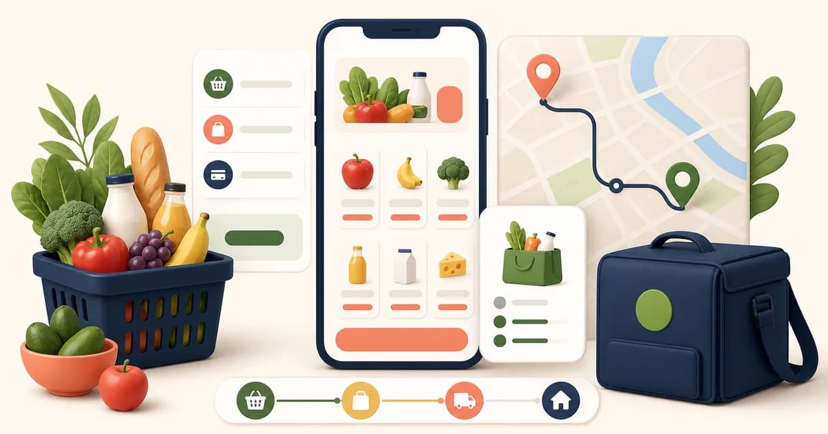
The short answer: study grocery and food delivery services as evidence of a customer promise connected to an operating model. The ten current named examples below show useful, observable choices around location, fulfillment, substitutions, repeat shopping, and recovery. They are not a ranking, a performance comparison, or an endorsement. Copy neither the screen nor the promise until your own catalog, pickers, carriers, support process, and local rules can support it. Review date: 2026-08-23.
What to look for in grocery and food delivery UX
A delivery basket is not a normal product cart. Availability can change while an order is open; fresh items can be variable weight; a requested product may need a substitute; and the delivery promise depends on an address, a store, a picker, and a handoff. The design task is to make those dependencies understandable before payment, then preserve the same facts for the person who fulfills and supports the order. A polished product grid cannot repair a wrong store, an unavailable item, or an unworkable delivery instruction.
For each example, separate the observable service behavior from the lesson. An interface may reveal a feature only after a postcode, address, store, or sign-in step, and offerings can vary by market. Treat the linked first-party page as a dated source, not a permanent specification. Food claims are especially sensitive: in the United States, FDA food-labeling and food-allergy materials are useful primary context, but the product package, applicable jurisdiction, and qualified review govern what a particular merchant should say.
10 real grocery and food delivery examples
1. Instacart: ask for location before promising a shop
Instacart’s grocery-delivery page places a ZIP-code field ahead of shopping and then presents local-store shopping, a selected delivery time, order-progress tracking, and shopper communication as part of the flow. That is an observable serviceability gate: the location is used before the site makes a local grocery-delivery journey meaningful. Lesson: collect the smallest location input needed before showing assortment, delivery method, fee, or arrival claims that depend on it. Limitation and adaptation: a multi-retailer marketplace has store-level coverage and shopper messaging; a single-store merchant may need only a store selector or postcode check. Do not ask for a full address early unless it is genuinely required, and explain why the information is needed.
2. Walmart: make a substitute a customer choice
Walmart’s official help page says shoppers can mark an item as not substitutable or choose a preferred substitute before placing a pickup or delivery order. It also explains that a substitute can be accepted, declined, or returned, and that weighted items and replacements can affect the authorization amount. Lesson: model substitution as an item-level instruction with a clear money and recovery path, rather than a hidden global default. Limitation and adaptation: Walmart’s particular payment holds, return paths, and eligibility rules are its own. A smaller operation should offer only the options it can fulfill reliably—for example, “no substitute” and one customer-selected backup—and make the price basis and post-delivery remedy explicit.
3. Kroger: turn a list into a repeatable shopping mission
Kroger’s delivery page exposes named-list creation in the delivery experience, including an instruction to create a new list when a saved-list limit is reached. The visible interface makes lists a concrete object rather than merely a marketing idea. Lesson: let shoppers save a meal, household routine, or replenishment mission with a name they recognize later, then make that list editable before it returns to a cart. Limitation and adaptation: do not infer that every saved item remains available, the same size, or eligible for the same fulfillment method. Re-evaluate price, stock, pack size, and delivery eligibility when a list is reopened; a useful repeat mechanism should preserve intent without silently recreating an old order.
4. Amazon Fresh: keep fulfillment boundaries visible
Amazon’s grocery delivery and pickup FAQ distinguishes Amazon Fresh, Whole Foods Market, and other stores, explaining that carts from different stores are fulfilled separately and require separate delivery or pickup windows and checkout. The same page states that an Amazon Fresh or Whole Foods Market order can be cancelled until shopping begins and describes past-purchase and repeat-item routes. Lesson: when fulfillment sources cannot share a promise, show the boundary in the basket and checkout rather than pretending it is one seamless order. Limitation and adaptation: separate carts add friction, so use them only when stock, picking, payment, or delivery genuinely cannot be coordinated. If a merchant combines sources, it needs an honest combined availability and delivery calculation—not a cosmetic merger.
5. Ocado: connect delivery coverage to what can be browsed
Ocado’s home page asks shoppers to check whether it delivers to them and says that this reveals the products and delivery options available to that location. Its navigation also includes favourites, shopping lists, and regulars. Lesson: make location selection an understandable catalog-setting action: it should change the store’s visible promise, not feel like a roadblock placed before browsing. Pair it with clear routes for known items and routine shopping. Limitation and adaptation: delivery geography, minimum orders, and assortment rules differ by operator and can change. Do not reproduce a coverage check without a maintained source for the resulting catalog and slot data; otherwise the page simply moves uncertainty later in the journey.
6. Tesco Groceries: preserve both department and problem-based entry points
Tesco’s grocery landing page visibly organizes shopping through familiar departments such as fresh food, bakery, frozen food, food cupboard, drinks, household, and health and beauty. Its official help content also describes a delivery substitute being made clear to the customer and capable of being refused. Lesson: conventional departments remain valuable for a planned grocery shop, especially when they keep perishable, pantry, and household needs legible. Add curated meal or dietary routes only when they link back to the same complete product facts. Limitation and adaptation: a department tree is not a substitute for search, product attributes, or a truthful stock state. Do not treat a promotion or recipe collection as proof that every ingredient, pack, or substitute is appropriate for a shopper.
7. DoorDash Grocery: present fulfillment status beside store choice
DoorDash’s grocery page shows store cards with delivery information and, where applicable, labels such as “Guaranteed Stock” and SNAP. Its grocery FAQ describes scheduling, contact during shopping for an out-of-stock item, a substitute or refund outcome, and a self-help route for qualifying issues. Lesson: surface the fulfillment facts that change a store choice close to the store card, then continue those facts into the order record. Limitation and adaptation: badges must have a defined operational meaning and eligibility scope. A retailer should not add urgency, stock, quality, payment, or guarantee labels just because competitors use them; document the rule, owner, exception path, and customer remedy first.
8. Uber Eats: offer a bounded menu of replacement consent
Uber Eats’ official grocery help page sets out several sold-out-item choices: a similar replacement, approval before replacement, a customer-selected replacement, or refund. It also explains that replacement details and a changed price can appear in an updated receipt. Lesson: a substitution UI becomes easier to understand when the shopper can choose between a few plainly worded consent models and see what happens if they do not respond. Limitation and adaptation: defaults and response deadlines have real consequences, particularly for allergens, dietary restrictions, brands, quantity, and budget. Use the least permissive default that your operation and customer expectation justify, and make an item removable when consent cannot be obtained.
9. Gopuff: make the address the context for a compact catalog
Gopuff’s current home page opens with an address field and then a compact category menu that includes snacks, alcohol, frozen, pantry, quick meals, and fresh grocery. The observable ordering puts service context before a broad convenience catalog. Lesson: for a fast, limited-assortment service, location can be the first decision because it determines whether the catalog and delivery proposition exist at all. Limitation and adaptation: a convenience-led category set is not a complete grocery taxonomy, and regulated products need market-specific controls. A merchant should expose only categories it can fulfill, support, and legally sell at the selected location, including any age or handoff requirements.
10. Shipt: give shoppers a clear control over contact
Shipt’s help center describes three checkout substitution preferences: contact the customer for each out-of-stock item, do not substitute, or choose a specific backup. Its ordering guidance also lets shoppers add delivery notes and describes an order-update cutoff. Lesson: define exactly when a picker should contact a customer and when they should follow a pre-authorized instruction. This helps the customer decide how much attention the order needs before shopping begins. Limitation and adaptation: contact flows depend on reliable notifications, available staff, and a realistic cutoff. Do not promise real-time conversation if a picker cannot wait for it; record the fallback, refund behavior, and support route so silence does not become unwanted merchandise.
Apply the lessons without copying the brand
- Map each customer-facing claim to a live data source, an operational owner, and a safe failure state.
- Test address selection, stock changes, variable-weight goods, dietary constraints, substitutions, payment changes, delivery instructions, and order editing in one end-to-end journey.
- Keep product ingredients, allergens, quantity, price basis, and package information accessible near the purchase decision; filters and merchandising labels do not replace product evidence.
- Give fulfillment, delivery, and support teams the same item, consent, contact, and handoff information that the customer sees.
- Review every promise when its source, market, policy, or operating capability changes—not just when the visual design changes.
Where Groxery fits
Groxery is Polo Themes’ grocery and food Shopify theme. Its storefront features can provide a starting point for catalog presentation, navigation, branding, content pages, and responsive shopping. They do not create delivery zones, live inventory, food-label verification, substitution consent, picker communication, routing, or an issue-resolution policy. Configure the theme with reviewed product and operational data, then test the complete order path with realistic unavailable and substituted items before treating a demo as production proof.
Conclusion
These ten examples are useful because each makes an operational choice visible: where service is possible, what a shopper can buy, who may change an item, when an order can change, and how a problem can be reported. The transferable pattern is not a particular card, badge, or checkout sequence. It is an honest agreement between the interface and the people, data, inventory, and delivery capacity behind it. Build that agreement first; the visual treatment can then make it easier to understand.
Frequently asked questions
Are these the best grocery delivery apps?
No. This is not a ranking or recommendation list. They are current, named services selected because their official pages expose different grocery or food delivery decisions that a store team can study.
Should a store always allow substitutions?
No. Offer substitutions only when the customer can understand and control the outcome and the operation can honor that instruction. “No substitute” should remain available where an alternative could be unsuitable or where consent cannot be captured safely.
Can dietary filters replace the food label?
No. Filters can help people navigate, but product ingredients, allergen information, package details, and applicable labeling requirements remain essential. Use the current FDA food-labeling and food-allergy pages as U.S. primary context, then confirm the actual product and local requirements.


