Design · August 23, 2026 · 7 min read
Grocery/Food Brand Design
A food branding guide for making an offer memorable without obscuring ingredients, quantity, availability, dietary clarity, or the delivery promise.
By Polo Themes
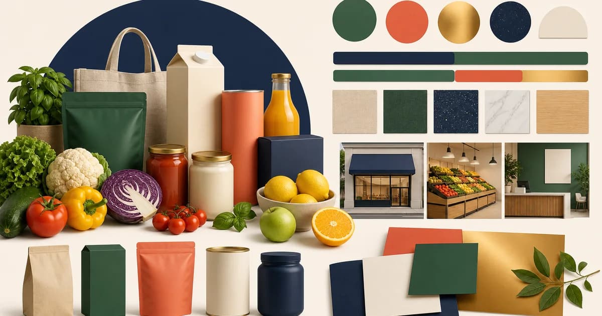
The short answer: food branding should make the offer feel desirable and make the transaction feel dependable. Appetite is part of the job, but it cannot replace product truth. A useful grocery or food identity gives a customer a quick sense of taste, audience, and point of view while keeping ingredients, quantity, dietary information, availability, and delivery terms easy to find and understand. The strongest system is recognizable even when the order is late, an item is substituted, or a support agent needs to explain what happened.
A food brand is an operating promise
Start before the logo. Describe the food philosophy, the specific customer, the assortment role, and the service boundary in ordinary language. A neighborhood weekly shop, a specialty pantry, a meal-prep service, and a producer selling direct each need a different promise. “Fresh,” “healthy,” “local,” “sustainable,” “premium,” and “convenient” are not positioning by themselves. They become useful only when the business can say what the term means, what evidence supports it, and where the claim stops.
The brand brief should include exclusions. If the store does not control farms, kitchens, last-mile delivery, or all packaging, do not write as though it does. If a quality, origin, nutrition, environmental, or wellness statement has a legal or factual implication, route it through the person who owns substantiation. FTC guidance is a primary U.S. reference for environmental marketing claims, but specific advertising and food-label rules depend on jurisdiction and product. Qualified local review belongs in the work, not as a footnote after a campaign has shipped.
1. Separate the brand story from the product facts
Editorial language can tell a customer why a collection exists, how an ingredient is used, or what a meal occasion feels like. Product facts answer different questions: what is being sold, in what quantity, with which ingredients, and under what storage or delivery conditions. Give these roles distinct visual treatments. A warm recipe photograph should not make a package look larger than it is; a promotional headline should not sit where an allergen warning is expected; a lifestyle panel should not become the only place a customer can find the actual product name.
This distinction improves merchandising too. A brand can use a seasonal story to inspire a basket, then return the shopper to a consistent product grid with the same quantity, availability, and price treatment as the rest of the store. When the campaign changes, the catalog remains trustworthy.
2. Define a visual language for confidence
Choose a limited set of visual roles instead of trying to make every surface expressive. One role can carry appetite imagery; another can handle product facts; another can signal delivery status, promotion, dietary navigation, warnings, or support. Typography, spacing, color, iconography, and motion should reinforce those roles consistently. A warning should be visible without looking like a sale. A delivery update should be clear without borrowing the emotional tone of a recipe. People learn an interface faster when important distinctions do not change from page to page.
Check contrast and text size with real labels, long product names, and translated or supplier-provided content. Pale food palettes can be attractive while still failing to make prices, availability, or allergen information readable. W3C accessibility guidance is a durable reference for contrast and semantic structure; visual review alone is not enough. Use the actual storefront, keyboard controls, and assistive technology expectations during design review.
3. Create an image system, not a pile of beautiful photographs
Food images do several jobs: identify a packaged item, show texture, set a meal context, convey preparation, and support a brand mood. Define which image type is used where. Pack shots should make the product and quantity recognizable. Ingredient or texture images can help a shopper understand the item. Styled serving images should be clearly contextual, particularly when added garnishes, vessels, or multiple packages are not included. Fresh, frozen, chilled, and prepared products need their own honest standards because the customer’s expectation of condition is different.
Document crop, background, lighting, color correction, prop limits, and alt-text responsibilities. Consistency makes comparison easier and reduces the chance that a supplier image communicates something the store cannot fulfill. The system should also cover imperfect but common moments: a seasonal product arrives in different packaging, a replacement uses a new label, or a quality issue requires a current image for support.
4. Make dietary clarity part of the identity
Some food businesses build their identity around a diet, ingredient philosophy, origin, or production method. That can make browsing easier, but it raises the bar for accuracy. Define every badge, determine the source record, set a review cadence, and retain the underlying ingredient and allergen detail. Do not treat a cheerful icon as a guarantee of suitability for every person. In the United States, FDA labeling resources provide primary guidance about food labeling and allergens; packaging and applicable local law remain more authoritative than a marketing filter.
Good brand design gives these facts dignity. It does not bury them because they complicate the mood. A customer who can confidently understand the product is more likely to trust the rest of the experience.
5. Extend the system through delivery and recovery
A brand becomes credible when its tone and clarity survive a difficult order. Design the confirmation, substitution notice, delay update, pickup instruction, refund explanation, and support intake with the same care as the homepage. Each message should identify the order, explain the relevant fact, state the next available action, and avoid pretending that a system error is a personal concierge moment. Reliable language is often simple: what changed, why the store knows it changed, and what the customer can do now.
This is also where packaging belongs. Bags, labels, inserts, temperature or handling notices, and handoff communications should use the same names and visual roles a customer saw online. Do not add a handwritten-looking “artisan” layer if the operation needs a clear, machine-readable order identity to pack safely.
6. Let promotions support, not distort, the brand
Promotions should have eligibility, availability, and capacity owners. The creative team needs current information about stock, service zones, dates, exclusions, and fulfillment limits before it creates urgency. A store can be generous without manufacturing scarcity, concealing a minimum, or implying a discount applies to an item that cannot be delivered. If an offer changes the basket behavior, test it across product pages, cart, checkout, confirmation, and support.
Avoid universal claims such as “best,” “clean,” “guilt-free,” “eco-friendly,” or “farm fresh” unless they have a defensible, defined basis and appropriate review. A more specific claim with an accessible explanation is both more useful and more resilient.
A brand-system working session
- Write the customer, food philosophy, service boundary, and exclusions in one page.
- Inventory every customer-facing claim and assign a factual owner and review cadence.
- Define visual roles for story, product facts, dietary information, availability, promotion, delivery, and support.
- Create image standards for package, ingredient, serving, fresh, chilled, frozen, and prepared food contexts.
- Prototype an ordinary order, an out-of-stock substitute, and a delivery problem using the same system.
- Test readability, keyboard behavior, and assistive labels with real catalog content.
- Publish only terms that match the current operation and keep an update process for changes.
Using Groxery as the storefront foundation
Groxery is a Polo Themes Shopify OS 2.0 grocery and food theme with responsive design, custom branding, custom pages, advanced navigation, newsletter support, social sharing, documentation, and support listed in its catalog record. Those features make it a relevant starting point for applying a food brand system to a Shopify storefront. They do not prove the accuracy of a food claim or create an operating process for fulfillment. Bring an evidence-led brand brief, structured product data, and reviewed policies to the configuration work.
Conclusion
Food branding earns its value when it makes the right things memorable: a clear food point of view, a recognizable product system, and a delivery promise the operation can keep. Build appetite into the experience, then protect the customer’s ability to understand what will arrive.
Frequently asked questions
Can a food brand use lifestyle images on product pages?
Yes, when they add useful context and are clearly distinct from the product itself. Keep a recognizable package or product image, quantity, and facts nearby so styling does not misrepresent what is included.
Who should approve food-related marketing claims?
The person or process with access to the evidence should approve them, often with qualified legal or regulatory review where needed. The answer depends on the claim, product, supplier relationship, and jurisdiction.
Why include delivery messages in brand design?
Customers judge a brand most sharply when an order changes. Clear, consistent delivery and recovery messages make the service promise credible and help support resolve problems without adding confusion.


