Guides · August 23, 2026 · 7 min read
Food Product Photography
A practical guide to photographing food products so customers can understand the package, quantity, texture, serving context, and likely delivered condition.
By Polo Themes
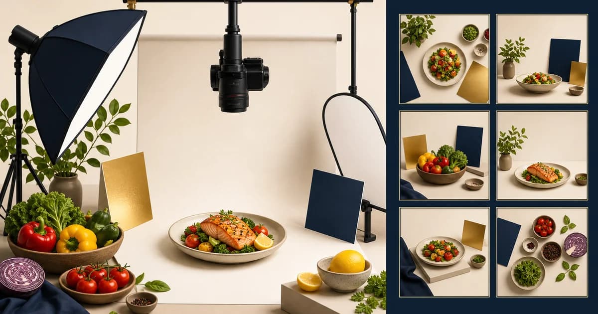
The short answer: photograph food to help a customer recognize and choose the thing that will be delivered. The image should create appetite, but it must also show package identity, scale, quantity, texture, and appropriate condition. A dramatic serving scene is useful only when it does not make a single package look like a feast, hide a required label, or imply that ingredients, garnishes, cookware, or preparation are included.
The product record comes before the shot list
Begin with a verified product record: exact name, variant, package dimensions or net quantity, current packaging, selling unit, ingredient and allergen information where applicable, storage category, and any customer-relevant condition. Photography cannot correct a weak catalog. If the team does not know whether a product is 250 g, 500 g, fresh, chilled, frozen, or prepared to order, it cannot create an honest image brief.
Establish one source of truth for the final approved image and one person who can retire it when packaging changes. Supplier assets may be useful, but they should not be published unreviewed. Check that a supplied image depicts the exact pack, flavor, variant, count, and claim being sold in the target market.
Build a repeatable image set
Most food products need more than one image. A package-oriented set often includes a front view, a back or side view when relevant details are there, a scale view, a close texture or ingredient view, and an optional serving or use context. The priority changes by category. A canned pantry item needs a legible label and size. Loose produce needs an honest quantity convention and condition standard. A prepared meal needs a clear explanation of whether the scene is plated, heated, or a serving suggestion.
Make the primary image do the identification job. Use a consistent angle, background, crop, and size across comparable products so a shopper can scan a category without visual tricks. Reserve more expressive imagery for secondary positions. This makes the storefront calmer and helps price and pack-size comparison work on small screens.
Show quantity instead of implying it
Food is especially vulnerable to misleading scale. A close crop can turn a snack into a family-sized item; an oversized bowl can make a small package seem generous; a multi-item arrangement can look like one purchase. Put the net quantity in text beside the image, use a proportional reference when useful, and label a multiple-package scene clearly. If the product is sold by variable weight, explain the ordering unit and how the final quantity or charge is determined instead of photographing a single unusually large specimen as the implied norm.
Avoid decorative props that look like included product. A serving board, herbs, sauces, glassware, or other food can enrich a contextual image, but it should not confuse the commercial offer. The store’s copy and image sequence must make the boundary obvious. Advertising rules vary, but the basic consumer expectation is stable: people should not need to decode a photograph to learn what their purchase contains.
Capture color and texture with restraint
Food color is a powerful cue, especially for produce, baked goods, meat, and prepared dishes. Use controlled lighting, a repeatable color workflow, and review on the devices customers use. Do not use aggressive retouching to make condition, ripeness, size, or texture promise something fulfillment cannot reasonably provide. For reflective packaging, test glare at the actual card size; a label that is legible in a studio file may vanish in the storefront crop.
Texture images should illustrate the product rather than invent it. A cut-open view of a baked good, a scoop of a frozen dessert, or a cooked serving can be valuable if it is representative and the preparation state is disclosed. If results depend on a recipe, appliance, or garnish outside the package, keep that context in the caption or accompanying instructions.
Use distinct standards for fresh, chilled, frozen, and prepared food
Fresh food has natural variation, so define acceptable appearance, crop, batch differences, and when a current image must be replaced. Chilled and frozen products require images that do not conceal their storage state or suggested handling. Prepared foods need an explicit decision about whether the image shows the delivered product, a plated serving, or a preparation suggestion. These standards should be connected to the real product and fulfillment process, not selected after a stylized shoot.
When condition can vary, write supporting content honestly. A phrase such as “appearance may vary” is not a license to ship a materially different product. The better response is a clear condition standard, current inventory checks, and a support route for a quality concern.
Keep labels and claims in their proper place
Required or decision-critical facts should exist as structured, readable text in the product experience even if a package image also displays them. Do not make a customer zoom into a photograph to identify an allergen statement, ingredient list, or net quantity. Conversely, do not crop a pack shot so tightly that visible claims become ambiguous. FDA labeling guidance is an authoritative U.S. reference for food-labeling context; it does not make a store’s photography review optional or replace jurisdiction-specific requirements.
Any marketing claim added in the image must be supportable. FTC advertising guidance is a useful primary reference for the general principle of truthful advertising. Avoid editing words, seals, or outcome claims onto an image simply because they fit a campaign layout. If the claim has an owner and evidence, place it where the customer can also access the explanation.
Plan for accessibility and production reuse
Images need purposeful alternative text when they convey information not already present in adjacent text. A product photo may be described concisely as the package, flavor, and size; a decorative food texture image may need no repeated detail. W3C’s images tutorial explains why the context determines the appropriate alternative. Store alt text with the asset or product record so it does not become an afterthought during a campaign upload.
Deliver several crops intentionally rather than relying on a storefront to crop a large hero image blindly. Review card, product-page, search, social, and mobile placements. Keep filenames, source files, licenses, retouch notes, and approval history organized. This lets the team replace packaging quickly without losing the visual system.
A food photography acceptance checklist
- Verify the photographed item matches the SKU, variant, pack, and selling unit.
- Provide a clear primary package or product-identification image.
- Show quantity in structured text and avoid scenes that imply more is included.
- Label serving, preparation, props, and garnish context accurately.
- Use consistent lighting, crop, and color standards across comparison sets.
- Keep important labels, ingredients, allergens, and claims available as accessible text.
- Review the final storefront image against the item a picker or warehouse will actually send.
Applying the standard in a Groxery storefront
Groxery is designed for grocery and food presentation on Shopify and lists responsive layout, custom branding, custom pages, navigation, social sharing, and Shopify OS 2.0 among its catalog features. It can display the image system; it cannot decide whether a photograph is representative. Build the image standards and product data first, test the theme’s cards and product pages with real package sizes and labels, and retain a review process as the assortment changes.
Conclusion
Good food photography is not less appetizing because it is accurate. It is more useful: it lets a shopper recognize the product, understand the amount and condition, imagine a use, and still trust the item that arrives. Make honesty a production standard, not a disclaimer.
Frequently asked questions
Should food products be photographed in packaging or plated?
Usually both can help, but they answer different questions. A package or clear product view identifies the purchase; a plated image provides context. Make the relationship between them obvious and do not imply that the plated extras are included.
How do I photograph variable-weight food?
Use a consistent visual standard, state the selling unit and quantity treatment in text, and explain how the final amount or charge is determined. Do not present one unusually large item as the guaranteed outcome.
Can product labels exist only in images?
No. Important information should be available as readable text in the product experience. Images can support recognition, but they are not a reliable substitute for structured details and accessible content.