Guides · August 23, 2026 · 7 min read
Food E-Commerce UX Best Practices
Keep repeat food shopping fast while making ingredients, allergens, quantities, availability, substitutions, and delivery choices explicit.
By Polo Themes
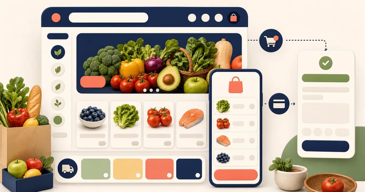
The short answer: food e-commerce UX works when it serves two needs at once: a regular shopper can build a basket quickly, while every shopper can still inspect the facts that make the purchase suitable. That means fast search and reorder alongside clear quantity, ingredients, allergens, storage, availability, substitution, and delivery information. Convenience that hides a food decision is not good UX; it simply pushes the uncertainty into fulfillment or support.
Start with the customer’s shopping mission
A household doing a weekly shop behaves differently from someone replacing milk, planning a recipe, buying for an event, or navigating a dietary restriction. Make the core paths obvious without forcing everyone through a quiz. Search, browse, repeat purchase, saved lists, and editorial meal inspiration can coexist when each leads to the same trustworthy product record. The user should not have to wonder whether a recipe item has a different pack size, availability state, or dietary detail than the catalog item.
Write down the first question each path must answer. A rapid refill asks “can I add my usual item?” A dietary path asks “what evidence supports this filter?” A recipe path asks “what can I get for this meal in my service area?” The page hierarchy follows from the question. This is more durable than beginning with a carousel or a trendy animation.
Make location-specific truth available early
If assortment, price, delivery, pickup, or inventory changes by location, ask for the minimum location information before presenting those values as firm. Explain the purpose and allow someone to browse a general catalog where possible. Once a store or address is selected, preserve it visibly and give the customer a simple way to change it. A location banner that does not affect the basket is worse than no banner because it creates a false sense of serviceability.
Design search for imperfect food language
Food searches are often short, plural, colloquial, brand-led, or ingredient-led. Results should recover gracefully from a miss and help a shopper narrow by category, dietary attribute, pack format, or availability only when the data supports those filters. Show the query, avoid trapping the user in an empty state, and provide useful next actions. Search relevance is not a one-time design decision: review failed searches, unavailable-item searches, and support questions to identify missing synonyms, weak categories, or catalog gaps.
Never let a search result overstate a dietary attribute or substitute an editorial label for the information on the product. Food-allergen information can have serious consequences. FDA resources describe U.S. food allergen labeling, but the applicable requirements and the source of truth depend on product and jurisdiction. Keep the underlying detail close to the purchase decision.
Put comparable facts on cards and complete facts on pages
A collection card should make it possible to recognize the item and compare basic commercial facts: name, variant or pack form, net quantity, selling price, availability, and a useful visual. The product page can provide ingredient, allergen, storage, preparation, origin, nutrition, or other relevant details. Do not make a customer open several pages merely to distinguish a 250 g package from a 500 g package. Conversely, do not cram essential information into an image or tiny text that becomes unusable at mobile sizes.
If product imagery contains a serving idea, distinguish it from the sold item. When the package is the product, show it clearly. When the food is sold by weight or the final amount can vary, state how that affects the charge and fulfillment. Good food UX makes the relationship between photo, unit, and delivered product easy to understand.
Treat dietary navigation as evidence-led navigation
Filters such as vegan, gluten-free, kosher, halal, organic, low sodium, or allergy-related categories can be useful only if they have a defined data source and review process. Explain terms when necessary, do not turn a convenience filter into individualized dietary advice, and make the original ingredients and allergen information accessible. A customer should be able to clear filters and see why an item is included. If evidence is incomplete, the safe UX is to omit the claim or label the uncertainty—not to borrow confidence from a similar product.
Make adding and editing a basket low-friction but visible
An effective add-to-basket interaction confirms the specific variant and quantity without interrupting a repeat shopper unnecessarily. The persistent basket should show count and a route to review. In the basket, surface details that can change the outcome: unavailable items, substitutions, estimates, delivery eligibility, and fee or minimum conditions. Avoid placing critical warnings in a transient toast alone. A customer returning to the basket should be able to see the state without remembering an earlier message.
Give substitutions their own moment of consent
Substitution preferences need to be understandable under time pressure. Ask whether each eligible item may be replaced, what kind of replacement is acceptable, and whether a no-substitution choice exists. The wording must reflect the real process: do not say “we will ask” if a picker may make a judgment without contacting the customer. Carry the preferences into the fulfillment tool and give customers a way to see how to report a mismatch. This is especially important for dietary, baby, medical, cultural, or strict-budget purchases.
Make delivery selection explain the basket
A delivery or pickup selector should not feel disconnected from products. If a chosen slot, method, or location changes eligibility, communicate the effect before payment. Label time ranges plainly, identify cutoffs, and let people correct address or contact details without losing the basket. The order confirmation should act as a compact receipt of the customer’s choices: items, quantities, substitution preferences, charge treatment, handoff method, timing, and support route.
Include accessible states from the first prototype
The grocery flow contains repeated controls, dynamic totals, filters, quantity steppers, slot selectors, and error messages. Give controls programmatic names, preserve keyboard operation, use visible focus, connect form errors to the affected field, and do not rely on color alone for availability or diet labels. Announce meaningful state changes in a way assistive technology can use without turning every minor update into noise. W3C’s forms guidance is a strong primary reference for the underlying patterns; test with the content and devices your customers actually use.
A practical UX review checklist
- Can a shopper tell whether their location is serviceable before relying on a delivery promise?
- Can they compare quantity and price basis without opening several products?
- Are ingredients, allergens, and other food facts available as text, not only as imagery?
- Can they express a clear substitution choice for the items where it matters?
- Does the basket reveal changes that affect fulfillment or the final charge?
- Can a keyboard or screen-reader user complete the same core path and understand errors?
- Does the confirmation match the data a picker and support agent will use?
A theme is a starting point, not food data
Groxery provides a Shopify OS 2.0 storefront foundation for grocery and food catalog presentation, with responsive design, branding controls, navigation, custom pages, newsletter support, documentation, and support listed in its product record. Those are useful building blocks for the interface. They do not validate product labels, create a dietary taxonomy, synchronize inventory, or decide how substitutions and delivery work. Make the content model and operation authoritative first, then configure the storefront around them.
Test whether basket language survives fulfillment
Run a terminology audit across the product page, basket, picker view, receipt, and issue form. Words such as each, pack, case, bunch, estimated, unavailable, reserved, substitute, pickup, and delivered must refer to the same thing at every stage. Ask a shopper, picker, driver, and support agent to explain one representative order without prompting. When their interpretations differ, fix the source field and interface label rather than adding another confirmation banner.
Include a basket whose state changes after it is built: one item becomes unavailable, a variable amount changes, the selected slot loses eligibility, and the customer edits their location. Verify that the interface identifies what changed, preserves unaffected choices, recalculates only from authoritative data, and asks for renewed consent where the commercial or substitution decision materially differs. The test protects both speed and informed choice because it prevents silent recovery logic from making decisions for the shopper.
Conclusion
The best food e-commerce experience is quick because it is clear. It lets repeat customers move fast, but it never makes a person trade speed for essential information. Put operational truth—location, product facts, quantity, availability, substitutions, and delivery—into the flow where it changes a decision.
Frequently asked questions
What should appear on every grocery product card?
At minimum, show a recognizable name, relevant variant or pack form, net quantity, price, current availability, and a clear product image. Add only claims that can be maintained from the product record.
Should a store automatically substitute sold-out food?
Only according to a clear customer preference and an operation that can carry it out. Per-item consent and visible constraints are safer than assuming every shopper wants an alternative.
How do I test food e-commerce UX before launch?
Run representative orders with real catalog records, including unavailable items, a dietary filter, a variable-weight item, a substitution, an address change, and an issue report. Compare the customer view with the fulfillment and support records.