Design · August 23, 2026 · 10 min read
15 Best Eyewear Website Design Examples
Fifteen real eyewear sites to study for clearer discovery, fit information, prescription handoffs, and support—not a ranking of brands.
By Polo Themes
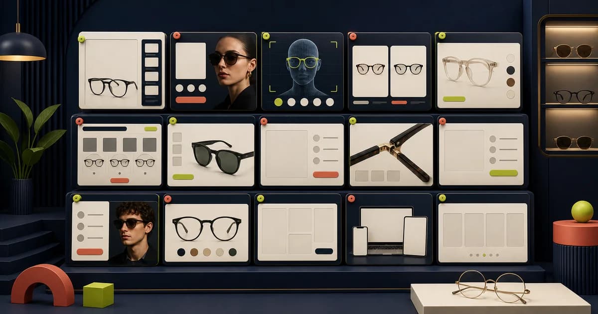
The short answer: study real eyewear sites for the decisions they make visible, not for a brand look to copy. The 15 direct sites below were reviewed on 2026-08-23. This is not a ranking, endorsement, performance comparison, or claim about results. Each example identifies one observable design lesson and one limitation to solve before adapting the idea to another eyewear store.
Frames are physical, personal products with technical questions attached. A shopper needs to understand appearance, dimensions, selected color, lens route, availability, and where to get help. The useful design pattern is therefore evidence at the point of choice: a named frame, a current variant, images that inspect the object, measurements that can be compared, and a next step that does not over-promise what software can decide.
15 real eyewear website design examples
1. Warby Parker: show the available try-on routes
Warby Parker’s Ways to Try page places web and app virtual try-on beside an in-store option. Design lesson: name the routes together, so a shopper can choose a route that fits their situation rather than encountering a camera request at the end. Limitation/adaptation: virtual viewing does not establish physical fit; retain dimensions, ordinary product photography, and a real support route.
2. Ray-Ban: connect try-on back to products
Ray-Ban’s virtual try-on page describes creating a virtual model and using the catalog to try eligible pairs. Design lesson: make an interactive feature continue product browsing rather than isolating it as a novelty. Limitation/adaptation: feature availability varies by device and market, so label eligibility where it appears and offer normal images if it is unavailable.
3. Zenni Optical: give visual search a clear beginning and exit
Zenni’s official Find By Image explanation starts with a frame image and returns matches from its catalog. Design lesson: explain the input and return people to a filterable product list. Limitation/adaptation: similarity is not identity; describe results as catalog matches and preserve text search, shape filters, and manual browsing.
4. EyeBuyDirect: explain camera alternatives first
EyeBuyDirect’s virtual try-on instructions show a Try On entry point and describe camera-based viewing plus image or video alternatives. Design lesson: tell shoppers how a feature works before asking for permission and provide another input path. Limitation/adaptation: camera access must not be required for purchase; dimensions, multiple angles, and image descriptions still matter.
5. JINS: stage configuration after frame exploration
JINS presents a progression from choosing a frame to virtual try-on and then lenses and prescription information. Design lesson: show a complex purchase as visible stages while the selected frame stays in context. Limitation/adaptation: lens and prescription capabilities are merchant-specific; display only the options and fulfillment steps the operation actually supports.
6. Oliver Peoples: separate editorial story from product navigation
Oliver Peoples uses an image-led brand presentation alongside direct routes into optical and sunglass collections. Design lesson: let editorial art direction establish a point of view while keeping product categories recognizable. Limitation/adaptation: an emerging store should not let atmospheric imagery delay access to frame facts, prices, availability, or a usable catalog.
7. Persol: keep collection identity attached to shopping routes
Persol organizes its official storefront around recognizable eyewear collections and product families. Design lesson: a named collection can give shoppers a useful story and a bounded place to browse. Limitation/adaptation: collection language cannot replace attributes; preserve shape, material, size, lens, and selected-variant information after entry.
8. Gentle Monster: use bold imagery without losing the product
Gentle Monster’s official site uses distinctive campaign imagery while maintaining routes into glasses and sunglasses. Design lesson: editorial expression can make a brand memorable when category navigation remains available. Limitation/adaptation: smaller merchants should validate image weight, focus order, motion, and mobile readability rather than copying visual scale that their content operation cannot maintain.
9. Bailey Nelson: connect product browsing with service context
Bailey Nelson presents eyewear shopping and optical-service routes within one branded destination. Design lesson: keep retail and service choices related but clearly labeled so visitors know which journey they are entering. Limitation/adaptation: services, eligibility, and availability vary by location; source those details from the live operating system rather than static campaign copy.
10. Target Optical: make filters describe the choice
Target Optical’s virtual try-on and collection pages expose a virtual mirror alongside filters such as face width and frame attributes. Design lesson: a filter should describe the decision it changes, so a shopper understands why a result set is narrowing. Limitation/adaptation: a face-width filter is a browsing aid, not a fit verdict; retain exact product measurements and never hide the full catalog behind a recommendation.
11. LensCrafters: connect shopping to appointment support
LensCrafters’ eye-exam page makes appointments an identifiable next step within its eyewear ecosystem. Design lesson: where in-person service can help, expose it as a useful parallel path instead of burying it in a footer. Limitation/adaptation: appointment details are local and changeable; take availability from the live booking system and do not present booking as clinical advice.
12. Specsavers: make professional support findable
Specsavers’ eye-test page gives eye-test information a clear destination next to retail browsing. Design lesson: let a shopper move to professional support when a filter or FAQ cannot answer the question. Limitation/adaptation: clinical services are regulated and market-specific; separate retail copy from clinical advice and use the correct local provider and booking conditions.
13. Ace & Tate: use collection-led entry points
Ace & Tate’s official storefront provides collection-led routes into optical frames and sunglasses. Design lesson: concise collection entry points help visitors who know the broad product type they want without requiring expert taxonomy. Limitation/adaptation: collections only work if filters and availability remain understandable after entry; they cannot be the sole route into the complete catalog.
14. KITS: make category and offer choices easy to scan
KITS provides direct routes into glasses, sunglasses, and contact-lens shopping. Design lesson: a compact category map helps visitors choose the right product system before they encounter detailed filters. Limitation/adaptation: broad category labels still need product-level measurements, eligibility, selected-variant truth, and support; navigation alone does not solve fit.
15. FramesDirect: organize a broad assortment without hiding brands
FramesDirect exposes routes across eyeglasses, sunglasses, and brands in a large catalog. Design lesson: support both product-type and brand-led entry for shoppers who arrive with different knowledge. Limitation/adaptation: large navigation systems require disciplined taxonomy and keyboard behavior; a smaller store should not reproduce breadth it does not have.
What to adapt instead of copy
These sites do not share one mandatory feature. The repeatable idea is reducing one uncertainty at a time. Discovery tools help someone begin. Images and stated dimensions help them compare. A configuration flow records a lens choice. An appointment or contact path handles questions software should not answer. Keep the chosen frame, color, size, and availability state visible through those handoffs, and state when a fact is unavailable rather than inventing symmetry.
For a Polo Themes storefront, begin with stable catalog data: names, selected-variant imagery, frame and bridge dimensions, materials, lens eligibility, availability behavior, and a real support owner. The Optics E-Commerce Shopify Theme can be a visual foundation for an eyewear catalog, but it cannot establish a merchant’s product facts, prescription workflow, or service policies. Build the conventional product route first; add a camera, scan, quiz, or trial only after its data handling and operations have been verified.
A practical review checklist
- Can someone browse and search without a camera or quiz?
- Does a selected variant retain its imagery, dimensions, price, and availability through the lens route?
- Is every interactive feature explained before a permission, upload, or personal-data request?
- Can two frames be compared using the same named attributes?
- Does each support or policy claim have an owner and an actual operating process?
Review examples with a frame-selection scenario
A useful comparison needs the same task on every site. Give a reviewer a scenario such as finding a lightweight frame in a known width, comparing two colors, understanding the lens-selection boundary, and locating help before purchase. Ask them to narrate each decision. Record where a site supplies evidence, where it asks for trust, and where the route depends on an optional tool. This produces a design brief grounded in customer work instead of a collage of attractive homepages.
Repeat the scenario with constraints: a narrow phone screen, keyboard navigation, images disabled or slow, and the preferred color unavailable. Eyewear journeys often look coherent in their ideal state but become ambiguous when a variant changes or a camera feature cannot run. The fallback experience should preserve the product name, selected variant, dimensions, price, availability, and support path. If it cannot, the enhancement is carrying information that belongs in the underlying page.
Turn observations into a page contract
For each borrowed pattern, write the customer question it answers, the catalog fields it needs, the owner who maintains those fields, its unavailable or error state, and the way it will be tested. A comparison tray, for example, is only helpful when attributes use the same definitions across frames. A store appointment module is only trustworthy when location, service, availability, and confirmation behavior reflect the real operation.
- Keep the pattern only if it answers a named selection or service question.
- List the exact frame, lens, location, or policy data needed to render it truthfully.
- Design its loading, empty, unavailable, permission-denied, and correction states.
- Assign an owner for data and an owner for the customer handoff.
- Recheck the pattern after catalog or service changes, not only during redesigns.
Finish by comparing the page contract with the team that must operate it. Merchandising should confirm that filters use maintained attributes rather than visual guesses. Support should be able to see the same selected frame and service context as the shopper. Fulfillment should recognize the item and variant names shown in the order. The person responsible for privacy should review any camera, upload, quiz, appointment, or contact flow in its configured form. Accessibility review should cover the rendered route, not a static design. This cross-functional pass exposes patterns that are elegant in isolation but unworkable as a system.
Preserve the findings as annotated screens with dates and source links. Websites and services change, so an observation should not become a permanent claim about another brand. The durable lesson is the customer question, the observed pattern, the conditions under which it worked, and the adaptation your own catalog can support.
Conclusion
The best eyewear website design examples are the ones that make a concrete choice easier to understand, not the ones with the most effects. Borrow the structure: clear catalog entry, honest selected-variant imagery, exact dimensions, staged configuration, and accountable support. Then adapt it to your own data, market, and operations, and test whether a shopper can reach a decision without guessing.
Frequently asked questions
Are these sites ranked?
No. The title preserves the article’s planned search intent, but the article assigns no ranks and makes no claim that one site performs better than another. Each is a real named site selected for one observable pattern.
Should every eyewear store offer virtual try-on?
No. First provide useful imagery, stated measurements, selected-variant information, and human help. If virtual try-on is added, explain its data and permissions and retain the conventional product route.
What should an eyewear product page show first?
Show the selected frame and variant, useful images, exact available dimensions, price and availability, and the next valid purchase or support action. Lens and prescription choices should follow without losing that context.
How often should this research be reviewed?
Review direct-site examples before a design sprint or before adopting an interactive feature. Interfaces, market availability, policies, and eligibility change, so these observations are explicitly dated 2026-08-23 rather than presented as permanent facts.


