Design · August 23, 2026 · 9 min read
Eyewear Store Design Best Practices
Eyewear stores should make frame fit, dimensions, lens choices, prescription steps, imagery, and fulfilment expectations understandable before purchase.
By Polo Themes
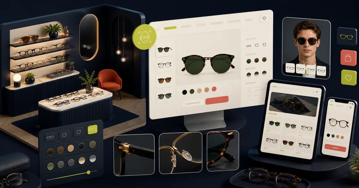
Eyewear combines style with fit and, for prescription journeys, sensitive and complex inputs. The design must help shoppers narrow frames and understand what happens after selection without implying certainty it cannot provide.
Key Takeaways
- Expose frame measurements and lens compatibility before purchase.
- Separate fashion imagery from fit and clinical guidance.
- Explain prescription steps, limitations, and support ownership.
- Test complex lens choices and return scenarios with realistic data.
How should you structure frame discovery?
Baymard Institute’s “Product Listing UX: What Information to Display in Product Listings (50% Get It Wrong)” shows that missing attributes hide relevant products. Structure frame discovery around dependable shape, material, color, dimensions, fit range, and use-case fields, preserving exact model identity without presenting style labels as fit guarantees.
Teach search common frame and lens vocabulary and test similar-looking products whose identity cannot depend on photography alone. The product-photography guide advances discovery by defining the views, accurate color, scale context, responsive crops, and alternatives each card or result needs.
Product cards need clear front imagery, exact model or name, price context, available colors, and enough dimension or fit information for the catalog. Preserve collection state when comparing. Test similar-looking frames so identity does not depend on photography alone.
How should you create a consistent frame media system?
Baymard Institute’s “Product Page UX 2026: 10 Pitfalls and Best Practices” says 42% of users infer size from product images while 37% of sites omit an in-scale view. Provide consistent front, angle, side, hinge, temple, and material images plus stated dimensions and credible scale context for every frame variant.
Map each color label to accurate media, and treat virtual try-on as supplementary evidence with a camera-free fallback. The evidence-led color guide helps separate product-color accuracy from interface color choices, while preserving focus, contrast, selection, and preference cues.
Map color variants to accurate media and labels. Virtual try-on can supplement evidence only with disclosed limitations and a non-camera fallback. Test permissions, privacy, loading, face-position errors, and unsupported devices in the actual integration.
How do you connect to a coherent system?
Baymard Institute’s “Product Page UX: Data Should Be Synchronized Across Product Variations (28% Don’t)” quantifies broken variant continuity. Connect discovery, dimensions, frame color, lens choices, prescription custody, cart identity, delivery, adjustments, and returns through shared data; a coherent visual style alone cannot preserve the selected configuration.
Repository evidence confirms PoloThemes’ Optics Figma kit and Shopify theme as adaptable eyewear foundations, not a complete service. The homepage design guide advances the system by showing how assortment, fit cues, campaign claims, and first routes prepare shoppers for the detailed configuration journey.
- Map real data.
- Customize without inventing capability.
- Test the complete order flow.
How should you explain dimensions and fit?
Baymard Institute’s “Product Page UX 2026: 10 Pitfalls and Best Practices” found 42% of users try to judge size from images. Explain lens width, bridge, temple length, and frame width with consistent units and a diagram, then show comparison with a comfortable existing frame instead of relying on undefined small, medium, or large labels.
Present fit advice as guidance, preserve access to human fitting where offered, and keep return terms near the uncertainty. The ethical urgency guide matters because limited-stock or deadline messages must not pressure shoppers past the careful measurement and fit evaluation this category requires.
Provide style and fit guidance as assistance, not certainty. Face shape recommendations are subjective and should not exclude choices. Offer human support or store fitting where the business provides it, and keep return terms close to this uncertainty.
How should you design frame and lens as connected choices?
Baymard Institute’s “Product Page UX: Data Should Be Synchronized Across Product Variations (28% Don’t)” applies directly to frame-and-lens configuration. Keep frame, color, size, availability, base price, lens eligibility, total, and production time synchronized; block incompatible combinations with an explanation and preserve progress when shoppers revise either choice.
Use plain steps only for options the business actually provides, and keep clinical recommendations within qualified content. The product-page design guide advances the configuration by tying media, option state, price, assurance, availability, and purchase action to one exact item.
Use clear steps for lens type, prescription, coatings, thickness, and add-ons according to the business's actual offering. Avoid presenting clinical recommendations beyond qualified content. Prevent incompatible combinations and explain the reason and alternative.
How should you handle prescription information carefully?
The Federal Trade Commission’s “Complying with the Eyeglass Rule” requires 3 years of retained affirmative-consent evidence when prescribers use digital prescription delivery. Separate frame shopping from sensitive prescription capture, state when data is needed and who reviews it, support correction, and keep compliance claims tied to the implemented workflow.
Offer only supported entry, upload, later-submission, or professional-verification paths, with specific errors and review. The Optics Figma theme is a relevant product destination because its prescription-oriented screens can be adapted to these states, while real privacy, clinical review, and fulfilment remain separate responsibilities.
Design unreadable upload, missing values, expired prescription, unsupported format, and review-needed states without exposing sensitive details in notifications. Security, privacy, retention, and clinical obligations need specialist and implementation evidence; the interface alone is not compliance.
How do you make delivery returns and adjustments explicit?
The Federal Trade Commission’s “Complying with the Eyeglass Rule” requires prescribers to provide a prescription immediately after an exam and, when requested later, within 3 business days. Keep processing, delivery, adjustments, return eligibility, customized-lens exceptions, and warranty terms beside the affected choice rather than hiding them after purchase.
Explain production or processing, delivery estimate basis, tracking, fitting or adjustment support, return eligibility, lens exceptions, and warranty before purchase. Custom or prescription items may have different terms that must not be hidden in a general policy.
Coordinate wording with operations and support and test actual order statuses. Do not guarantee dates or fit without capability. Provide a clear help route for discomfort, incorrect prescription information, damage, or delayed orders.
How should you build accessible selection and forms?
The World Wide Web Consortium’s “Web Content Accessibility Guidelines (WCAG) 2.2” requires text to remain usable at 200 percent resize. Build named color choices, keyboard-operable galleries and option groups, visible focus, persistent labels, specific errors, diagram alternatives, and camera-free or upload-recovery paths through the complete frame-to-lens flow.
Use names and selected indicators beyond swatch color, keyboard-operable galleries and option groups, visible focus, sufficient contrast, and clear errors. Diagrams need alternatives and zoom. Keep target spacing usable on mobile.
Test the full frame-to-lens-to-cart path with screen readers, keyboard, text resizing, camera denied, file upload, and errors. Accessibility extends through third-party try-on, payment, and account integrations; record gaps honestly.
How should you ground the design in verified polo assets?
Baymard Institute’s “Product Page UX: Data Should Be Synchronized Across Product Variations (28% Don’t)” demonstrates why screens cannot prove operational continuity. Optics includes more than 20 premade screens plus a Shopify theme, but catalog truth, prescription processing, privacy, integrations, accessibility, performance, and transactions still require implementation evidence.
The repository confirms Optics Figma UI with more than twenty pre-made screens covering product discovery, detail, cart, orders, prescription, and frame-finder patterns, plus a Shopify Optics theme and paired bundle. It also confirms editable components, organized layers, and customizable colors.
Use those capabilities as a starting design and theme system, not proof of virtual try-on, prescription processing, clinical review, privacy compliance, or fulfilment. Map the merchant's real data and services, verify integrations, and test safe transactions before claiming the full eyewear journey works.
How should you support frame evaluation?
Baymard Institute’s “Product Page UX 2026: 10 Pitfalls and Best Practices” reports that 37% of sites lack an in-scale image. Support frame evaluation with consistent angles, accurate color, stated dimensions, fit guidance, variant identity, adjustments, and nearby return terms; virtual try-on may supplement those facts only with disclosed limitations and fallback imagery.
Use consistent angles, dimensions, material, color, shape, and fit guidance. Filters should reflect reliable catalog attributes. Virtual try-on, if present, needs clear limitations and fallback imagery.
- Standardize product media.
- Explain measurements.
- Avoid guaranteed-fit claims.
How should you clarify lens and prescription paths?
The Federal Trade Commission’s “Complying with the Eyeglass Rule” requires prescribers to retain signed confirmations of prescription release for at least 3 years. A commerce flow should therefore separate frame and lens decisions, explain when prescription details are needed, preserve lawful customer access, and provide recoverable upload or verification paths without implying clinical review.
Show which party supplies, verifies, and fulfils each input, and keep frame availability distinct from lens eligibility. If an upload fails or verification is delayed, retain completed selections and explain the next step. Store operators should have an escalation route for mismatched names, expired documents, unsupported values, and orders that cannot safely proceed.
- Use plain-language steps.
- Preserve progress safely.
- Offer human support.
Review with domain and operational experts
Have opticians or qualified product experts review terminology, measurement, lens explanations, and prescription steps within their scope. Have fulfilment and support review production, delivery, returns, and adjustment language. Keep open clinical or legal questions assigned.
Test shoppers using realistic frame and lens scenarios and observe understanding, selection, and recovery. Review returns and support after launch for fit or configuration mismatch. Feed repeated evidence into product data, guidance, and components.
Test fit, prescription, and purchase as one journey
Use frames with multiple sizes, colors, lens options, prescription requirements, and an unavailable combination. Ask a shopper to compare dimensions, understand fit guidance, select a valid configuration, provide required prescription information, and review the resulting total. Product imagery and virtual try-on should clarify appearance without implying clinical accuracy they cannot provide.
Exercise keyboard and zoom access to galleries and selectors, missing measurements, saved prescriptions, upload failure, pupillary-distance guidance, insurance or reimbursement language, and a delayed lens option. Keep frame availability separate from lens eligibility and explain why a combination cannot proceed instead of silently disabling it.
Verify the configured item in cart, checkout, confirmation, and fulfilment records. Capture frame identifier, lens choices, prescription custody, price components, and expected delivery. Reuse the scenario when configurators, imaging tools, catalog attributes, or lab integrations change; a polished product page is insufficient if the manufactured order differs.
Include a customer who cannot use virtual try-on or provide a prescription digitally. The journey should offer an understandable alternative—measurements, human assistance, later submission, or store visit—without presenting the enhanced tool as the only valid route to purchase. Confirm that this fallback preserves the selected frame and explains any effect on timing or price.
Conclusion
Eyewear design must connect style with measurable frame evidence, valid lens and prescription choices, privacy, fulfilment, and fit recovery. Optics can accelerate the starting interface; the merchant still owns every real service and transaction. Test high prescriptions, multifocal needs, narrow and wide fits, children’s measurements, and customers unable to use camera-based try-on. These cases reveal whether the service offers genuine guidance or merely a visually convincing preview.
Frequently asked questions
What measurements should an eyewear product page show?
Use the measurements the merchant can source consistently—commonly lens, bridge, temple, and frame dimensions—with a diagram and comparison guidance. Do not imply guaranteed fit.
Does the Optics theme include prescription processing?
The repository confirms prescription-oriented design screens and a Shopify theme, not a complete clinical or prescription-processing backend. Verify and integrate the actual workflow separately.


