Design · August 23, 2026 · 6 min read
Electronics Brand Design: Make Technical Confidence Recognizable
How to build an electronics brand that gives product facts, compatibility, ownership information, and visual character clear roles.
By Polo Themes
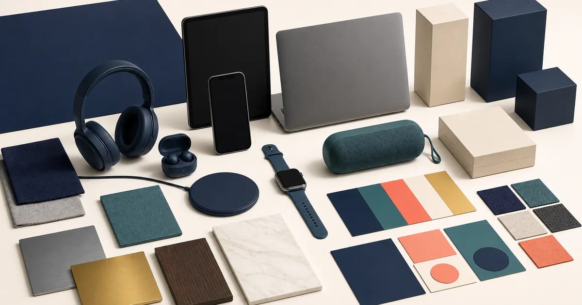
The short answer: electronics branding is credible when visual character and technical clarity reinforce each other. Start with a precise point of view about the category and audience, then give editorial story, factual specification, condition, warning, support, and ownership information distinct visual roles. A dark interface, neon accent, or product render is not technical confidence by itself. Confidence comes from a system that helps people tell what is known, what is optional, and what they need to verify.
Electronics stores often make one of two mistakes. Some adopt generic luxury signals and bury model details until the buyer is ready to leave. Others make every page resemble a raw spreadsheet and never articulate why the assortment exists. Both approaches make decision-making harder. A usable identity gives the store an opinion while leaving room for evidence. It can make a specialist catalog feel coherent without pretending that a battery, port, warranty term, or repair process is a matter of taste.
Begin with a category belief and an audience boundary
Write one sentence that identifies who the store serves, what category it curates, and the buying problem it promises to make less frustrating. “Tools for creators” is too broad if the inventory cannot support the claim. “A considered source for compact desk-setup components” is narrower and creates editorial consequences: compatibility, cable management, scale, and long-session use become content priorities. The sentence should exclude as much as it includes. A brand becomes vague when it tries to speak equally to experts, impulse gift buyers, enterprise procurement, hobbyists, and every device category at once.
Then define the evidence that must accompany the belief. A store about repairable equipment needs clear parts, condition, and service boundaries. A store about compact living needs dimensions and power information that fit small spaces. A store about studio equipment needs connector, monitoring, and setup detail. This is branding at the operational level: the promise determines which facts are never allowed to become hidden metadata.
Create separate visual roles for different kinds of information
Design systems become clearer when they name the job of each element. Editorial storytelling can use larger imagery, expressive typography, and intentional pacing to introduce a collection or a use case. Technical facts need stable labels, aligned values, generous spacing, and a predictable order. Warnings and constraints need prominence without alarmist styling. Condition information needs its own treatment so an open-box item cannot be mistaken for a new one. Support and policy routes should look dependable and available, not like tertiary afterthoughts.
This does not require a separate page style for every fact. It requires a vocabulary that remains consistent across a campaign, collection, product page, cart, confirmation, and service request. If blue text means a link in one context and a compatibility status in another, the identity creates friction. If a promotional badge looks exactly like an inventory state, the buyer cannot judge urgency honestly. Document the roles with examples, not only color tokens.
Use typography for scanning, not techno theater
Technical categories benefit from type that distinguishes product names, labels, values, help text, and long-form explanation. Choose a family and scale that remain legible at small sizes and under text enlargement. Reserve display treatments for editorial moments; do not force dense model numbers into a stylized face that makes characters hard to distinguish. Tables need row labels and values that align without requiring a buyer to trace across a crowded screen. A small amount of hierarchy does more for clarity than a large collection of type weights.
Color must carry the same discipline. Use contrast-tested foreground and background combinations, and never rely on color alone to communicate stock, warning, selection, or comparison differences. A muted technical palette can be distinctive, but it needs a clear accessible state system for focus, error, success, and disabled controls. W3C’s WCAG overview is the primary standards reference for accessibility requirements; evaluate the implemented combinations and interactive states rather than treating a design file as proof.
Turn photography into a recognizable evidence system
Product imagery should follow rules that a customer can learn. Set a consistent order for overview, rear, side, ports, controls, scale, accessory, packaging, and condition imagery. Define how reflective material, screens, illuminated indicators, and colored finishes are captured. Use lifestyle imagery to make a use case imaginable, but never let it replace the inspection views required to identify the object. Where an interface is shown, label whether it is representative and avoid using a screen composition to imply an unsupported performance outcome.
Consistency does not mean every image has the same background. It means a shopper understands where to find the same kind of evidence across products. An intentionally editorial campaign can coexist with neutral product photography when their roles are clear. That distinction is especially useful for refurbished inventory, where item-specific evidence should take precedence over a polished family render.
Extend the identity beyond the storefront
The brand is tested hardest after purchase. Order confirmation, setup material, packing inserts, support replies, repair intake, and return instructions should use the same vocabulary for model identity and responsibility. A customer should not have to relearn whether “device,” “unit,” “model,” and “SKU” refer to different things in each channel. Standardize labels and route people to the right help with the information they already have: order number, model, serial where relevant, observed issue, and included accessories.
Packaging is another moment where visual character can support truth. It can organize first-use steps and point to verified documentation without claiming certification or technical attributes that have not been established. If a product has disposal, recycling, battery, or data-handling considerations, coordinate the message with the actual policy owner. Brand consistency is not a reason to make consequential information small or optional.
Build the system in two artifacts, then prove it in one journey
Electronix Figma UI is the catalog’s editable electronics UI kit, with pre-made pages and screens, organized layers, components, and customizable colors listed by Polo Themes. It can help a team explore the visual language and page hierarchy. Electronix E-Commerce Shopify Theme is the direct storefront foundation, with customizable sections, Mega Menu, and Ajax Cart listed in its catalog record. Neither product is a complete organization-specific design system or an automatic implementation of accessibility, specifications, support policy, or content governance.
Use the Figma kit to document roles, tokens, page states, and content examples. Use the Shopify theme to configure and test the live experience. Keep a deliberate boundary between a design concept and a verified production behavior. The productive handoff is not a collection of attractive frames; it is a mapping from component to store section, product field, responsive behavior, owner, and acceptance check.
A brand-design workshop that produces usable output
- Name the audience and exclusion. Identify the buyer, the category, the confidence problem, and the customers or promises the store will not pretend to serve.
- Inventory truth-bearing content. Collect model identity, specifications, compatibility, condition, included items, policies, support routes, and the owner for each.
- Assign information roles. Define the type, spacing, color, icon, and placement rules for editorial, fact, warning, status, support, and policy content.
- Create a representative specimen. Design a collection, detailed product page, cart, confirmation, and service request using real long names and incomplete states.
- Test implementation, not just concept. Verify focus, contrast, text expansion, image alternatives, tables, and small-screen reading in the actual storefront.
- Govern change. Record who may introduce a new badge, label, color, or component and how it is reviewed across design and storefront code.
Conclusion
A memorable electronics identity does not conceal the hard parts of ownership. It gives product evidence a stable place, makes assistance recognizable, and uses visual craft to guide attention rather than manufacture certainty. Establish a narrow category belief, make the factual system legible, and carry it through support as carefully as discovery. That is how a store feels technically confident without making claims it cannot keep.
Frequently asked questions
Does an electronics brand need a dark color scheme?
No. A dark scheme is a stylistic option, not a category requirement. Choose colors and contrast based on the brand’s point of view and on readable, accessible interactive states. The critical design decision is that facts, warnings, selections, and support routes remain clear in every theme treatment.
How can a small catalog feel like a real brand?
A small catalog can be more coherent because it can make a focused promise and document every product thoroughly. Use consistent product terminology, photography order, category guidance, and ownership information. Avoid padding the assortment or the story with unsupported category authority.
Are Electronix Figma UI and Electronix Shopify Theme interchangeable?
No. The Figma product is an editable design asset, while the Shopify product is a storefront theme. They can support a coordinated workflow, but designs still require implementation and live validation, and theme configuration still needs real content, accessibility checks, and operational ownership.