Guides · November 4, 2026 · 5 min read
How to write a product-image brief your photographer can use
Build a practical product-image brief with required views, variant identity, crop checks and acceptance notes before your next catalog shoot.
By Polo Themes
A useful product-image brief connects each photograph to a question a shopper needs answered. “Make the collection look premium” is a mood direction. “Show the front, side profile and exact color of every frame” is a production instruction someone can complete and review.
Before arranging another shoot, pick one representative product and write its brief all the way through. That small exercise often exposes missing information while it is still cheap to correct.
Begin with identity, not aesthetics
Give the photographer an exact product identifier, variant name and list of physical samples. Include the naming your store actually uses. If the sample box says “amber” and the storefront says “tortoiseshell,” resolve that difference before anyone exports files.
For an eyewear collection, distinguish the model from its color and size. Three photographs of different frame colors are not three views of the same variant. A polished contact sheet is still wrong if customers cannot tell which frame they are selecting.
Add a short list of what must not be implied. A frame-only listing should not look as though a pictured case or lens service is automatically included. Styling props can remain in lifestyle images, but the surrounding product information must explain what the customer receives.
Give every image a purpose
Use a shot list with a reason beside each view:
- Required view: Front view; Shopper question: What shape is this item?; Review note: Keep orientation comparable across the collection
- Required view: Side or profile; Shopper question: How deep or thick is it?; Review note: Do not hide the feature behind a prop
- Required view: Detail; Shopper question: What does the material or join look like?; Review note: Preserve the actual surface appearance
- Required view: In context; Shopper question: How does its scale relate to something familiar?; Review note: Identify props and avoid implying included accessories
- Required view: Variant view; Shopper question: Is this the color I selected?; Review note: Match the catalog identifier before upload
This is an example brief, not a mandatory number of photographs. A food package may need a legible label view. A cable may need both connectors. A garment may need a construction detail. Keep a view only when it answers a distinct question.
Design for the places the image will appear
The product gallery, collection card and campaign banner rarely use the same crop. Give the photographer examples of those placements and describe which part of the product must remain visible in each.
Do not ask the photography team to guess the theme's requirements. Open the actual design and inspect its image containers. Supply the needed aspect ratios and export constraints from that setup. Avoid inventing one universal pixel dimension for every store.
Keep a full composition master when your workflow allows it. Deliver separate named exports for placements that require materially different crops. If a narrow card cuts off the feature that distinguishes one product from another, the crop has failed even if the file looks sharp.
Make the handoff easy to check
A simple filename structure might be `model-color-view-sequence`. Agree it with the person uploading the images before the shoot. The exact punctuation matters less than reliable identification and a mapping back to the catalog.
Include a delivery sheet with product identifier, variant, image purpose, filename and approval status. Keep rejected files separate from accepted exports so an uploader does not accidentally choose an attractive but inaccurate revision.
Write proposed image descriptions while checking the files. Describe the meaningful visible information without making claims the photograph cannot prove. “Blue rectangular frame shown from the side” is useful. “The most comfortable frame for all-day wear” requires evidence beyond an image.
Review one complete product before approving the batch
Put the first product's images into a preview of the real storefront. Check its collection card, product gallery and selected variant. Ask another person to identify the product and color without your explanation.
Inspect whether similar products remain comparable, whether any crops conceal an important detail, and whether a lifestyle image creates confusion about included items. Note the exact file and placement when requesting a correction.
Only then approve the remaining exports against the agreed brief. This reduces the chance of discovering the same framing mistake across a whole collection after delivery. It does not replace a final check of every product-to-image mapping.
Keep generated artwork separate from product evidence
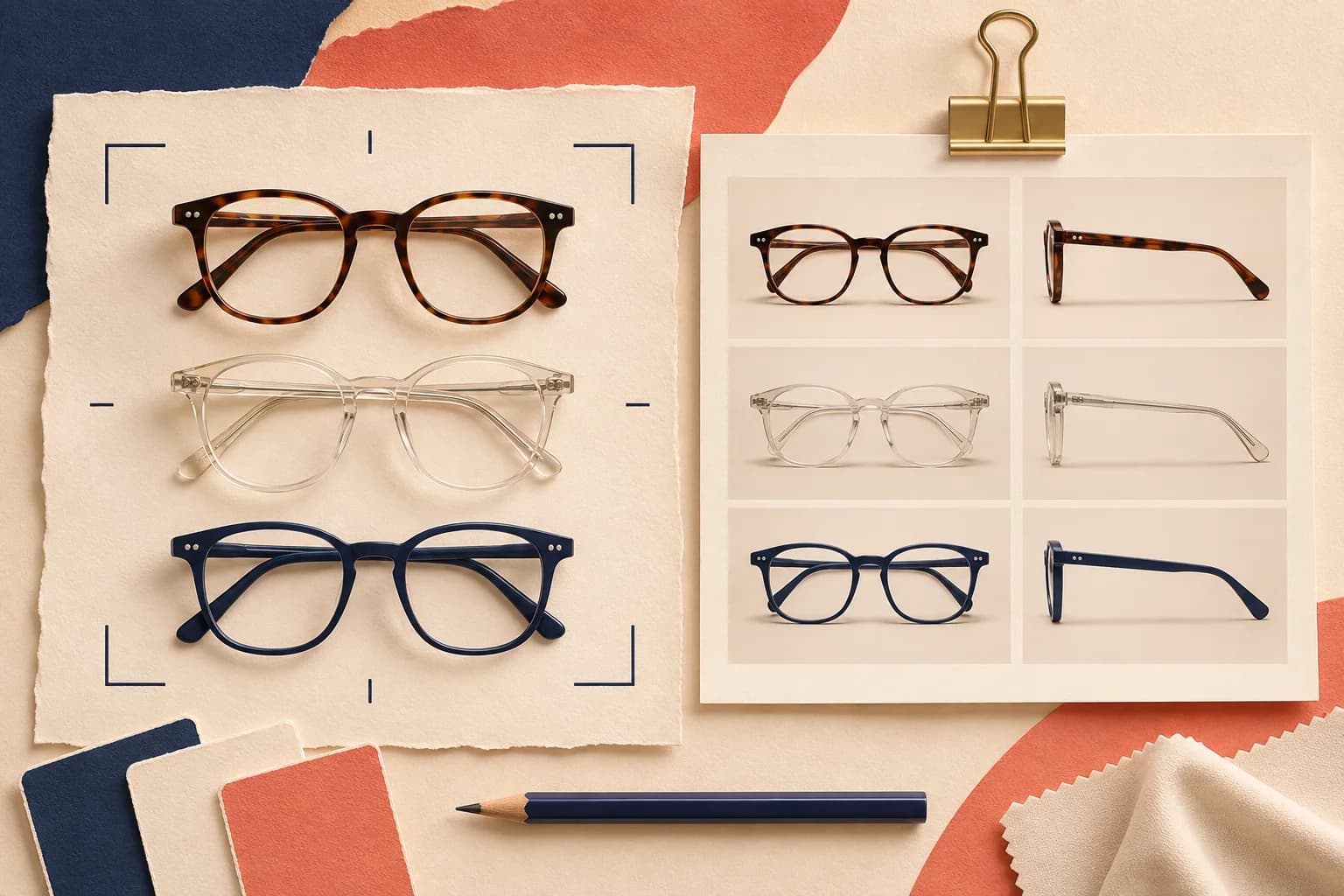
An illustration can explain a workflow or introduce an editorial article. It should not stand in for a photograph documenting the item a customer will receive. The hero artwork above illustrates a contact-sheet concept; it is not a photograph of a product sold by Polo Themes.
When you explore Optics, use photographs from your own catalog to judge the presentation. Verify the actual gallery and variant behavior before treating the design as a fit. A theme can organize the images you supply; it cannot establish their accuracy for you.
The finished brief should let the photographer produce the right material, the uploader map it correctly, and the reviewer explain why it passes. That is a stronger deliverable than a folder of attractive pictures with uncertain names.