Figma · August 23, 2026 · 7 min read
Best Figma Wireframe Kits
Choose wireframe kits that accelerate structural questions without turning untested assumptions into gray high-fidelity screens.
By Polo Themes
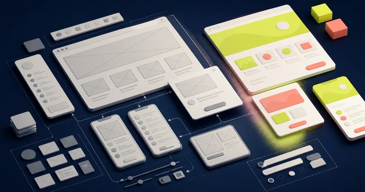
The best Figma wireframe kit helps a team answer structural questions quickly and discard weak answers cheaply. It provides enough familiar pieces for navigation, content, forms, records, and feedback without making an untested flow look approved. Fidelity should match the decision: rough for sequence, more detailed for content and behavior, and coded when browser or device evidence matters.
Figma Community is a practical source of wireframe resources, but Community availability does not guarantee license, maintenance, accessibility, or product fit. Figma’s prototyping tools can connect flows and states. GOV.UK’s service guidance provides a useful direct reference for choosing prototype fidelity around learning. None replaces research, content, technical discovery, or domain approval.
Start with the question, not the canvas
Write the uncertainty and the evidence that would change the decision. Examples include whether users understand a category, can recover from an invalid choice, can distinguish roles, or can complete a task with current content. Select only the wireframe pieces needed to stage that question. A complete app shell can distract from the one assumption under review.
Choose the participant and context. A customer on a phone, operator using a dense desktop queue, and administrator handling a risky record need different fixtures. State what the prototype deliberately omits. This prevents observers from interpreting blank styling, fake data, or missing backend behavior as a product decision.
Compare wireframe sources by editability
Inspect whether navigation, fields, tables, cards, dialogs, alerts, and mobile controls are connected components with understandable properties and auto layout. Replace sample labels immediately. A kit is fast only if realistic content can change without detachment and if variants support the states needed for the test.
Check breadth against search cost. Hundreds of near-identical blocks can slow assembly and make reviews inconsistent. A smaller semantic library often works better when components are named by responsibility. Confirm publisher, license, fonts, icons, plugins, and linked libraries before sharing a prototype outside the evaluation team.
Use real words before visual polish
Replace lorem ipsum with representative headings, labels, helper text, errors, values, and empty states. Content length and vocabulary expose hierarchy and comprehension problems that boxes conceal. Include one translated or expanded example and one missing value. Content design begins during structure, not after visual approval.
Use synthetic but plausible data for sensitive domains. Do not copy real prescriptions, customer accounts, payment records, or support cases into Figma. Mark unverified prices, policies, service promises, and performance targets rather than inventing realistic values. A wireframe is evidence about an interaction hypothesis, not evidence that its displayed facts are true.
Prototype behavior at the necessary fidelity
Connect the happy path only after adding the branch most likely to invalidate it: permission denial, unavailable item, empty result, failed payment, stale record, interrupted task, or destructive confirmation. Use overlays, variables, and interactions when they help participants understand the state. Avoid complex prototype machinery whose construction cost exceeds the learning value.
Some questions require code. Keyboard behavior, semantic structure, responsive reflow, focus management, performance, input method, native controls, and assistive technology cannot be proven by Figma connections. Move to a coded prototype when those concerns become decisive. Record which evidence came from demonstration and which still needs implementation testing.
Keep fidelity deliberate
Low fidelity supports divergent exploration because stakeholders are less likely to debate color and spacing. Mid fidelity helps test content hierarchy, states, and reusable patterns. High fidelity supports brand, visual accessibility, detailed interaction, and implementation handoff. Do not progress automatically. Increase detail only when the next question requires it.
Avoid gray high fidelity: meticulously aligned boxes, complete icons, and production-like spacing that consume time while important rules remain placeholders. Label open decisions and use visibly provisional components. A rough alternative with real content can generate better evidence than a polished route built on assumed policy.
Run the test and preserve evidence
Prepare tasks rather than tours. Let participants decide where to begin and avoid explaining the intended route. Observe vocabulary, hesitations, wrong turns, recoveries, and expectations. Ask what they believe happened after consequential feedback. Separate usability findings from preferences and from missing prototype fidelity.
Record the question, prototype version, participant context, task, observations, limitations, decision, and follow-up. Preserve rejected alternatives long enough to explain why they lost, then archive them away from active source. A final wireframe should not erase the reasoning that shaped it.
Collaborate without freezing ownership
Invite engineering early to identify platform, data, state, and integration constraints; content to challenge terminology; accessibility specialists to identify risks; and domain owners to correct rules. Their review should add evidence, not convert every wireframe into a specification meeting. Name decisions that remain open and the person who can close them.
Use branches, pages, or explicit status labels to separate explorations from the accepted direction. Avoid copying components into every concept. Keep one controlled wireframe library and record local exceptions. When the flow stabilizes, decide which patterns graduate into the product system and which remain disposable test scaffolding.
Wireframe-kit checklist
- The prototype names one uncertainty, audience, context, evidence goal, and deliberate limitation.
- Components are semantic, connected, adaptable, and small enough to find quickly.
- Representative content, difficult states, translations, missing values, and safe synthetic data replace placeholders.
- Interaction detail matches the research question without simulating guarantees Figma cannot provide.
- Keyboard, semantics, responsive behavior, native controls, and performance move to code when required.
- Research captures observations, limitations, decisions, and rejected alternatives rather than preference votes.
- Graduated product patterns and disposable prototype scaffolding remain clearly separated.
Failure modes
The flowchart theater failure connects dozens of screens but tests no uncertainty. Return to one task and one failure branch. The lorem-ipsum failure hides hierarchy and comprehension; use real language. The prototype-as-promise failure makes payments, permissions, clinical review, or data updates appear implemented; annotate ownership and limits.
The premature-system failure promotes every experiment into a shared component. Keep disposable pieces local until repeated evidence justifies maintenance. The fidelity-escalation failure adds visuals after each review regardless of the next question. Stay rough, change medium, or move to code according to evidence needs.
Generate structural alternatives before converging
Use the kit to build at least two structurally different answers to the risky question, not two cosmetic arrangements. One may expose choices early while another guides sequentially; one may center records while another centers tasks. Test the tradeoff using identical content and states. Keeping components lightweight makes divergence affordable and reduces attachment to the first plausible flow.
Converge from evidence and constraints, then record what was rejected and why. Do not merge every preferred element into a compromise that has no coherent model. A later change in audience, platform, or policy may make an archived alternative relevant again; its dated assumptions help reviewers decide rather than repeat the whole debate. Keep rejected routes clearly separated from the prototype used for current acceptance and engineering handoff.
Prepare remote and unmoderated use carefully
A prototype tested without a facilitator needs a clear starting state, realistic instructions, stable links, recovery from dead ends, and a finish that does not reveal the intended answer. Verify it in a clean session with another account. Keep analytics and participant-data collection within approved research and privacy practices; Figma delivery does not settle consent or retention.
For handoff, annotate state transitions, ownership boundaries, content rules, responsive priorities, and unresolved questions. Link accepted requirements rather than duplicating them inside frames. Retain the research report and prototype version. Engineers should receive the decision and evidence, not an expectation to infer every behavior from connector arrows. Review the implemented slice against the original task and failure branch, then update the record when platform evidence changes the chosen structure.
Conclusion
Choose a wireframe kit for semantic coverage, realistic-content resilience, fast state changes, clear licensing, and low search cost. Use Figma to explore flows and communicate behavior, then move to code when the evidence depends on the real platform. The best kit helps a team learn and discard; it does not make uncertain work look finished.
Frequently asked questions
Should wireframes use lorem ipsum?
No. Representative content exposes hierarchy, vocabulary, error, and space problems. Use safe synthetic data wherever real information is sensitive.
When should a prototype move to code?
Move immediately when the question depends on semantics, keyboard or assistive technology, responsive reflow, native behavior, performance, integration, or actual data.
Do polished wireframes test better?
Not universally. Higher fidelity can help when brand or detailed interaction matters, but it can distract from structure and make early assumptions feel prematurely settled.


