Figma · August 23, 2026 · 8 min read
Best Figma UI Kits for Online Stores
Evaluate online-store kits against your merchandise model, service promises, content extremes, and post-purchase responsibilities.
By Polo Themes
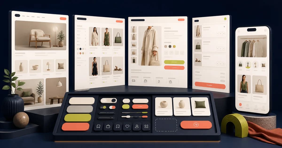
An online-store kit should make merchandise understandable before it makes the brand look fashionable. The strongest file for one shop may be actively misleading for another: apparel depends on fit and material, electronics on specifications and compatibility, eyewear on measurements and lens choices, and courses on curriculum and instructor evidence. Begin with what customers must decide, then judge the kit’s components and pages.
Polo’s recorded catalog provides useful named contrasts. Wosa is shaped around fashion; Electronix around technical retail; Optics around frames, prescriptions, and a finder quiz; Course Whiz around learning products; and the E-Commerce Bundle groups five niche kits. These are starting references, not a promise that any file contains a merchant’s exact rules, content, integrations, or production behavior.
Classify the merchandise before the interface
Write a product schema for three representative items. Include every fact a buyer uses, the order in which those facts matter, and the values that can be absent or uncertain. Add variant relationships, stock, price states, fulfillment choices, policies, and evidence such as reviews or specifications. This schema reveals whether the candidate’s card and detail patterns support actual comparison or merely repeat title, image, and price.
Then classify the purchase. A replenishment item rewards rapid reordering; a considered purchase needs comparison and reassurance; a configured item needs valid combinations; a digital product needs access terms; a service-like product may need scheduling or eligibility. A store can contain several modes. The kit must either accommodate their differences or provide a stable foundation for distinct templates.
Named candidates for different store models
Wosa for editorial fashion retail
The repository describes Wosa as a fashion UI product with more than twenty screens, including home, listing, detail, orders, reviews, address, wishlist, and cart. That inventory makes it relevant to apparel and accessories where collections, imagery, and saved products matter. Its limitation is domain depth: the catalog entry does not establish sizing logic, garment measurements, fabric care, localization, returns eligibility, or merchandising governance.
Electronix for specification-led shopping
Electronix is recorded with more than ten screens for landing, authentication, listing, detail, search, cart, and reviews. It is a better visual hypothesis for devices than a clothing template because technical attributes deserve more space. Still, teams must design their own comparison matrix, accessory compatibility, bundles, model identifiers, warranty language, installation services, and disposal information. A specification area is useful only when its taxonomy matches the catalog.
Optics for guided and configured purchases
Optics has the richest recorded specialist flow among these store candidates: more than twenty screens whose named scope includes prescription and a frame-finder quiz alongside standard commerce pages. It can help an optical retailer explore guided discovery. The design cannot establish prescription validity, lens compatibility, measurement accuracy, or clinical wording. Those high-consequence decisions require local owners and carefully tested recovery.
Course Whiz for digital learning products
Course Whiz records more than twenty-five screens covering marketing, instructor detail, profiles, owned courses, categories, wishlist, onboarding, and settings. It shows why a digital-product store cannot end at checkout: access and continued use are part of the value. A team still needs enrollment rules, curriculum structure, progress semantics, entitlement, refunds, assessment, and instructor operations appropriate to its service.
Test discovery with an inconvenient catalog
Create a collection with mixed image ratios, long names, overlapping categories, missing attributes, unavailable items, price ranges, and several promotions. Ask someone unfamiliar with the taxonomy to find a suitable product. Observe whether navigation labels, filters, sorting, chips, counts, and empty results form one understandable system. A candidate fails when the demo taxonomy works but realistic inventory produces contradictory or meaningless controls.
Search deserves its own route. Prototype a precise query, a broad query, a misspelling, no results, and a result whose relevant information is not in the title. Decide whether suggestions represent products, categories, content, or recent history. Show how a shopper recovers. Search boxes are visually simple; the difficult design work lies in result meaning, ranking expectations, refinement, and honest absence.
Stress the product-detail decision
Replace the hero product with the hardest item in the catalog. Include an unavailable combination, delayed fulfillment, incomplete media, lengthy specification, uncertain review count, and conditional return. Change selections in a prototype and inspect whether price, availability, imagery, identifier, delivery, and action feedback remain aligned. When the kit supplies only static swatches, record the behavior and component work that remains.
Information priority should reflect risk. A buyer choosing a laptop needs compatibility and warranty before lifestyle storytelling; a learner needs curriculum and instructor credibility before decorative testimonials; an eyewear buyer needs fit and lens constraints before impulse prompts. Rearrange the candidate using connected components. If the file resists domain-specific hierarchy without widespread detachment, it is a composition reference rather than a reusable store foundation.
Include service content and post-purchase work
Delivery, pickup, returns, support, and cancellation are product information, not footer decoration. Place concise promises near the decision and preserve fuller explanations in appropriate content. Test changed conditions after an item enters the cart. The interface should state what changed, why it matters, and what the customer can do. Do not let a Figma message imply an operational promise that the merchant has not approved.
Follow a completed order into status, shipment, download or access, support, return, refund, and reorder. The relevant route varies by merchandise, but ownership should be deliberate. Kits built to showcase landing pages often stop at confirmation. That omission does not make them unusable; it makes the missing service layer part of the adoption estimate.
Inspect the system beneath the pages
Audit cards, media, price displays, badges, selectors, forms, navigation, drawers, alerts, and order rows as reusable components. Review properties, variants, nesting, names, auto layout, foundations, and library dependencies. Change one shared value and see whether it reaches the intended instances. A tidy page list is not enough when every content variation creates a local override.
Resize the full browse-to-order route. Test long translated navigation, text enlargement, missing media, keyboard focus, visible errors, and meaning without color. Figma evidence can reveal gaps and document intent, but accessibility conformance is determined by the implemented semantics, interactions, content, and testing. Keep that limitation explicit in the selection record.
Online-store evaluation checklist
- Three difficult products fit the supplied information architecture without hiding purchase-critical facts.
- Navigation, search, filtering, sorting, and collection context use one comprehensible catalog vocabulary.
- Variant, stock, promotion, delivery, return, error, and changed-cart conditions have explicit treatments.
- Account and post-purchase routes match the merchandise rather than ending at a generic receipt.
- Components remain linked after realistic content and responsive changes; exceptions are deliberately recorded.
- Fonts, icons, imagery, plugins, external libraries, and commercial terms have verified owners and licenses.
- Engineering and operations reviewers have marked platform constraints and unverified service promises.
Failure modes and recovery
The common failure is importing fashion assumptions into every store. Large imagery, sparse facts, and aspirational copy can actively obstruct technical or configured purchases. Recover by returning to the product schema and rebuilding one decision-heavy detail page. Retain the visual direction only where it supports the information. Replace generic cards and selectors when the merchandise requires a different interaction model.
Another failure is optimizing conversion while neglecting trust. Hidden delivery limits, unclear returns, ambiguous subscriptions, missing seller identity, or unsupported product claims may make a cleaner mockup and a worse service. Ask content and operations owners to review the trial. Label proposed language as unverified until the responsible system and policy can honor it.
Finally, screen-count scoring can favor the bundle even when most pages are irrelevant. Compare the hours required to reach a trustworthy representative journey: discovery time, cleanup, adaptation, new design, implementation clarification, and maintenance. A smaller specialist source can be cheaper. A broad bundle earns its place only when several included domains contribute evidence the team will actually reuse.
Keep merchandising changes governable
Online stores change faster than their initial layouts. Campaigns replace heroes, categories gain attributes, assortments become seasonal, and service messages change under operational pressure. Ask who can alter each pattern and within what range. A design-system owner may govern the card, a merchandising team may select its content, and engineering may enforce data rules. The Figma source should make those boundaries discussable without becoming a fictional content-management interface.
Preserve regression examples for the adopted components: one fashion item with several sizes, one technical product with dense specifications, one configured purchase with dependent choices, and one digital item with access terms. Replay them when typography, spacing, price treatment, navigation, or product data changes. This small fixture set prevents a broad visual refresh from silently breaking the least convenient category in the catalog. Include the owning merchant in that review whenever the change alters how customers interpret merchandise, eligibility, fulfillment, or service commitments.
Conclusion
Choose Wosa, Electronix, Optics, Course Whiz, or a broader bundle according to the merchandise model—not a generic idea of online retail. Inspect recorded scope, then prove discovery, a difficult product decision, changed cart, service promise, and post-purchase route with real content. The winner is the file that reduces relevant invention while leaving its remaining gaps visible and maintainable.
Frequently asked questions
Can one UI kit support several product categories?
Yes, when shared foundations and components allow distinct information priorities. Do not force every category into one card or detail template merely for consistency.
Is a niche kit always better than a general kit?
No. A niche kit wins when its domain patterns match important decisions. A maintained general system may offer stronger components, accessibility guidance, and implementation alignment. Test both roles.
What content should be used during evaluation?
Use representative and adversarial catalog records: long titles, missing media, complex options, changing prices, unavailable stock, translations, and conditional service information.


