Figma · August 23, 2026 · 8 min read
Best Figma UI Kits for Mobile Apps
Compare mobile UI kits by platform fidelity, state coverage, accessibility, security-sensitive flows, and engineering handoff.
By Polo Themes
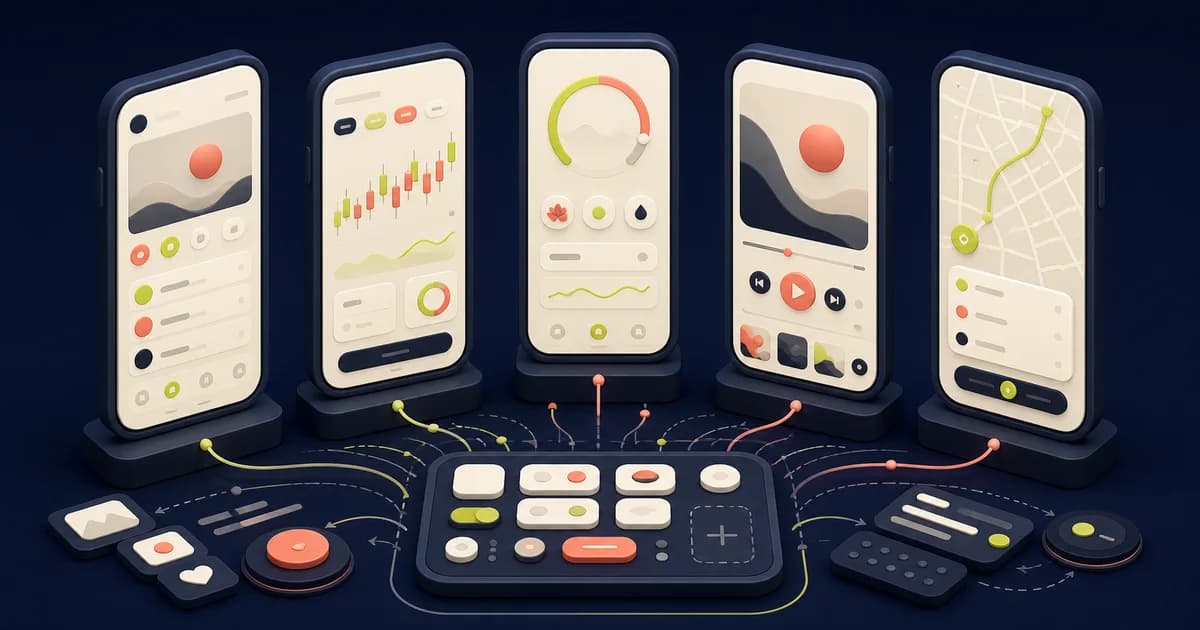
The best Figma UI kit for a mobile app is the one that matches its actual platform, interaction model, data conditions, and delivery team. A huge screen count can look efficient while hiding the hard work: system navigation, permissions, keyboard behavior, authentication recovery, offline use, accessibility, and components that engineers can map to production. Choose evidence and coverage over mockup volume.
For native work, begin with Apple Design Resources and the Material 3 Design Kit. They are maintained reference points for iOS and Android conventions, not finished product strategies. Untitled UI is a useful commercial comparison for broad component coverage and examples, especially when a product also has responsive web surfaces. A marketplace kit can accelerate a narrow visual direction, but its source, update history, license, and component quality require inspection.
Shortlist: which kit fits which mobile job?
Apple Design Resources is the strongest starting point for an iPhone or iPad product that should feel native. Its value is correspondence with Apple interface materials and platform conventions. It does not define your information architecture, domain states, privacy copy, business rules, or App Store acceptance. Teams still need to verify every pattern against the current Human Interface Guidelines and test the implemented app with supported devices and assistive technology.
The Material 3 Design Kit is the direct comparison for Android and cross-platform systems that deliberately use Material conventions. It provides tokens, components, and examples aligned with Material 3. It does not guarantee that a Compose, Flutter, React Native, or web implementation will behave like the design file. Dynamic color, window classes, system bars, back behavior, and platform releases must be handled in code.
Untitled UI suits teams seeking a large general-purpose library and documented package tiers. It can supply useful patterns for account, dashboard, commerce, and marketing surfaces, but it is not an operating-system kit. Adapt navigation, controls, touch behavior, and density instead of shrinking desktop components into phone frames. Confirm the current license, included file, and update entitlement before purchase.
A specialized marketplace kit may be worthwhile when it contains realistic domain flows that would otherwise take days to model. Inspect the actual Figma file before adopting it: variables rather than painted swatches, variants rather than detached copies, Auto Layout that survives content changes, named layers, responsive constraints, and documented states. Screenshots and sales-page claims are not evidence that the source file is maintainable.
Choose native, cross-platform, or responsive-web intent first
Write down the intended delivery targets before comparing aesthetics. A native iOS app, native Android app, shared Flutter or React Native app, progressive web app, and embedded web view have different navigation, input, notification, file access, payment, and accessibility behavior. One component library can express a shared brand, but it should not erase platform expectations that help people operate the product.
For a shared codebase, identify what will remain platform-specific. Back navigation, bottom sheets, date pickers, switches, permission prompts, share actions, keyboards, and system status areas frequently diverge. Create explicit iOS and Android variants when behavior differs. A design system is healthier when it records those differences than when one ambiguous component forces engineers to guess.
Audit components, tokens, and content pressure
Open the library rather than judging preview frames. Check whether color, typography, spacing, radius, elevation, and motion values use variables or documented styles. Inspect component properties, nested instances, modes, naming, deprecation, and release notes. Change a core token and confirm that dependent components respond predictably. Detach nothing during the trial; detachment can hide a brittle architecture until adoption is expensive.
Replace sample content with the shortest and longest plausible names, translated labels, large monetary values, multiline errors, missing avatars, zero results, and dense notification counts. Resize between supported widths and increase text size. A mobile kit should preserve reading order and reachable actions without truncating meaning, covering content, or requiring a precise marketing screenshot ratio.
Demand complete navigation and lifecycle states
Map launch, onboarding, signed-out, signed-in, suspended, expired-session, deep-link, interrupted, backgrounded, restored, offline, update-required, and account-deletion journeys. Design the state reached when a notification opens missing content or when a deep link requires authentication. A polished home screen says little about whether the app survives lifecycle transitions.
Prototype tabs, stacks, modals, sheets, back actions, scroll restoration, search, and keyboard dismissal with semantics engineers can reproduce. Record which destination owns each state and what persists after interruption. Figma prototypes demonstrate an intended path; they do not prove native gesture priority, focus movement, memory restoration, animation performance, or operating-system integration.
Treat permissions and security-sensitive screens as product work
Camera, location, contacts, photos, microphone, notifications, and tracking requests need contextual explanation before the system prompt. Show what feature needs access, whether access is optional, and how to continue or recover after denial. Do not imitate an operating-system permission dialog inside the app. The real prompt, settings route, policy, and wording vary by platform and release.
Authentication designs should cover password managers, passkeys where supported, multifactor challenges, code expiry, resend limits, device change, lockout, recovery, suspicious activity, and support escalation. Do not place real secrets, production customer records, access tokens, recovery codes, or security answers in Figma. Redacted mock data belongs in design files; threat modeling, secure storage, rate limiting, session invalidation, and authorization belong in implementation and security review.
Model network, data, and device constraints
Create explicit loading, empty, partial, stale, offline, retrying, conflict, permission-denied, server-error, and success states. Decide whether queued changes can be edited or cancelled and what happens when synchronization conflicts. Skeletons should resemble the arriving content and should not run indefinitely. Show timestamps and freshness when stale information could change a consequential decision.
Test a compact phone, large phone, tablet or foldable if supported, landscape where required, keyboard open, screen zoom, slow network, low-power mode, and interrupted upload. Platform kits provide components, not a device-support policy. Product and engineering must agree which configurations are supported and validate on representative hardware or emulators.
Build accessibility into each component contract
Specify semantic role, accessible name, state, value, focus order, error relationship, and activation behavior for interactive elements. Keep touch targets large enough for the applicable platform guidance, preserve visible focus where relevant, and avoid color-only status. Test text enlargement, bold text, reduced motion, increased contrast, switch access, keyboard input, VoiceOver, and TalkBack in the implemented application.
Figma contrast checks, annotations, and prototypes are useful review aids, but they cannot establish conformance. They do not expose the final accessibility tree, announcement timing, focus traps, dynamic type behavior, or gesture alternatives. Treat accessibility notes as an engineering contract and include disabled, selected, busy, invalid, and unavailable states rather than assuming one default component covers them.
Keep payments and regulated actions platform-aware
If the app sells goods, subscriptions, digital features, healthcare services, or financial products, establish which platform and jurisdiction rules apply before drawing checkout. Apple and Google policies can constrain purchase methods and account flows, and those policies change. A UI kit cannot determine eligibility or approval. Legal, payments, and platform owners must review the implemented flow.
Never use a static design to imply payment security. Tokenization, transport protection, authentication challenges, fraud controls, receipt handling, refunds, tax, and sensitive-data scope depend on the provider and implementation. Design pending, declined, cancelled, duplicate, restored, and disputed outcomes while keeping card or bank data out of shared design artifacts.
Prepare a buildable handoff
Connect each approved component to its production counterpart or record that none exists. Provide token names, platform variants, content rules, state diagrams, data dependencies, analytics intent, localization notes, and accessibility semantics. Separate required behavior from visual suggestion. Engineers should not have to infer whether a mock status bar, keyboard, permission sheet, or biometric prompt is system-owned.
Run a thin vertical slice before adopting the whole kit: one authenticated task with loading, failure, recovery, accessibility, analytics, and platform differences. Compare the built result on iOS and Android targets, then revise the Figma library based on implementation evidence. Include a real device with enlarged text and interrupted network access so the review captures constraints that a desktop prototype cannot reproduce faithfully. This exposes token gaps and impossible interactions earlier than a complete screen migration.
Mobile UI kit evaluation checklist
- The kit matches the intended native, cross-platform, or responsive-web delivery model.
- Official Apple or Material resources anchor platform-specific controls and behavior.
- Variables, components, variants, Auto Layout, naming, and update practices survive inspection.
- Navigation, lifecycle, offline, empty, error, interrupted, and recovery states are designed.
- Permissions, authentication, sensitive data, and payment boundaries are explicit and reviewed.
- Text enlargement, semantics, focus, contrast, reduced motion, VoiceOver, and TalkBack are tested in code.
- A vertical slice maps Figma components to production components before broad adoption.
Conclusion
Use Apple Design Resources for iOS fidelity, the Material 3 Design Kit for Android foundations, and a documented commercial library such as Untitled UI when broad general patterns justify adaptation. The best choice is not the file with the most screens. It is the kit whose platform intent, components, adverse states, accessibility contracts, and implementation mapping remain understandable after the demo content disappears.
Frequently asked questions
Can one Figma kit serve both iOS and Android?
It can share brand tokens and some product patterns, but platform-owned controls and behaviors often need explicit variants. Validate the implemented experience separately on each supported platform.
Is a paid mobile UI kit better than an official free kit?
Not automatically. Official kits are valuable for platform fidelity; paid kits may add product examples and breadth. Inspect source quality, license, maintenance, states, and engineering fit before deciding.
Does a Figma prototype prove accessibility?
No. It can communicate intent and reveal some visual problems, but semantic output, assistive-technology behavior, focus, text scaling, and motion must be tested in the built app.


