Figma · August 23, 2026 · 8 min read
Best Figma Kits for Checkout Flows
Compare checkout kits through payment-provider fit, address and tax states, accessibility, failure recovery, and truthful handoff.
By Polo Themes
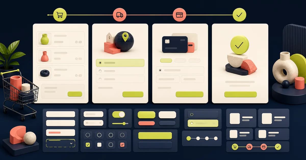
The best Figma kit for checkout is not the one with the sleekest card form. It is the one that helps a team model the entire commercial decision: cart changes, identity, address, delivery, tax, discounts, payment selection, authentication, review, submission, failure recovery, and confirmation. Provider constraints and business rules should shape the interface before decorative components do.
Start with the implementation platform. Shopify teams should use current Checkout extensibility guidance and Polaris as direct references because checkout customization is constrained by Shopify surfaces and eligibility. Custom commerce teams using Stripe should compare designs against the Payment Element and Elements documentation. Material 3 is useful for general responsive and mobile controls, but it is not a payment processor or checkout specification.
Shortlist kits by implementation reality
Polaris offers Shopify’s design principles and component guidance, while Checkout extensibility defines how apps can customize supported checkout areas. This pairing is more trustworthy than an unconstrained marketplace mockup for a Shopify build. It still does not mean every Polaris component, visual placement, or checkout idea can be deployed on every Shopify plan, market, extension target, or API version. Confirm the current platform contract.
Stripe Elements and the Payment Element are the strongest direct references for a custom Stripe integration. They support provider-controlled collection and presentation of payment methods, with appearance customization bounded by the integration. A Figma recreation is only a communication aid. It must not become a hand-built card field that expands sensitive-data scope or diverges from actual provider states.
Material 3 helps when checkout lives in an Android app or a system using Material components. It contributes field, button, sheet, dialog, and progress foundations, but it does not supply merchant rules, address validation, tax calculation, inventory reservation, fraud decisions, or settlement. General ecommerce UI kits can help with cart and order-review composition only after those platform boundaries are known.
Map the transaction before arranging screens
Draw states and transitions for guest and account checkout, cart validation, stock changes, delivery eligibility, address verification, discount application, tax estimation, payment-method availability, authentication, order creation, and receipt delivery. Mark which system owns each decision and which data can change between review and submission. A linear happy-path prototype hides concurrency and service failures.
Decide whether checkout is one page, several steps, an app sheet, or a platform-hosted surface from evidence about content and implementation. Step count alone does not determine effort or completion. A shorter flow that conceals delivery cost, forces account creation, or loses data after an error is not simpler for the buyer.
Design cart and inventory reconciliation
Cover quantity edits, unavailable variants, purchase limits, price changes, expired promotions, backorders, subscriptions, bundles, gifts, and mixed fulfillment. Explain what changed and preserve unaffected choices. When stock is reserved, disclose the relevant behavior without promising a countdown the backend cannot enforce. Never encode inventory truth solely in the visual state.
Order summaries should expose product, variant, quantity, recurring terms, discounts, shipping, tax, duties, fees, credit, and final total with labels appropriate to the market. Use realistic long product names and multiple currencies. A kit designed around one short item and a dollar total may collapse when price precision, translated text, or regulatory disclosures arrive.
Treat address, delivery, and tax as variable systems
Address forms differ by country. Support optional and required fields, organization, apartment, postal lookup, non-Latin scripts, validation uncertainty, and correction without erasing entries. Do not hard-code one country’s field order into the base component. Autocomplete and validation providers can assist, but the shopper needs a route to enter a valid address when the suggestion service is wrong or unavailable.
Model pickup, shipping, local delivery, digital fulfillment, split shipments, restricted goods, unavailable regions, dates, rates, and delayed calculation as applicable. Taxes and duties may be estimates until a particular step. State that honestly. The Figma file cannot calculate jurisdiction, nexus, exemptions, or landed cost; it must display the commerce service’s authoritative output and uncertainty.
Keep payment collection provider-owned
Represent the actual provider’s methods and states rather than inventing a generic card form. Include unavailable methods, wallet eligibility, saved-method consent, billing-address differences, authentication challenges, cancellation, decline, timeout, retry, duplicate submission, and asynchronous pending results. Method order and availability can depend on device, browser, currency, country, customer, amount, and provider configuration.
Do not put real primary account numbers, security codes, bank details, access credentials, or customer records into Figma. Use obviously synthetic data. PCI scope, tokenization, encryption, logging, fraud rules, webhooks, idempotency, and access controls are implementation and operational responsibilities. A familiar lock icon or provider logo does not prove security or compliance.
Make submission and failure behavior unambiguous
The final action needs an exact label, total, terms context, busy state, duplicate-click protection, and stable recovery. Disablement alone should not hide why submission is unavailable. If the result is unknown after a timeout, do not invite an immediate second payment without checking order status. Give the shopper a safe route to confirmation, retry, alternate payment, or support.
Distinguish field errors, business-rule rejection, payment decline, authentication failure, network loss, inventory conflict, and server failure. Place actionable feedback near the source and preserve valid information. Avoid blaming the customer for provider or merchant failures. Include telemetry identifiers for support without exposing secrets or internal risk reasoning.
Design accessible checkout under pressure
Checkout is a form-heavy, high-consequence task. Define labels, instructions, autocomplete purposes, error relationships, summaries, focus movement, status announcements, keyboard order, and visible focus. Keep the total and primary action understandable at text enlargement. Do not rely on color, placeholder text, animation, or icon shape alone to communicate validity or completion.
Embedded and provider-rendered payment controls need accessibility testing in the real integration. A Figma prototype cannot prove iframe focus, screen-reader announcements, browser autofill, virtual-keyboard behavior, contrast after theming, or authentication handoff. Test with keyboard, zoom, VoiceOver, TalkBack, and representative browsers and devices; use WCAG as a baseline alongside platform-specific requirements.
Respect platform and payment limitations
A Shopify checkout concept is limited by supported extension targets, APIs, plan and market capabilities, and merchant configuration. A custom storefront cannot assume it may replace hosted checkout internals. A Stripe concept is limited by enabled methods, account country, integration mode, browser support, authentication requirements, and provider changes. Verify these conditions before approving the design.
Native-app purchases add another boundary: platform rules may determine when an app must use an in-app purchase mechanism and how digital goods are described. The design kit cannot adjudicate this. Product, legal, platform, and payment owners should approve the flow, while engineering validates the precise SDK and API behavior in the target release.
Prototype adverse paths, not just success
Run scenarios for an expired session, address-service outage, price change, last-item conflict, delivery becoming unavailable, promotion rejection, wallet disappearance, authentication cancellation, slow webhook, lost network after submission, duplicate browser tab, and delayed confirmation email. Each scenario should end in a state whose next action and source of truth are clear.
Use realistic test accounts and provider test modes in a non-production environment when moving beyond Figma. Never use a successful prototype click as payment evidence. Demonstrate that the implementation creates one correct order, charges or authorizes as intended, handles retries idempotently, records provider results, and reconciles asynchronous outcomes.
Checkout kit evaluation checklist
- The chosen kit matches Shopify, Stripe, native-app, or other actual platform constraints.
- Cart, inventory, address, delivery, tax, discount, review, submission, and confirmation states are covered.
- Payment fields and authentication remain provider-owned, with synthetic data in design files.
- Decline, timeout, cancellation, duplicate submission, unknown result, and asynchronous recovery are explicit.
- Labels, autocomplete, errors, focus, status announcements, zoom, keyboard, and assistive technology are tested.
- Totals, recurring terms, fees, duties, consent, and uncertainty are visible before the final action.
- The handoff maps every design state to a backend or provider source of truth.
Handoff the contract, not merely the frames
Document component-to-code mapping, field schemas, validation ownership, state transitions, totals source, provider elements, extension points, analytics intent, consent, localization, accessibility semantics, and support routes. Mark assumptions and unsupported concepts. Keep platform screenshots and copied provider controls separate from components the team actually owns.
Review the built checkout with commerce operations, engineering, design, accessibility, security, payments, analytics, legal, and support in proportion to risk. Measure completion alongside declines, errors, retries, duplicate orders, support contacts, refunds, and accessibility failures. A conversion improvement that increases mistaken purchases or unresolved charges is not a clean success.
Conclusion
Use Polaris and Checkout extensibility as the primary references for Shopify, Stripe Elements and the Payment Element for custom Stripe collection, and Material 3 for compatible mobile foundations. A checkout kit earns adoption when it exposes commercial rules, provider ownership, adverse states, accessible form behavior, and recovery. Visual polish matters only after the transaction remains truthful and safe.
Frequently asked questions
Should designers recreate payment fields in Figma?
They may represent the expected layout for discussion, but implementation should use the selected provider’s supported components and states. Do not turn a visual copy into custom sensitive-data collection.
Can the same checkout design work for every country?
No. Addresses, payment methods, currencies, taxes, duties, disclosures, shipping, and authentication vary. Build shared foundations with deliberate regional rules and content.
Does a shorter checkout always convert better?
No. Evaluate task completion and trust with total cost, errors, retries, support load, and mistaken purchases. Removing steps can also remove necessary clarity or recovery.


