Guides · August 23, 2026 · 9 min read
How to Add a Sticky Add-to-Cart Bar
Add a Shopify sticky add-to-cart bar that mirrors the real product form, appears at the right moment, and remains accessible across variant and error states.
By Polo Themes
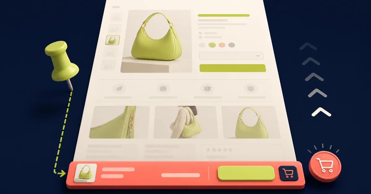
Add a sticky add-to-cart bar to Shopify only after the main product form is reliable. The sticky control is a secondary access point that keeps the purchase action reachable on a long product page. It must reflect the same selected variant, selling plan, quantity rules, price context, availability, validation, and submission result as the primary form.
A fixed button that submits a default variant is not a shortcut; it is a second checkout bug. Start by checking whether the current theme already includes a sticky cart or purchase setting. If it does, configure and test that maintained feature. If it does not, choose a compatible app or a theme-code implementation with an owner and release plan.
Decide whether the page needs a sticky action
Use observed friction rather than a generic conversion claim. Review scroll depth, product-page length, add-to-cart failures, device mix, customer recordings gathered with appropriate consent, support reports, and accessibility feedback. A bar may help when customers inspect long specifications or reviews and then struggle to return to the form. It may add clutter on short, simple pages.
Define the intended behavior in states, not pixels. Specify when the bar enters and leaves, which product information it shows, whether option selection occurs in the bar or routes back to the form, how it handles unavailable choices, and what happens during submission. Include mobile keyboards, safe areas, cookie notices, chat, drawers, and browser controls in the layout contract.
Prefer one purchasing state with two synchronized views. The primary product form remains authoritative. The sticky bar can display current identity and trigger that form, or it can contain coordinated controls built on the same state. Avoid two independent variant selectors or quantities that can disagree without an obvious winner.
Check the theme editor first
Duplicate the current theme or use the store’s approved preview workflow. In the theme editor, open the relevant product template and inspect the product information section and theme settings for a sticky cart, sticky purchase, or similar option. Names and capabilities vary by theme. Enable it on a test template, save, and assign only representative products while validating.
Review every provided setting rather than accepting defaults. Check mobile and desktop visibility, entry timing, image, title, price, selected options, quantity, button label, color, shadow, and position. Confirm the theme’s release notes or support documentation for variant and selling-plan limitations. A built-in option reduces custom ownership but does not remove acceptance testing.
Evaluate an app when theme support is absent
An app can be appropriate when the store needs merchant-managed targeting, analytics, or complex offer behavior and the theme exposes compatible app surfaces. Review permissions, data collection, script reach, pricing, performance, accessibility evidence, localization, theme compatibility, support, and uninstall cleanup. Install into a safe theme first and check what renders before consent where applicable.
Reject an app that duplicates the product form without maintaining its state, overlays checkout controls, cannot express subscriptions or required line-item properties, or fails when blocked. Confirm that removing the app eliminates embeds, blocks, snippets, assets, pixels, and scheduled behavior. The purchase page should not depend on abandoned markup after a trial ends.
Design the custom implementation around the product form
Shopify’s product template guidance treats the product form as the method for adding a selected variant to the cart. Identify the actual main form and its variant identifier, quantity, selling plan, line-item properties, validation, and submit lifecycle. Do not infer current selection from visible swatch text if the form contains the authoritative value.
Make the sticky action activate the existing submit path when possible. This reuses validation and cart handling already maintained by the theme. If the architecture requires a separate request, share a single state model and match the theme’s cart behavior exactly. Preserve localized paths and Shopify’s current cart interface contract rather than hard-coding a storefront address.
Render useful identity: product title when ambiguity is possible, the current variant label, active price, and availability. Keep the button label specific. When selection is incomplete, use “Choose options” and move focus to the first unresolved control instead of adding an arbitrary variant. When sold out, disable submission and present the same availability truth as the main form.
Choose a stable visibility rule
A common rule shows the sticky bar after the primary purchase action leaves the viewport and hides it when that action returns. Observe the real form rather than calculating a fixed scroll offset, because media, translations, app blocks, and dynamic content change page height. Ensure server-rendered content remains usable if the visibility enhancement never initializes.
Do not flash the bar on first paint or repeatedly animate it during minor scroll changes. Preserve space only where needed, respect reduced-motion preferences, and use a restrained transition. On desktop, consider whether a sticky product-information column already keeps the action available; adding a second floating control may create duplicate focus stops without solving a problem.
Synchronize variants and price
Listen to the theme’s established variant-change mechanism or shared state, not an assumed event copied from another theme. On selection, update the sticky variant label, price, compare-at context, unit price where applicable, availability, button state, featured image only if useful, and address state if the theme supports variant deep links. Confirm the submitted identifier matches what both views show.
Test partial and impossible combinations, high-variant products, deep-linked variants, browser back and forward, market changes, subscription plans, quantity breaks, and products with only one variant. A bar can lag behind asynchronous section updates. Ignore stale responses and never re-enable an option based on an earlier request that completed late.
Do not squeeze a full complex option system into a shallow mobile bar. When customization, engraving, file upload, bundle composition, or regulated acknowledgement is required, the sticky action should return the customer to the unresolved field and explain why. Bypassing required inputs creates invalid or incomplete orders.
Handle submission as a transaction
On activation, prevent duplicate submissions, expose a clear busy state, and keep the label stable enough to understand. On success, announce what was added and follow the theme’s established cart drawer, notification, or cart-page behavior. On rejection, retain selection and show an actionable message near the control and in the primary form where appropriate.
Exercise inventory loss, quantity limits, selling-plan errors, network timeout, malformed response, cart-drawer failure, and a rapid double tap. The bar must not announce success merely because a request started. Reconcile the returned cart state and recover controls after failure. If the cart changed on the server while feedback failed, offer a truthful route to review it.
Protect the mobile viewport
Account for device safe areas and dynamic browser chrome. The bar should not cover the final lines of content, policy links, chat controls, accessibility widgets, or the cart drawer. Add page spacing only while the bar is visible and verify it disappears with the component. Test narrow screens, landscape, zoom, long translated prices, sale labels, and text enlargement.
When the on-screen keyboard opens for quantity, personalization, search, or chat, confirm the bar does not consume the remaining viewport or sit over the active field. A compact bar still needs adequate touch targets and separation. Do not reduce button height or text below usable sizes merely to preserve a product thumbnail.
Make the duplicate control accessible
Use a semantic button with an accessible name that describes the action. Keep visible focus, sufficient contrast, logical focus order, and keyboard operation. Announce meaningful variant, availability, error, and cart changes without flooding a live region during every scroll event. The bar’s appearance itself usually does not need an announcement.
A sticky bar adds another focus stop, so its benefit must justify that duplication. If “Choose options” moves focus, land on the relevant option legend or invalid control and avoid disorienting scroll animation. Test with keyboard navigation, screen readers, zoom, reduced motion, touch exploration, and high-contrast preferences on the built storefront.
Run a demanding product scenario
Use a jacket with color and size, one unavailable combination, a sale price, a size guide, several media items, long care content, and reviews. Select blue and medium, scroll until the main action leaves view, and confirm the bar names that choice and price. Add once, verify the exact variant and quantity in the cart, then return without losing context.
Repeat on a narrow phone with enlarged text, a slow connection, and a rejected inventory update. Open the size guide, cookie notice, and cart drawer; rotate the phone and open the keyboard in a personalization field. The bar must avoid overlap, preserve the required field, recover from failure, and never submit a previous size.
Measure without inventing a conversion result
Before launch, record add-to-cart attempts and successes, invalid selections, duplicate additions, cart corrections, checkout progression, returns, support contacts, performance, and accessibility defects for the affected templates. If running an experiment, define the cohort, primary outcome, guardrails, duration logic, and decision rule in advance. Do not promise an uplift merely because the action remains visible.
Segment mobile and desktop because the geometry and need differ. Watch whether add-to-cart success improves without increased corrections, unintended variants, performance cost, or support. A higher click rate with more cart removals can mean the control encouraged premature action. Keep, revise, or remove the bar based on the full outcome.
Sticky add-to-cart launch checklist
- The theme’s maintained sticky option was checked before adding an app or custom code.
- The main product form is authoritative for variant, quantity, plan, properties, validation, and submission.
- Visibility follows the real primary action and avoids flashing, overlap, and unnecessary desktop duplication.
- Incomplete, unavailable, deep-linked, high-count, subscription, and custom-input product states are covered.
- Busy, duplicate, success, rejection, timeout, cart-drawer, and stale-response behavior is truthful.
- Safe areas, keyboard, zoom, translation, focus, screen reader, reduced motion, and touch are verified.
- Measurement includes cart accuracy, checkout, returns, support, performance, and accessibility guardrails.
Conclusion
A sticky add-to-cart bar succeeds when it is a faithful doorway into the existing Shopify purchase flow. Reuse maintained theme support when available, keep one authoritative form state, synchronize every consequential product change, and make failures recoverable. Validate difficult products and constrained mobile viewports, then measure cart accuracy and customer outcomes rather than assuming visibility creates conversion.
Frequently asked questions
Can a sticky bar use the currently selected variant?
Yes, but it must read from or share the product form’s authoritative state and update after every selection change. Test the submitted cart line rather than trusting the visible label.
Should the sticky bar always be visible?
Usually no. A useful pattern appears when the primary action leaves view and hides when it returns. The right rule depends on page length, layout, device, and observed customer friction.
Is a sticky add-to-cart app better than custom theme code?
Neither is universally better. Prefer a maintained theme feature first; otherwise compare an app’s permissions and operational cost with custom code ownership. Both require state, accessibility, performance, and uninstall testing.